

← Back/AI / Search

Glance

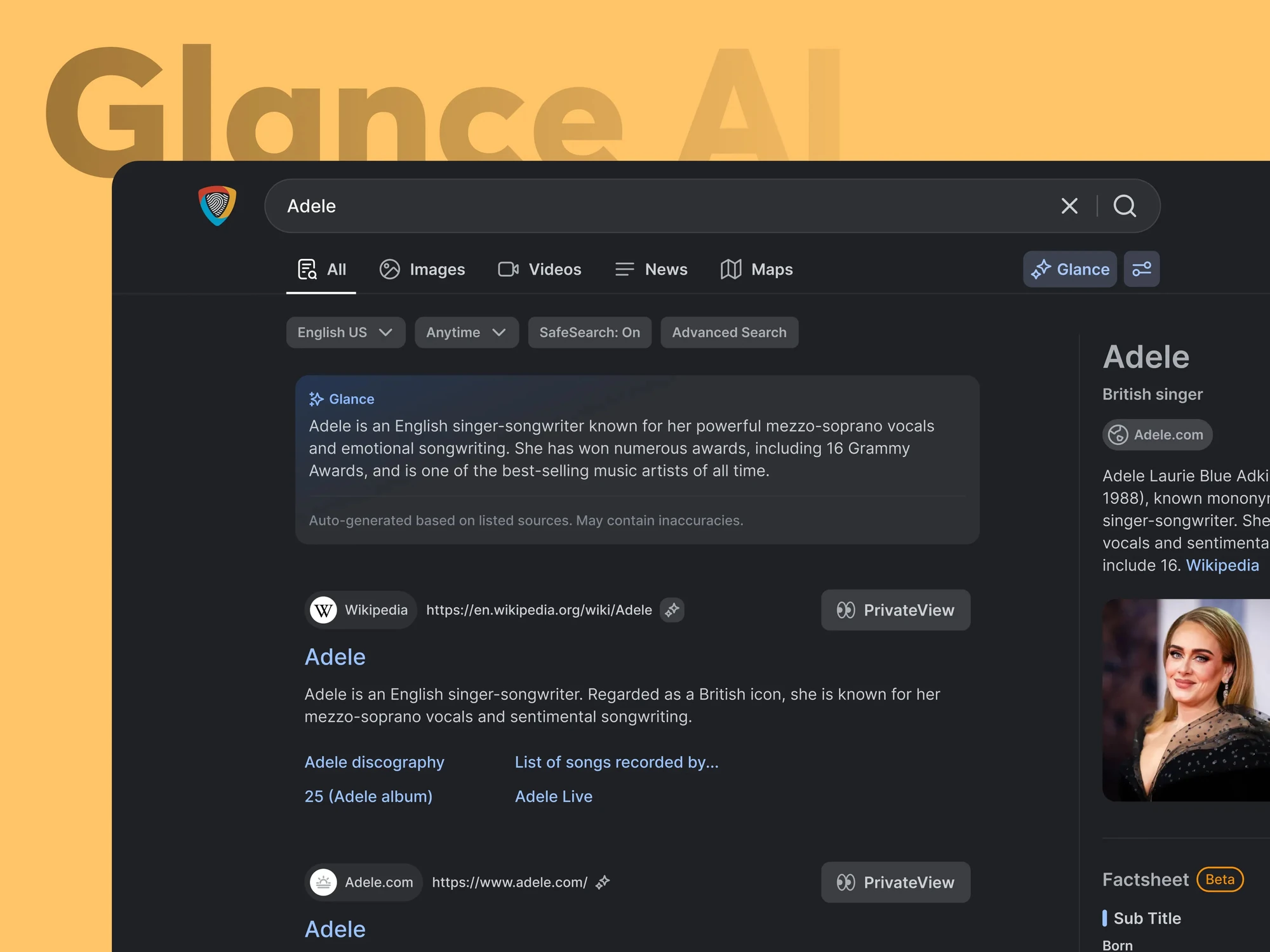
AI search products had solved answer quality and ignored interaction design: results arrived as static walls of text with no hierarchy and no spatial reasoning, inside an interface pattern of a text box and ten blue links that had not moved in twenty years. In 2025, as Product Design Engineer, I studied Perplexity, Arc and Phind, then designed and built Glance to make an AI answer something you can scan, trace and act on.

RoleProduct Design Engineer
Year2025
Tags
AISearchAnimationInteraction Design
View on Dribbble
Glance
At a glance

40%

Shorter perceived wait, in user testing

2.8×

Query refinement against traditional search

Read this first

This is the first version of Glance, from 2025. A better one now lives in the PrivacyWall design system.

Below the story: how I got from version 1 to version 2, with the research and the sketchbook pages that explain each change.

01The problem

AI search delivered better answers inside a reading experience that had not moved.

Results arrived as static walls of text with no hierarchy and no sources in reach. The interface was a text box and ten blue links, a pattern never designed to hold an answer.

02How we thought about it

The answer is a designed object, not text poured onto a page.

The category competed on retrieval and generation and ignored interaction design. I treated a generated answer as a composed object with a structure, sources and a moment of arrival. Designing those is what makes it feel trustworthy rather than merely fast.

03What we changed

  1. 01

    Showed what the system understood

    If the interpretation is visible, a wrong one can be corrected instead of re-guessed with new keywords.

  2. 02

    Composed answers by query type

    Factual questions get direct answer cards, exploratory queries get topic maps and comparisons get side-by-side matrices. The structure makes scanning work.

  3. 03

    Tied motion and citations to claims

    Citations sit beside the claim they support so verification is a glance. Motion explains where content came from, and if it only decorates it is removed.

04What it did

The contextual animation system reduced perceived wait time by 40% in user testing. Query refinement rate increased 2.8x compared to traditional search.

Version 1 to 2The sketchbook

From a paragraph in a card to a bounded, sourced answer.

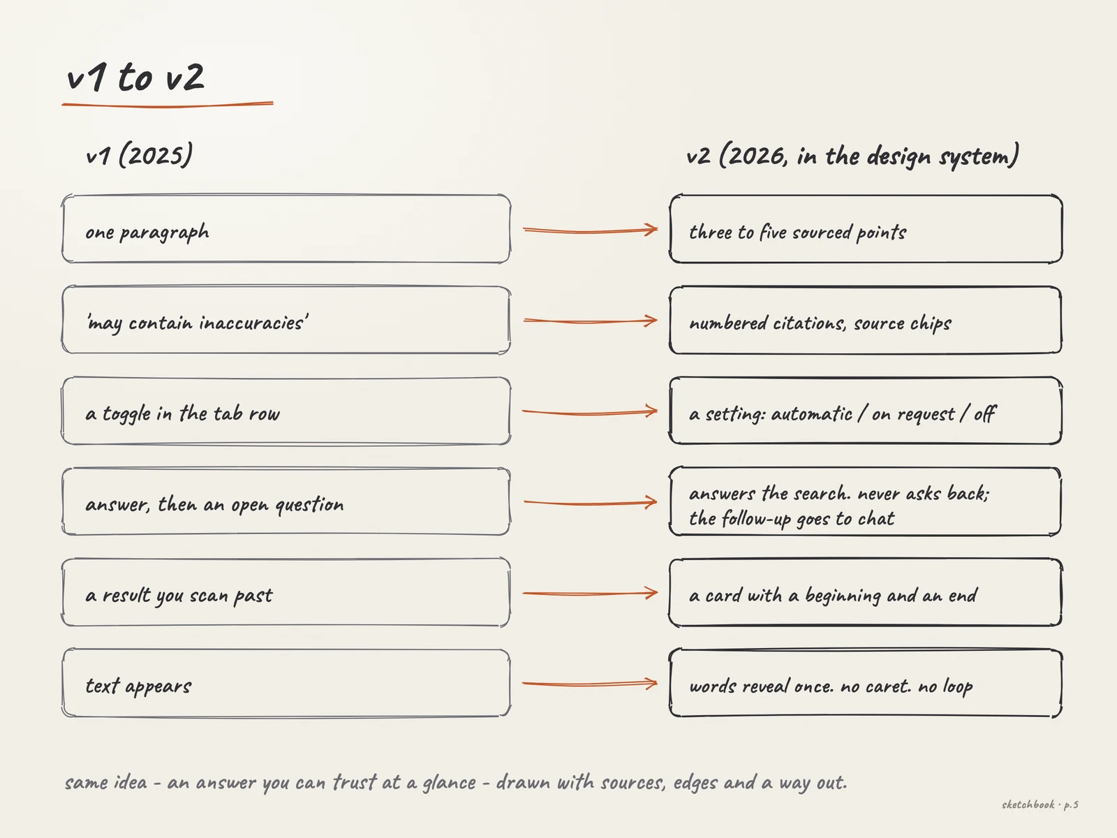
Version 1 proved the idea: an AI answer deserves its own object on the page. Version 2 is that idea with edges: sources you can see, states you can read, a setting you can change. The pages below are drawn for this case study from the documented decisions. They are not the original notebook.

Version 1 · 2025

What we shipped

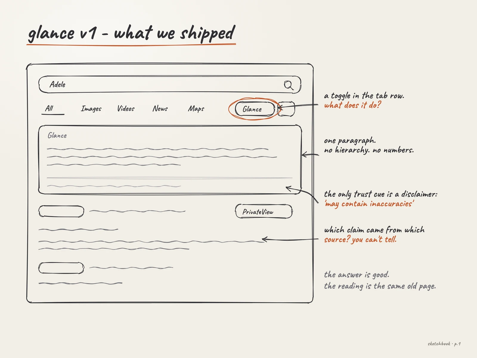
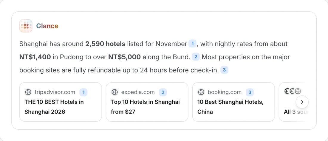
A Glance toggle in the tab row, a card with one paragraph, and a line at the foot: “Auto-generated based on listed sources. May contain inaccuracies.” The answer was good. The reading was the same old page, and nothing on the card said which claim came from which source.

Glance version 1: a Glance toggle in the tab row and one paragraph in a card with a disclaimer line
Pencil sketch of Glance version 1 with notes on the toggle, the single paragraph and the disclaimer
Sketchbook p.1 · redrawn for this page from the version 1 screenshot.

The research

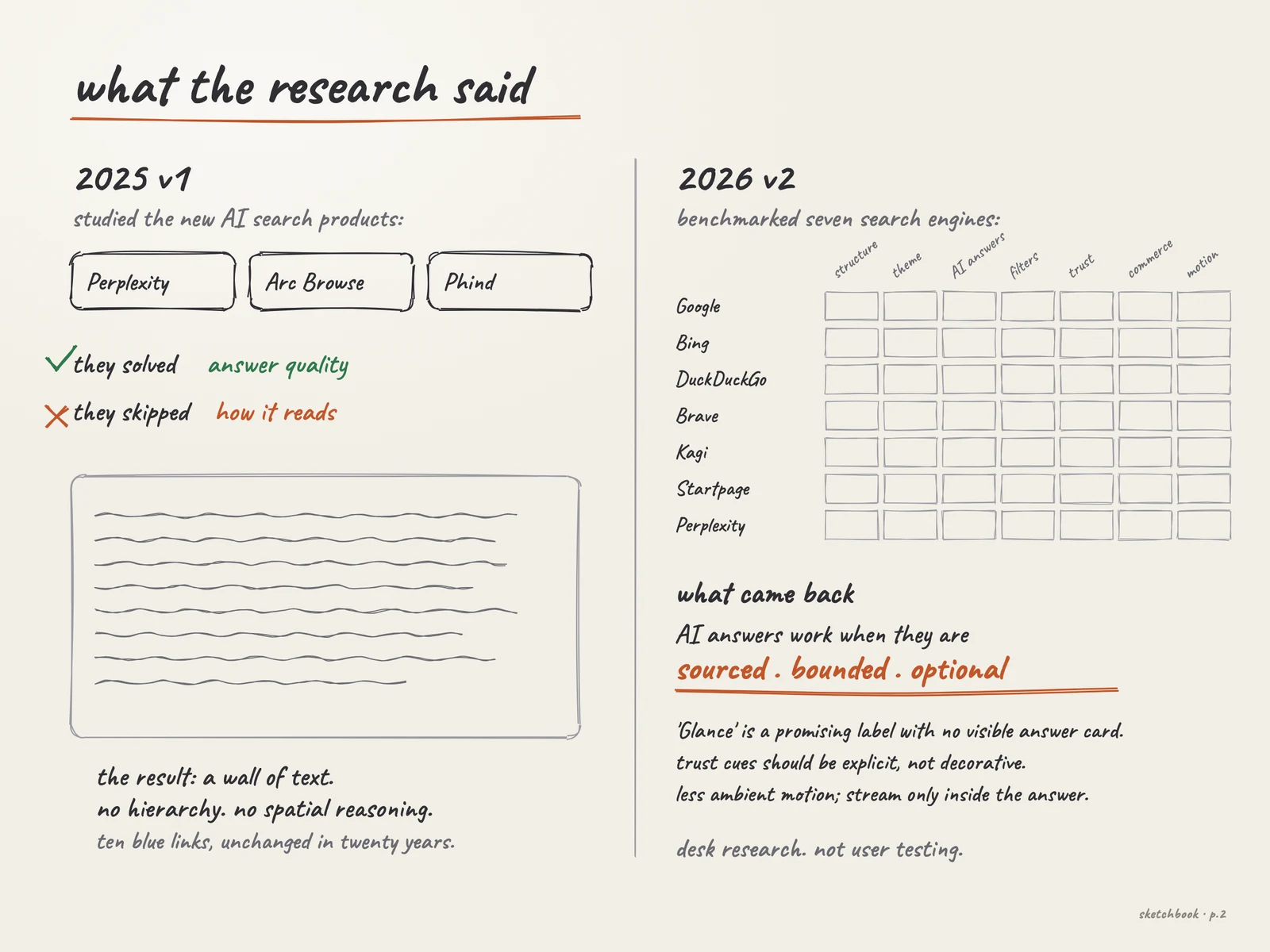
Three products in 2025. Seven engines in 2026.

The first round found the gap. The second round, a benchmark for the PrivacyWall search page, told me what the answer should be when it fills it.

Pencil sketch of the research: three AI search products in 2025 and a seven-engine benchmark in 2026
Sketchbook p.2 · the findings are the search report's own: AI answers work when they are sourced, bounded and optional.

Benchmark

Qualitative

3

2025, for v1. Perplexity, Arc Browse and Phind reviewed. They had solved answer quality and skipped how an answer reads: static walls of text, no hierarchy, no spatial reasoning.

Usability test

Mixed

−40%

2025, for v1. Perceived wait in user testing. The sample size is not recorded on this site, so read it as directional.

Benchmark

Qualitative

7

2026, for v2. Google, Bing, DuckDuckGo, Brave, Kagi, Startpage and Perplexity compared on structure, theme, AI answers, filters, trust, commerce and motion. Desk research.

Confidence: Medium

Code review

Quantitative

1

2026, for v2. The working PrivacyWall prototype inspected line by line: where the filters lived, what the privacy action was, what Glance showed.

Confidence: High

Usability test

Mixed

The PrivacyWall work, v2 included, was tested with users and its tasks passed. The search report itself is benchmark desk research, and participant detail is not published on this page.

Version 2 · 2026

One card, with edges

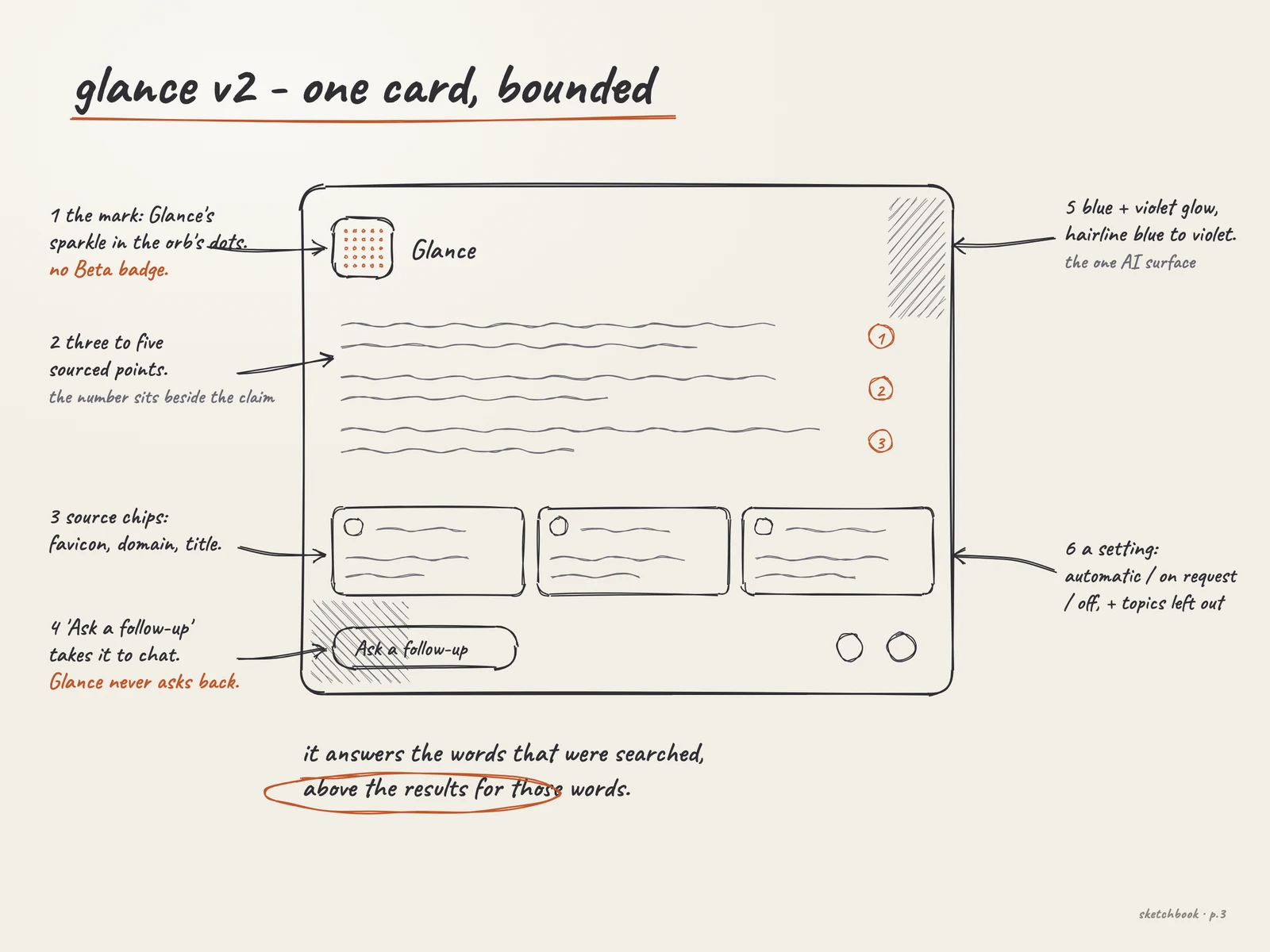
Glance became a component of the PrivacyWall design system. It answers the search and never asks back, sits above the results for those words, and is the product's one AI surface: the page lit by a blue glow and a violet glow, inside a hairline running from one to the other.

Pencil sketch of the version 2 Glance card with six numbered callouts
Sketchbook p.3 · the anatomy, from the design system's documentation.
Glance · an answer with its sources
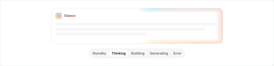
Glance card · live states
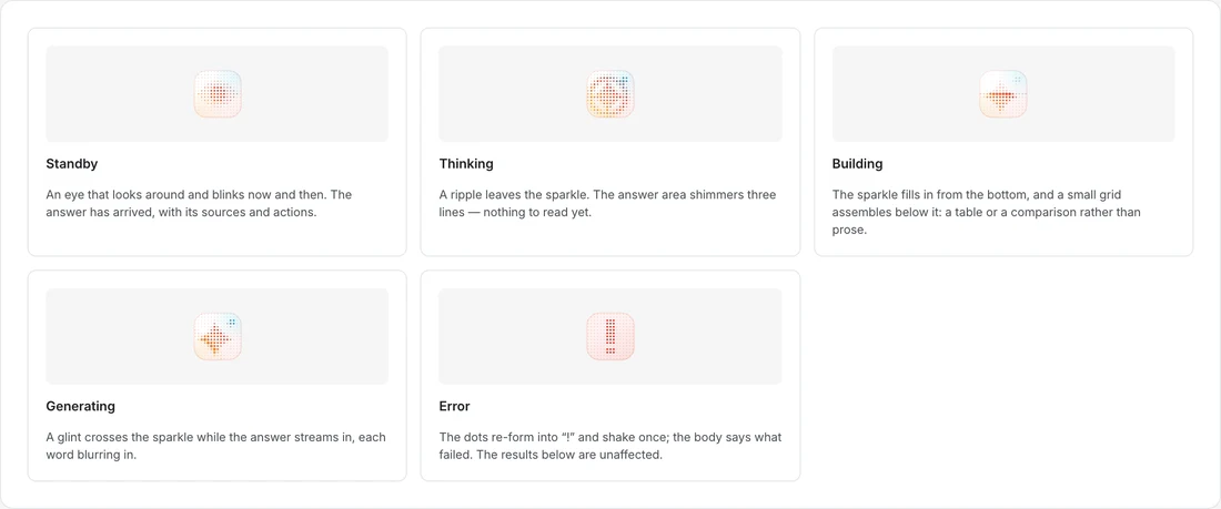
The five states
The mark at four sizes
The orb and the Glance mark, generating

Real components captured from the PrivacyWall design system.

States

The state is on the card, not in words

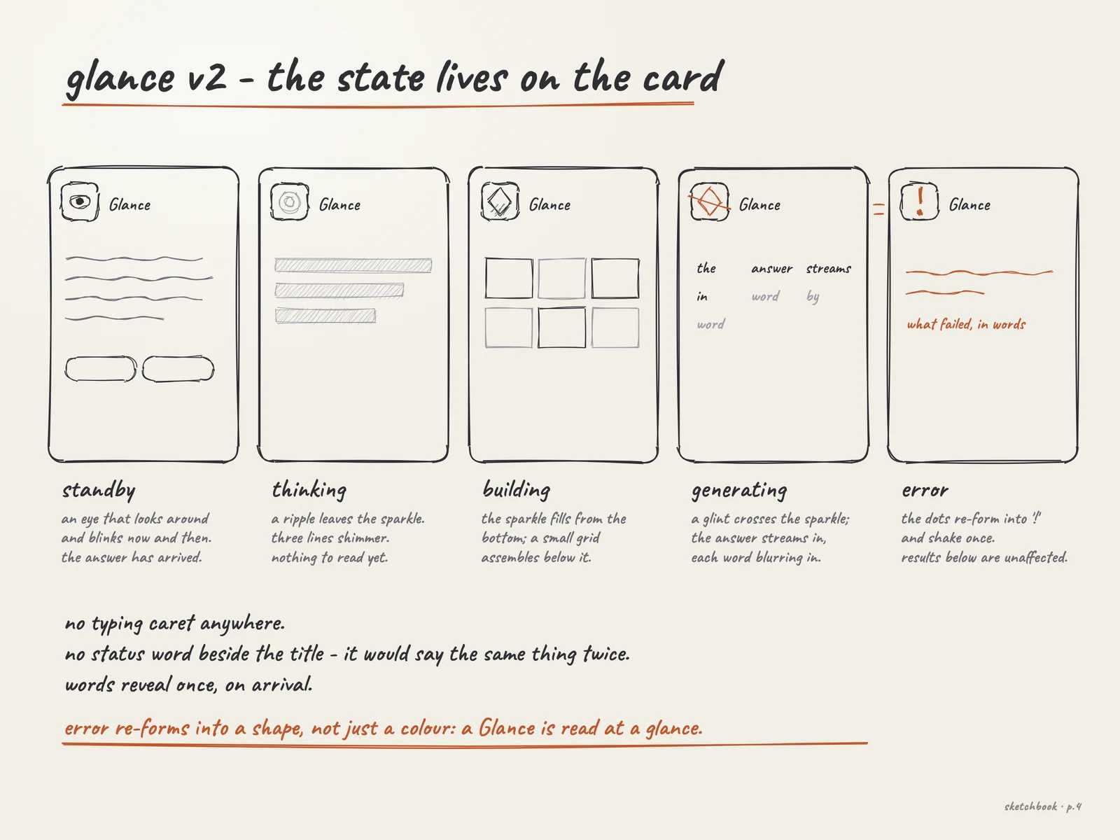
Shimmering lines while thinking, a grid assembling while building, words blurring in while generating. There is no typing caret and no status word beside the title, because it would say the same thing twice. A screen reader hears the state from a hidden status, and reduced motion loses nothing, because the three pictures differ even when still.

Pencil sketch of the five Glance states: standby, thinking, building, generating and error
Sketchbook p.4 · the five states and the rules around them.

In one page

What changed

Pencil sketch listing what changed from version 1 to version 2
Sketchbook p.5 · version 1 on the left, version 2 on the right.
See Glance v2 in the PrivacyWall system →

The settings that let a reader choose Automatic, On Request or Off, and leave topics out, are in the system's code and documentation.

How we knewEvidence

A frontier review, then testing: perceived wait and query refinement were both measured.

Benchmark

Qualitative

3

Perplexity, Arc Browse and Phind reviewed for what each had solved and what each had skipped.

Usability test

Mixed

−40%

Perceived wait in user testing against the plain-text answer.

Analytics

Quantitative

2.8×

Query refinement against traditional search.

Prototype

Qualitative

Built, not mocked, because fluidity and timing cannot be judged in a static frame.

DecisionsAnd why

What we saw, what we knew, what we chose, and what we gave up.

01

Treat the answer as a designed object

What we saw
AI search delivered better answers inside a worse reading experience: undifferentiated text, no hierarchy, no sources in reach.
Evidence
Benchmark· QualitativeThe category put its effort into retrieval and generation while the interface inherited a twenty-year-old list pattern.
Usability test· MixedPerceived wait fell 40% in user testing.
So we
Structured hierarchy, sources within reach, query understanding shown instead of implied, and motion that explains relationships.
Not
A wall of text with better retrieval behind it.
What happened
Query refinement was 2.8× that of traditional search.

User testingWhat was and was not tested

User testing is recorded for perceived wait. Its sample size is not stated on this page, so treat the percentage as directional.

My role

Product Design Engineer

What I personally owned on this project.

  • 01Designed and built the interface as a working product, not a concept deck
  • 02Researched the emerging AI search category and located the interaction gap
  • 03Designed the query-understanding surface and the answer composition model
  • 04Designed the motion system that ties answers to their sources
Made with
Design engineeringMotion designAI interaction patternsPrototype implementation
Next Project

iStoria

© 2026 Alhasan HosniDesigned & Built with precision