← Back/E-Learning / Mobile

iStoria

iStoria teaches English through graded stories and now has more than 5,000,000 learners. When I joined, only 45% of installs became users and only 8% of users became subscribers, because the first minutes asked for too much before they explained anything. I went through the onboarding one step at a time, with heat-maps, session recordings, interviews, moderated usability tests and A/B tests, and redesigned it: a how-it-works video, social sign-up, a scannable goals screen, a placement test with progress and a way back, and settings moved to the moment they matter. Installs becoming users rose from 45% to 80%, and users becoming subscribers from 8% to 40%.

RoleProduct Designer, research
Year2021 – 2022
Tags
E-LearningOnboardingUser ResearchMobileConversion
App StoreView on Dribbble
iStoria
At a glance

80%from 45%

Of installs became users

40%from 8%

Of users became lead subscribers

5M+

Learners on iStoria today

01The problem

Onboarding asked for too much before it explained anything.

Only 45% of installs became users and 8% of users became subscribers. The first screen was all text, there was no walkthrough, and later steps asked for a placement test, a reminder and voice settings before the learner had read a story.

iStoria, the problem

02How we thought about it

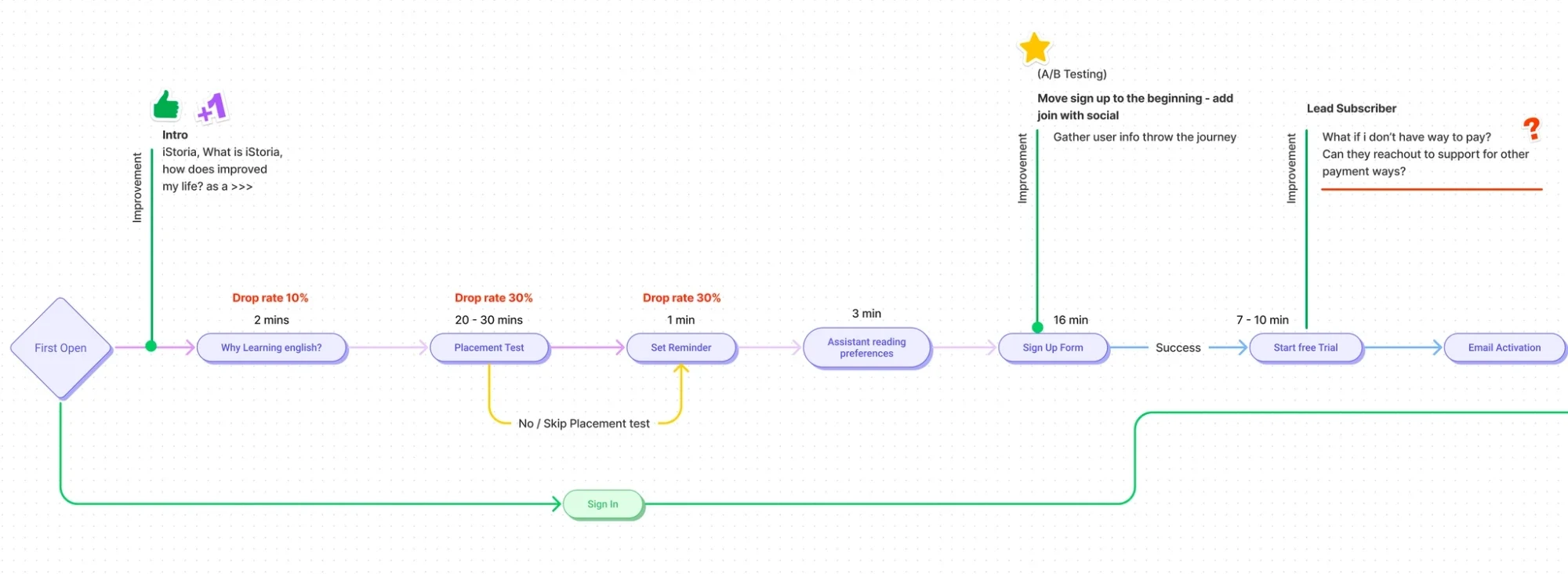
Treat onboarding as five problems, and measure each on its own.

Every step got a time and a drop rate. The principle that came out of it was to explain first and ask later, so questions that are not needed to start move to the moment they matter.

03What we changed

  1. 01

    Explained the app before asking for an account

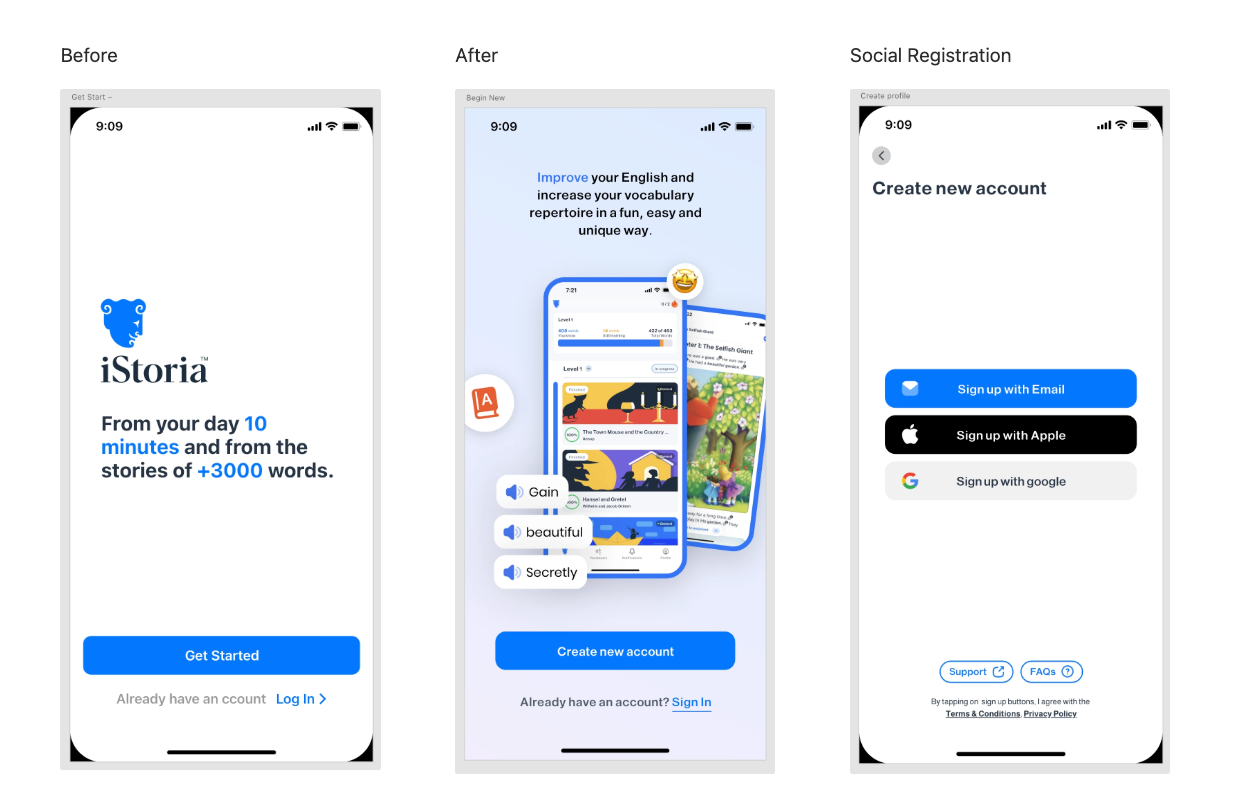
    People did not know what 'Get started' meant and wanted to understand how it works first. A short how-it-works video, better copy and social sign-up replaced a text-heavy form.

  2. 02

    Made the placement test visible and recoverable

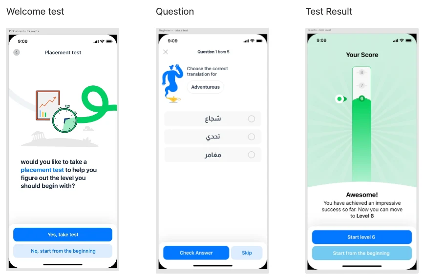
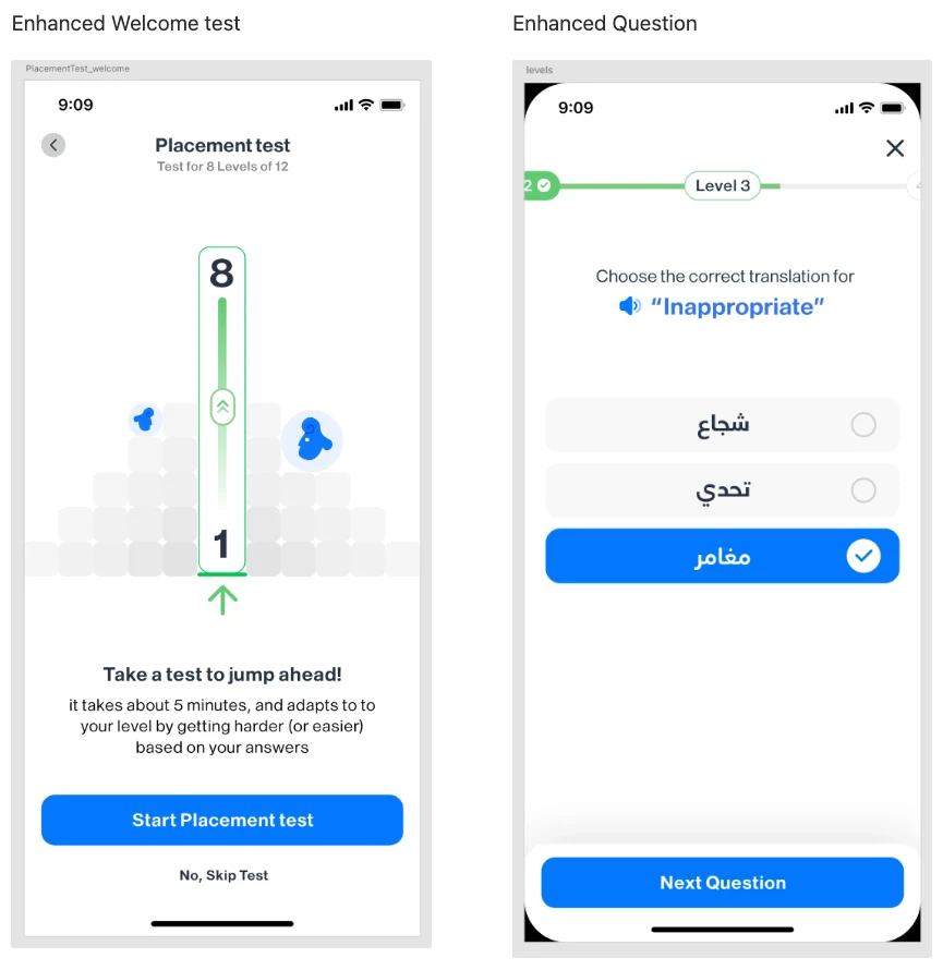
    It took about 35 minutes with no sense of progress, and leaving lost the score. It now shows level progress, saves and resumes, can be retaken and speaks every word.

  3. 03

    Moved settings to where they matter

    The reminder now follows the first chapter and merges with the daily goal. The assistant's voice is asked the first time the assistant reads a story.

iStoria, what we changed
iStoria, in use

04What it did

Installs becoming users rose from 45% to 80% and users becoming subscribers from 8% to 40%. iStoria now has more than 5,000,000 learners.

iStoria, detail

How we knewEvidence

Everything was tested in iStoria: observed, changed, then measured against the step's own numbers.

Analytics

Quantitative

45% → 80%

Installs becoming users, with users becoming lead subscribers rising from 8% to 40%.

Analytics

Quantitative

15 → 5 min

Registration time, from the long form to social sign-up.

Usability test

Mixed

Moderated tests where learners completed the placement test while thinking aloud, with notes on where they struggled and where they dropped off.

Interviews

Qualitative

One-to-one interviews with learners who had taken the placement test, and feedback from support tickets that some days they have no time to practise.

Analytics

Quantitative

Heat-maps and session recordings, used to balance the numbers with what people actually did on each screen.

A/B test

Quantitative

A paid plan with a free trial against a free plan with ads and paid-only features. The trial converted better first; the free plan with ads retained better.

DecisionsAnd why

What we saw, what we knew, what we chose, and what we gave up.

01

Explain the app before asking for an account

What we saw
The first sign-up screen was text-heavy and visually flat. Many people did not finish registering on their first visit.
Evidence
Analytics· QuantitativeA high drop-off between first open and the start of sign-up, with returning users engaging more.
Interviews· QualitativePeople did not know what 'Get started' meant, called the screen boring, and wanted to see how the app works before signing up.
So we
A skippable how-it-works video in English or Arabic, clearer copy, a visual first screen, social sign-up, and Support and FAQ buttons.
Not
A longer form with more text.
What happened
Installs becoming users rose from 45% to 80%, and registration fell from about 15 minutes to 5.

02

Let people scan the goals screen

What we saw
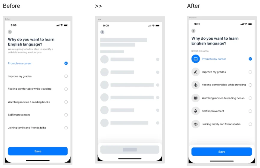
Learners had to read every line to choose, the touch targets were hard to hit, and nobody knew how many reasons to pick.
Evidence
Analytics· QuantitativeHeat-maps and recordings showed the struggle with the touch targets and the text.
Interviews· QualitativeUsers said the text-heavy screen was boring and wanted clearer instructions.
So we
Icons, larger touch targets, and a 'select 3 reasons' cue.
Not
Leaving the list as plain text.
What happened
Time on the step fell from 2 minutes to 1, and its drop rate from 8% to 2%.

03

Make the placement test something you can see through, and come back to

What we saw
It took about 35 minutes for eight levels, felt endless, and lost the score if you left.
Evidence
Usability test· MixedModerated think-aloud sessions found unclear progress, lost scores on exit, no retake, and no help with pronunciation.
Analytics· QuantitativeDrop-off at different stages of the test and time spent per question.
So we
A level progress bar, 'about 5 minutes', save and resume, a retake from inside the app, and audio for every word.
Not
A long test with no progress and no way back.
What happened
Time fell from 35 minutes to 20 to 25 for all levels, drop rate from 8% to 3%, and skipping the test from 36% to 12%.

04

Ask for reminders and voice only when they matter

What we saw
The reminder and the assistant's voice were asked before the learner had read anything, adding time to onboarding.
Evidence
Interviews· QualitativeSupport tickets said that some days people do not have time to practise.
So we
The reminder moved to after the first chapter and merged with the daily goal, with days to choose. The voice sheet appears the first time the assistant reads a story.
Not
Asking everything up front.
What happened
Both settings remain reachable later from the chapter or the app settings.

User testingWhat was and was not tested

Everything on this page was tested in iStoria: moderated usability tests, interviews, heat-maps and recordings, analytics before and after each change, and an A/B test of the subscription model. iStoria now has more than 5,000,000 learners. Participant counts are not published on this page.

My role

Product Designer, research

What I personally owned on this project.

  • 01Mapped the onboarding flow with time and drop rate for every step
  • 02Ran interviews, moderated think-aloud usability tests, heat-map and recording reviews
  • 03Redesigned sign-up, goals, placement test, reminder and voice settings
  • 04Planned the A/B test of a paid plan with a free trial against a free plan with ads
Made with
FigmaHeat-mapsSession recordingsModerated usability testsA/B testing
Next Project

Basket

© 2026 Alhasan HosniDesigned & Built with precision