← Design systems/2024-2025 · Lead Product Designer

Cold Electric

The software for a home battery and a factory microgrid: one language from the front door to the grid, across the app, the operator web and a virtual power plant.

5
Platforms brought onto one language
78%from 15%
Component reuse across teams
45%
Less design-to-development handoff time
4 daysfrom 3 weeks
To design a new feature surface

How it beganBefore the first screen

The interview took four months. The homework was an entire industry.

There was no assignment this time, only a quieter task: show the team why I wanted to be in the room. The trouble was that I knew nothing about energy.

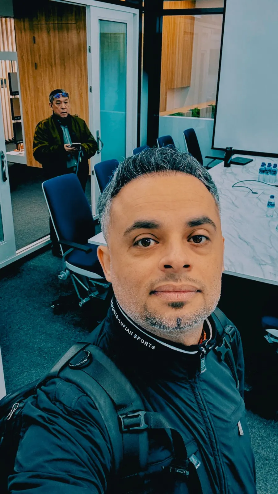
A selfie in a meeting room with a marble table, blue chairs and a projector screen
In the meeting room.
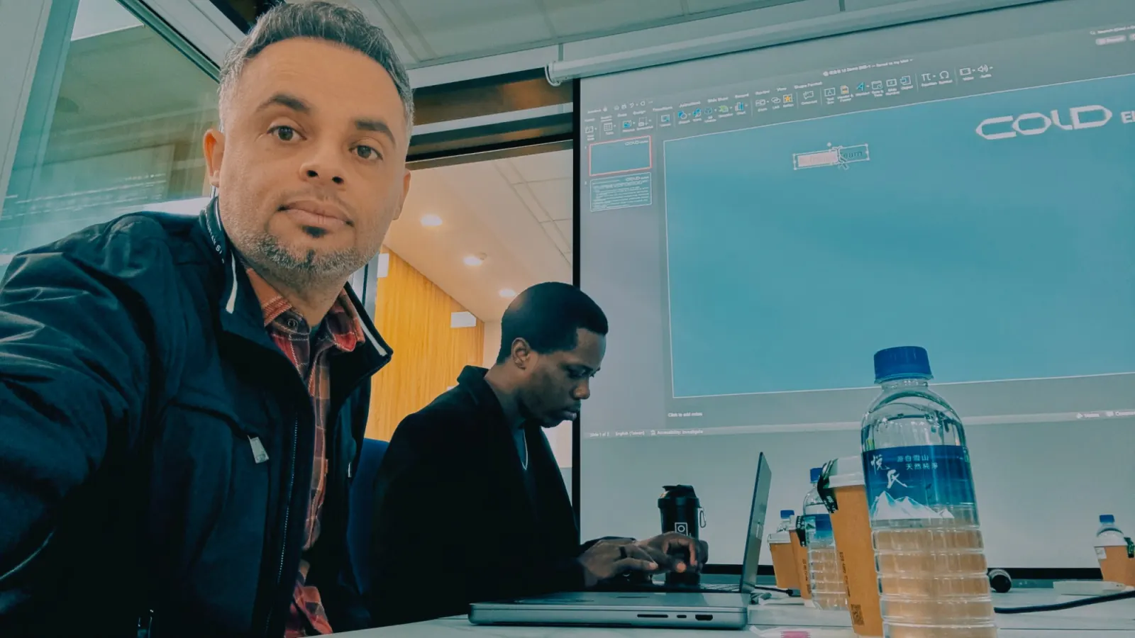
A selfie at the meeting table with a colleague on a laptop and the company deck on the projector
The company's deck on the screen, a colleague at work beside me.

01

A language I did not speak

Energy management, power, home batteries, smart homes: none of it was in my work yet. I had never shipped a feature for it, never tracked a fault in it, never fixed one.

And the field talks in shortcuts. Four of them came up in every conversation, with a long tail behind them. I could not have told you what any of them stood for.

  • ESS

    Energy storage system

  • BMS

    Battery management system

  • EMS

    Energy management system

  • LFP

    Lithium iron phosphate

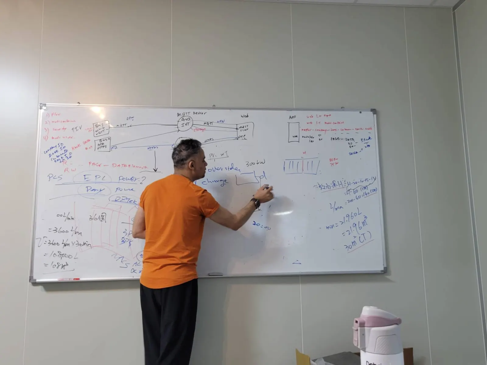
A whiteboard covered in diagrams: a BMS, an MQTT broker, a web client and notes on power and storage
The shortcuts, drawn out on a whiteboard: BMS, MQTT, PCS, racks.
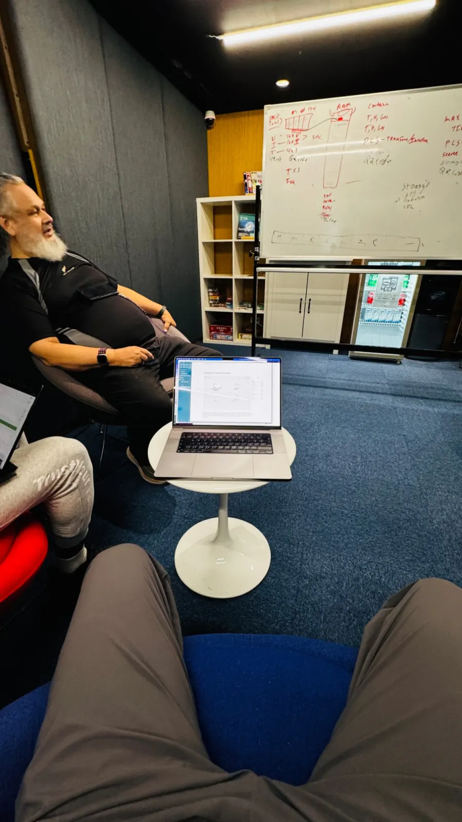
A meeting room with a whiteboard showing a rack, a PCS and state-of-charge notes, and a laptop on a small round table
Another room, another board, with Bruce, my software lead.

02

So I read the people who say it best

I went to the best-known players in the market, Anker and Tesla first, then the others, and gathered everything I could: which products they make, the software and the hardware, and how an app explains power, charge and money to someone standing in their own kitchen.

I kept notes on every product. The notes became pages.

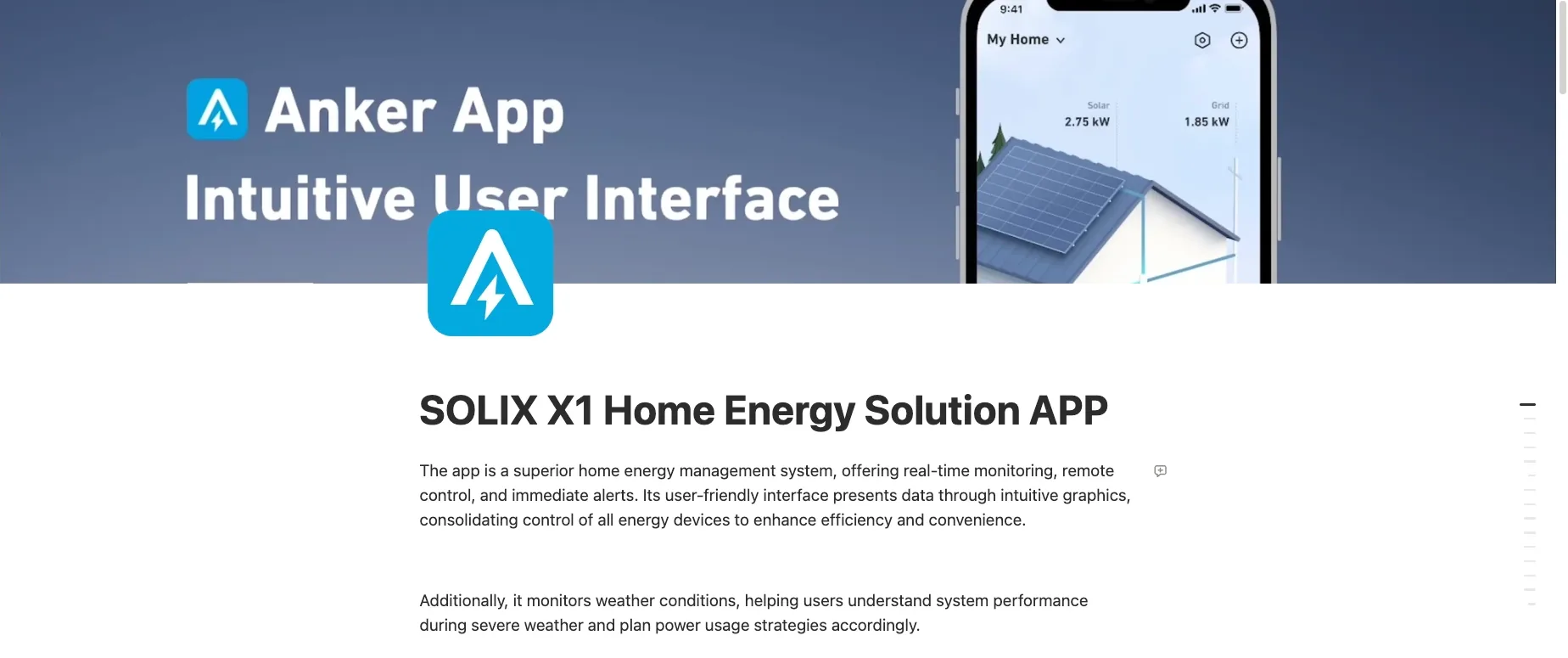
Anker · SOLIX X1 home energy app

My notes page on the Anker SOLIX X1 home energy app: its title banner and a phone showing a house with solar panels
The first page of my notes on Anker's home energy app.
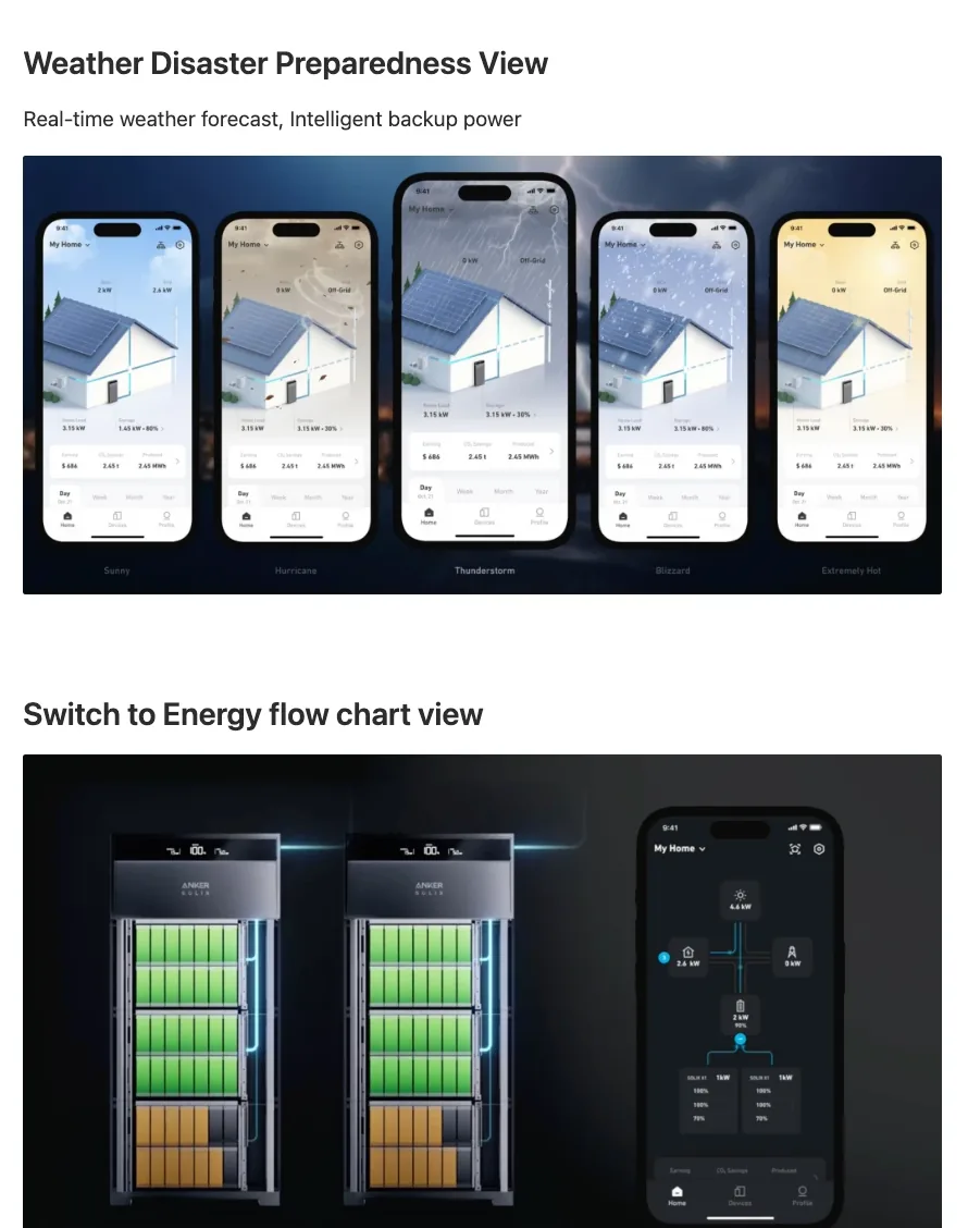
Notes on the weather preparedness view and the energy flow chart view
Weather preparedness and the energy-flow view.
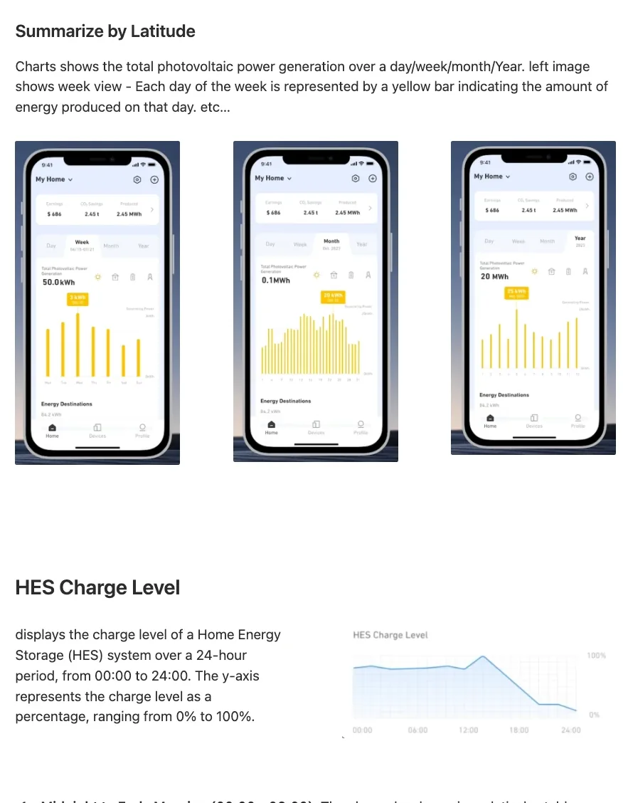
Notes on day, week, month and year solar generation charts
Solar generation by day, week, month and year.
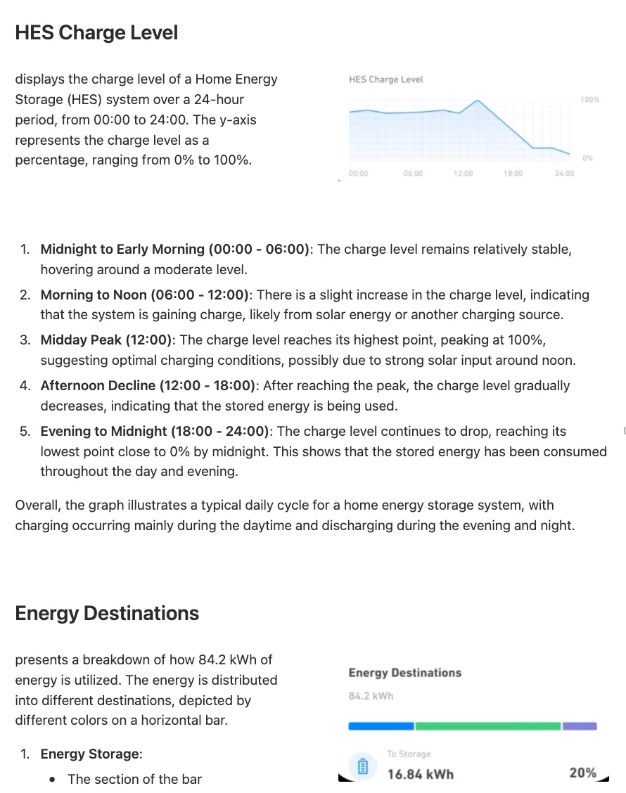
Notes reading a home energy storage charge level over 24 hours, line by line
Reading a 24-hour charge curve, line by line.

Tesla · Powerwall

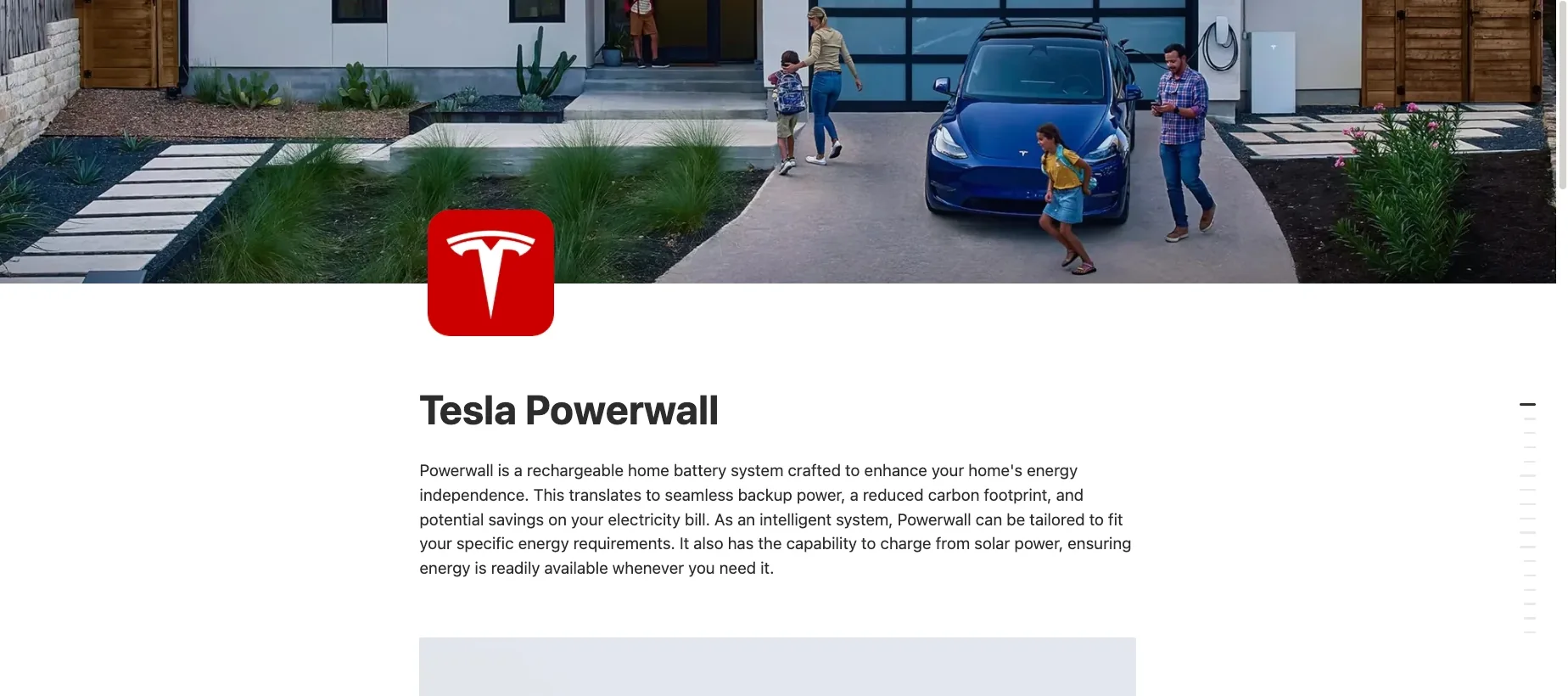
My notes page on Tesla Powerwall: a family on a driveway with an electric car
And the first page of my notes on Tesla's Powerwall.
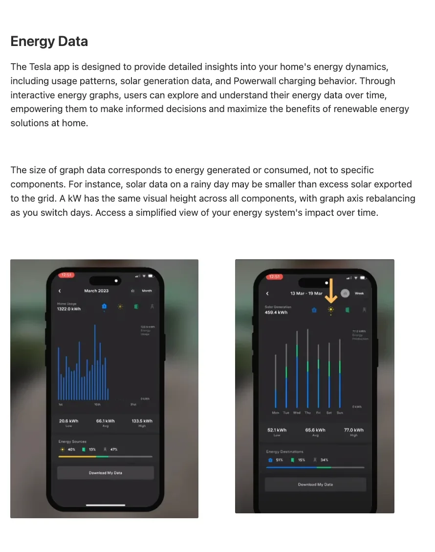
Notes on the Tesla app's energy data graphs
What the size of a graph means in the energy data.
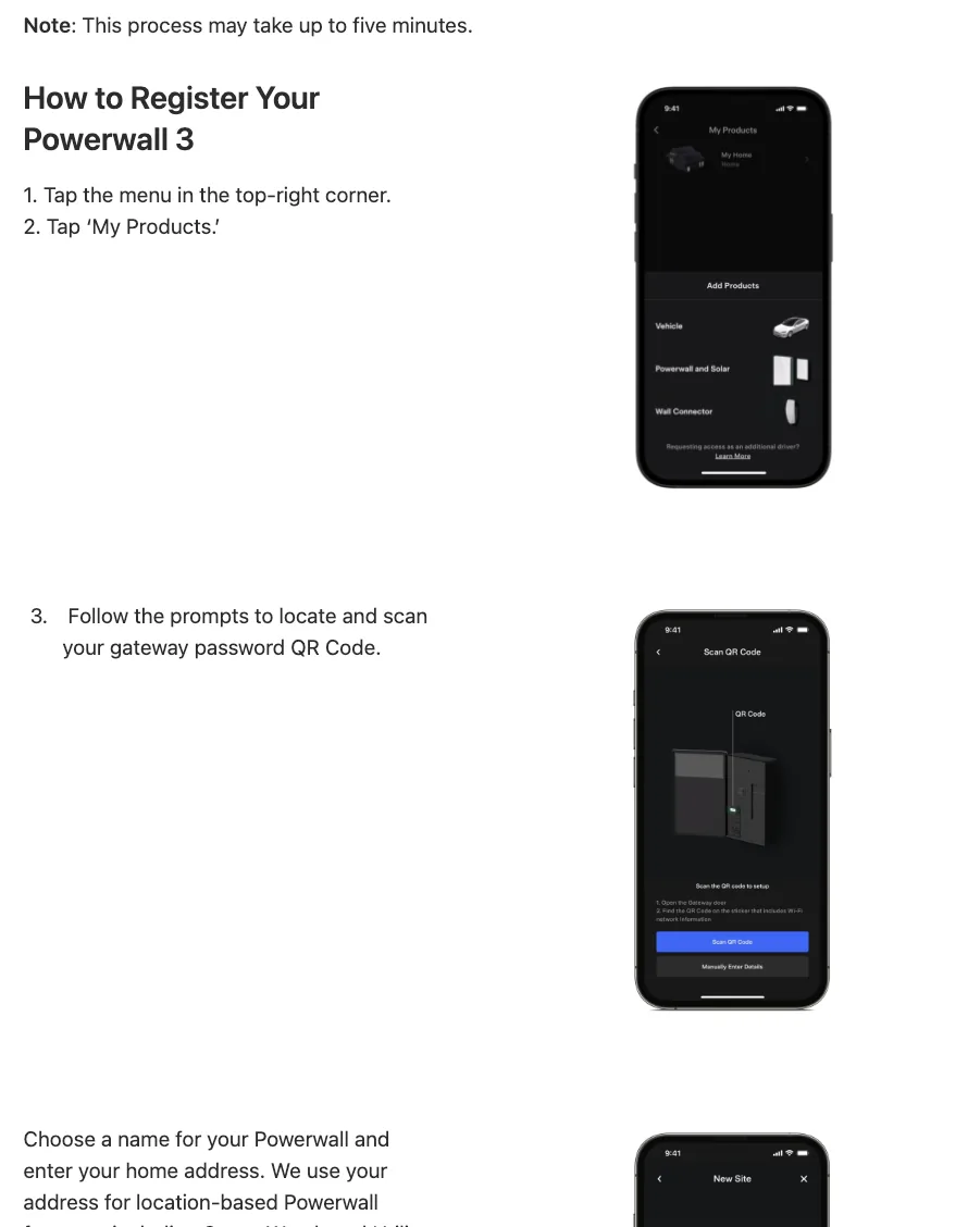
Notes on registering a Powerwall 3 in the app, step by step
Registering a Powerwall 3, one step at a time.
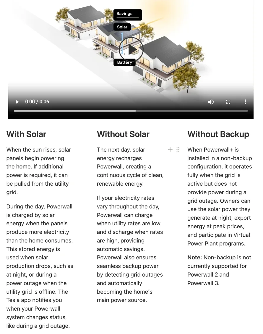
Notes comparing a Powerwall with solar, without solar and without backup
With solar, without solar, without backup.

03

The fog was the fun part.

It is a foggy corner of product design, the kind most designers never get a clear look at. The deeper I went, the more it made me think: where a kilowatt goes in a day, why a battery curve climbs at noon and sinks by midnight, what a number on a screen should promise to the person who owns the house.

I learned a great deal, and I did not stop when the interviews did. I kept studying the field after I left the company, because it was too much fun to put down.

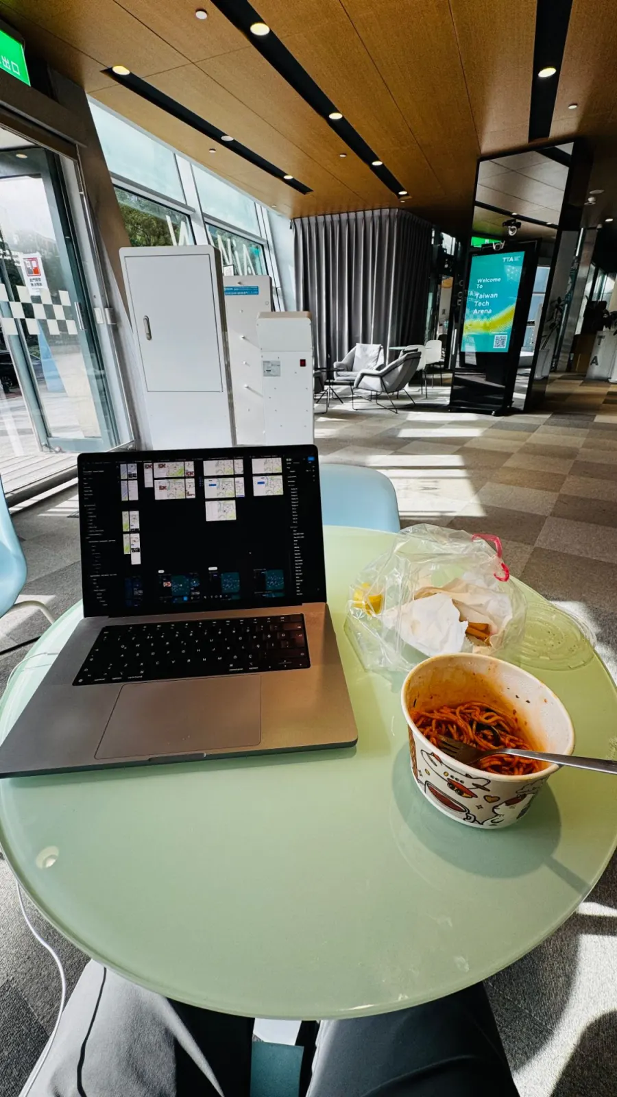
A laptop on a round table in a bright lobby, with design files open and a bowl of noodles beside it
A lobby table, the design files open.
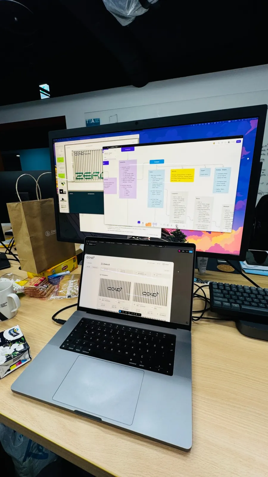
A big monitor showing the flow diagram above a laptop showing the Zone A screen with two containers
The flow on the big screen, Zone A on the laptop.
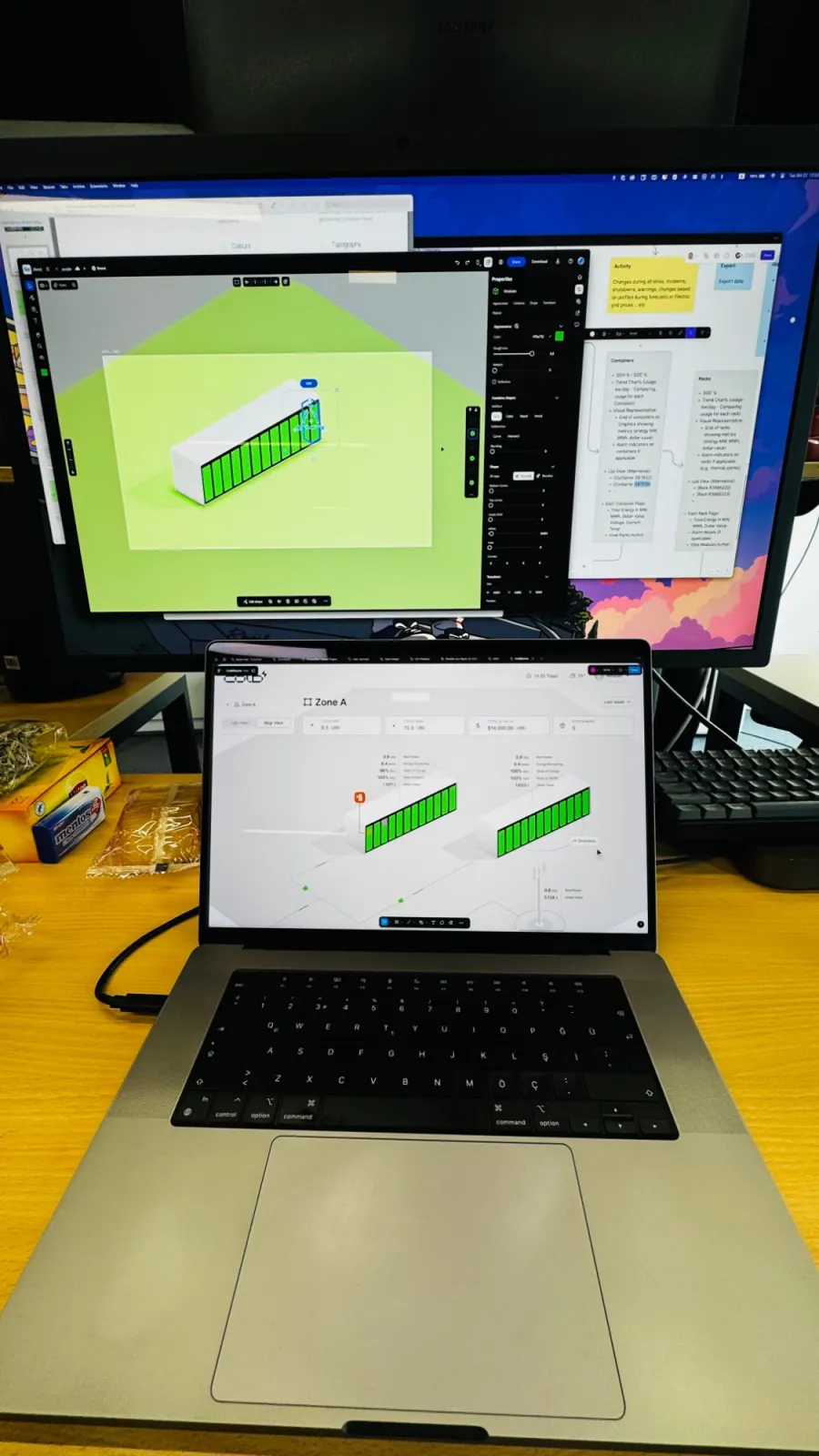
A big monitor with a 3D editor open on a green container model, above a laptop showing the Zone A map
Shaping the 3D container.
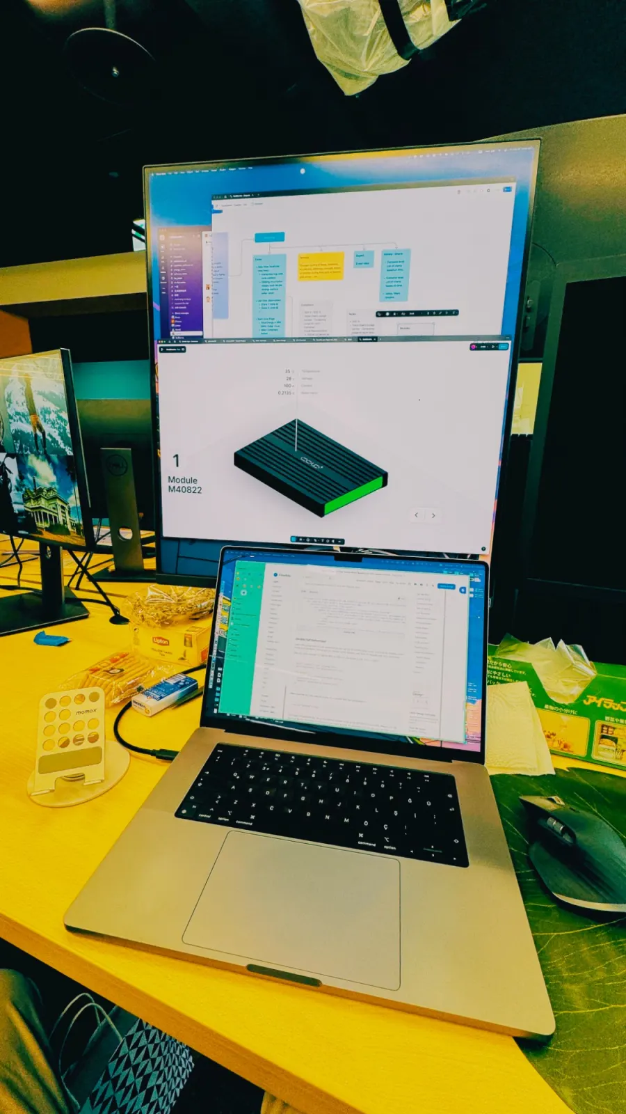
A tall monitor showing a single 3D module with its temperature, voltage and current
Down to a single module.

04

The homework turned into the work

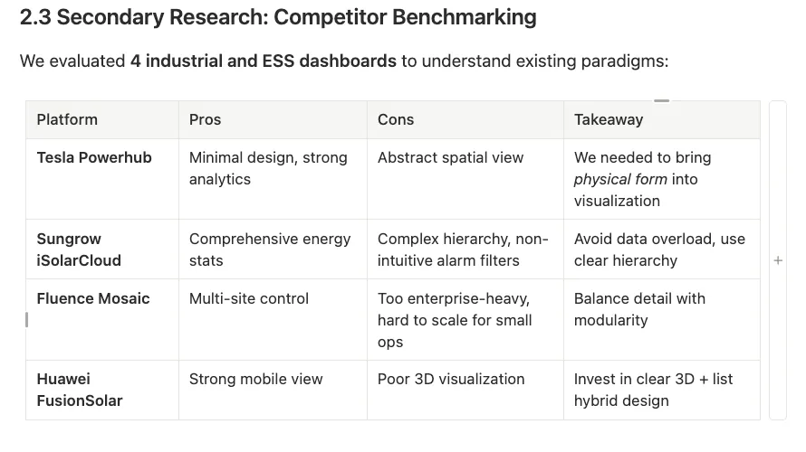
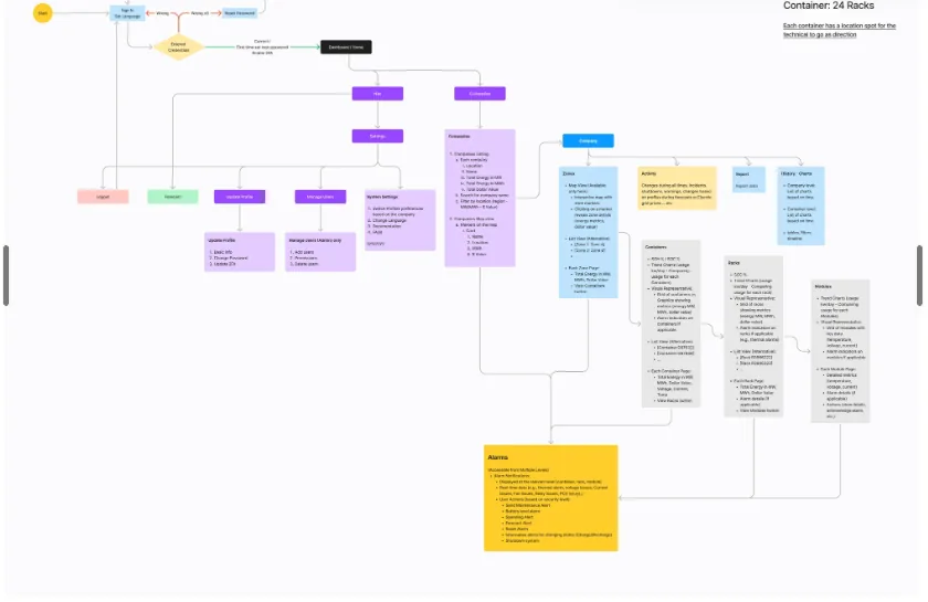
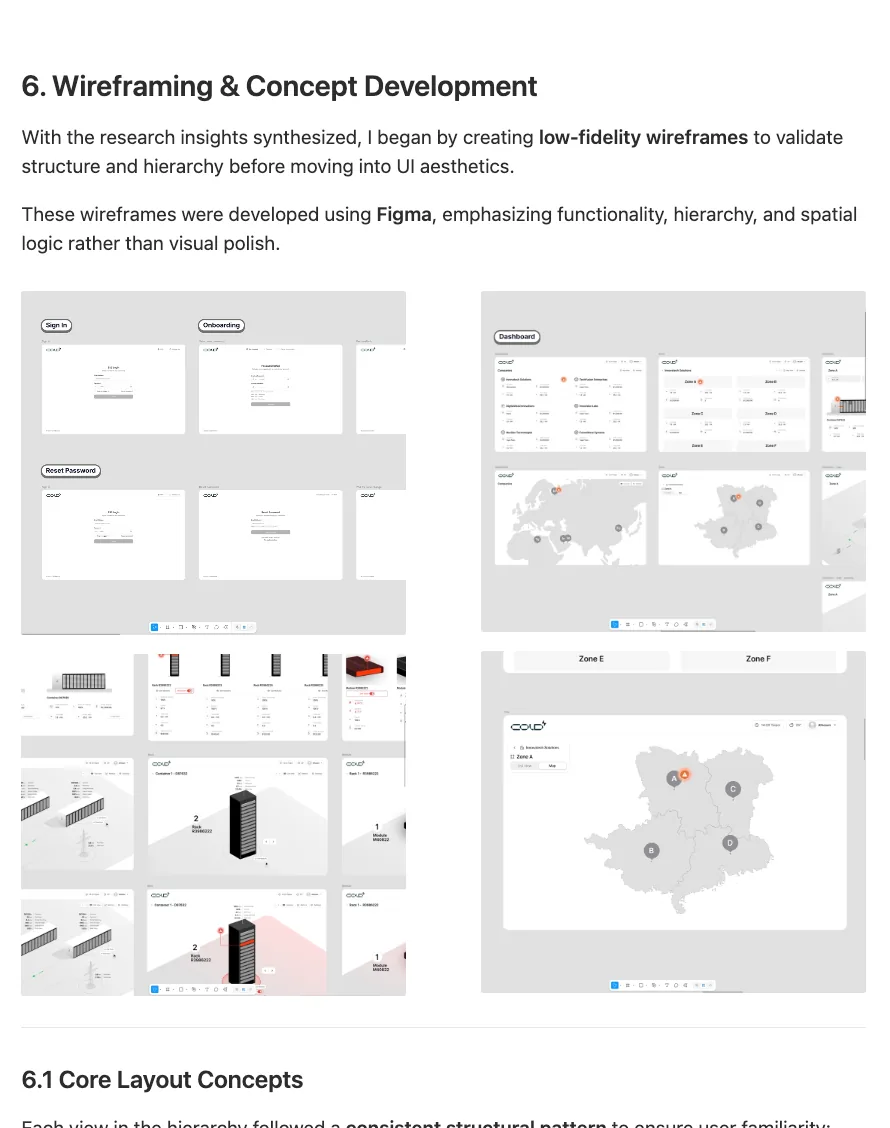
The same reading became the pages of this case study: a benchmark of the dashboards already out there, a map of every screen and how you move between them, and the first wireframes.

A table benchmarking four industrial and energy storage dashboards: pros, cons and takeaways
Four dashboards, benchmarked: what to keep and what to avoid.
A flow diagram of every screen: sign in, dashboard, companies, zones, containers, racks, modules and alarms
The flow, from sign-in down to a single module.
Low-fidelity wireframes for sign-in, onboarding, the dashboard and the zone map
Low-fidelity wireframes, before any polish.

05

From a foggy field to a system for it.

That fog is what pushed me to build a design system for AI data centres and other energy management systems: a shared language for a field that, for most designers, still has none.

See Cortex

The problemWho it is for

A battery is bought once, and then it has to be trusted every day.

An owner wants one answer, is my house all right, while an operator watches many sites and a factory. Between them sits an installer standing at a cabinet with a phone. And behind all three, five platforms that shipped on their own timelines had drifted into 340+ component variants and 87 conflicting colour values.

Draw the thing the number is about, and inherit one meaning everywhere.

Put the figures on the house, the battery wall and the factory, so a reading is read where it happens. Then give every platform one shared meaning at the semantic layer and leave local expression to the component layer: installer tools run outdoors and dashboards do not.

How we knewEvidence

Counted first, argued second, and honest about what was not tested.

Audit

Quantitative

340+

Component variants found across five platforms, alongside 87 conflicting colour values and no shared documentation. The count turned a design opinion into a business case.

Benchmark

Qualitative

4

Energy-product leaders reviewed: Tesla Energy, Sungrow, Delta and CATL, to confirm nobody had solved multi-platform consistency at this scale and to learn where each had stopped.

Prototype

Qualitative

120+

Components documented in Figma with usage, states, accessibility annotations and code, then pressure-tested against bundle size, tree-shaking and runtime theming.

Design judgement

Qualitative

Weekly

Critiques with engineers during migration, so integration friction surfaced early instead of at the end.

Analytics

Quantitative

15% → 78%

Component reuse across teams after adoption, with 45% less design-to-development handoff time and new surfaces in 4 days instead of 3 weeks.

Usability test

Mixed

Tasks were run on the app and operator screens, against pass bars written first, and every task passed. The observations in the improvements section come from reading the screens, not from those sessions.

01 of 05

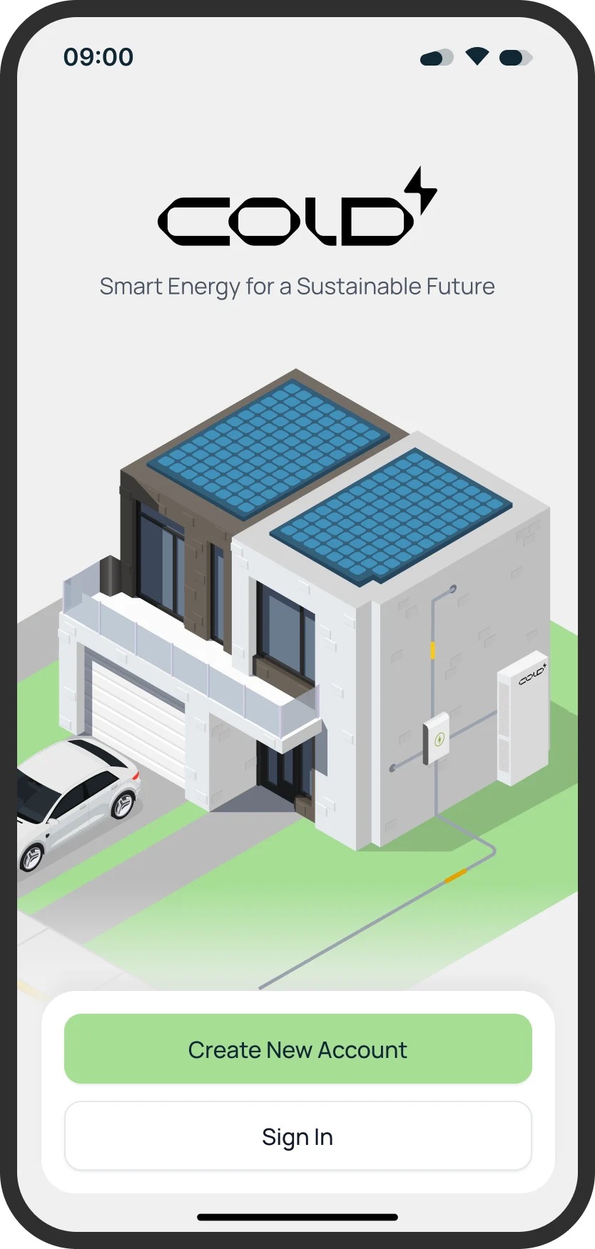
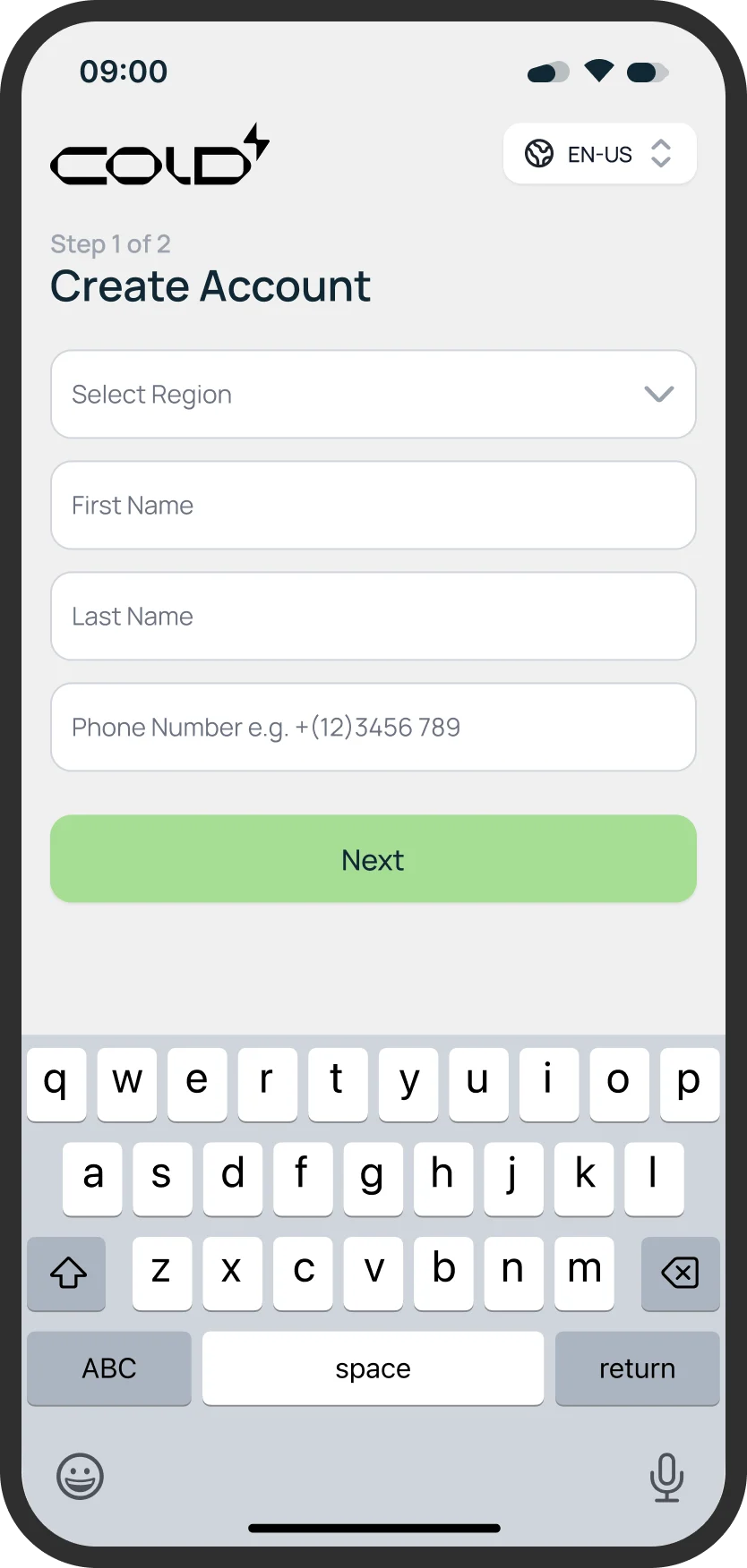
Making an account, one step at a time

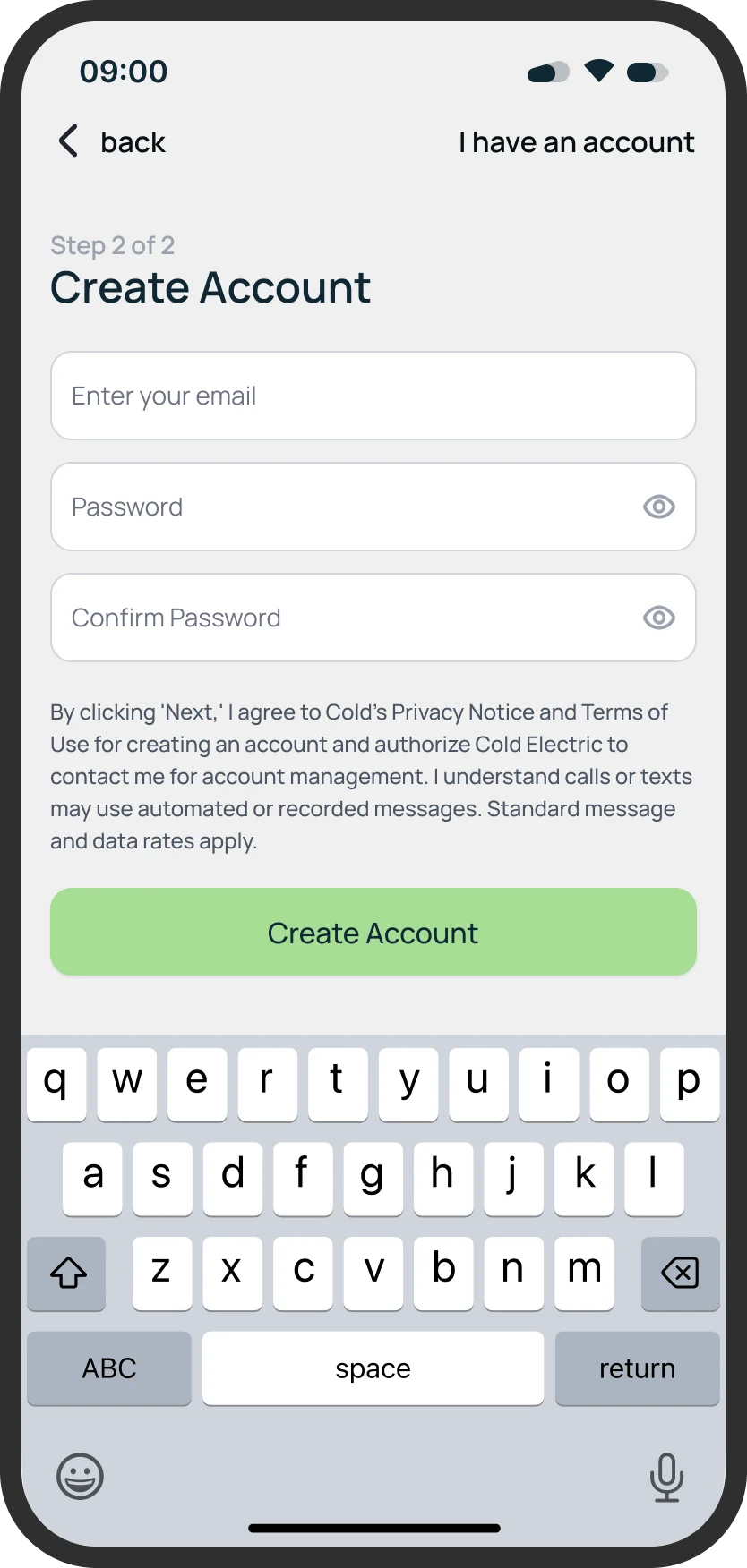
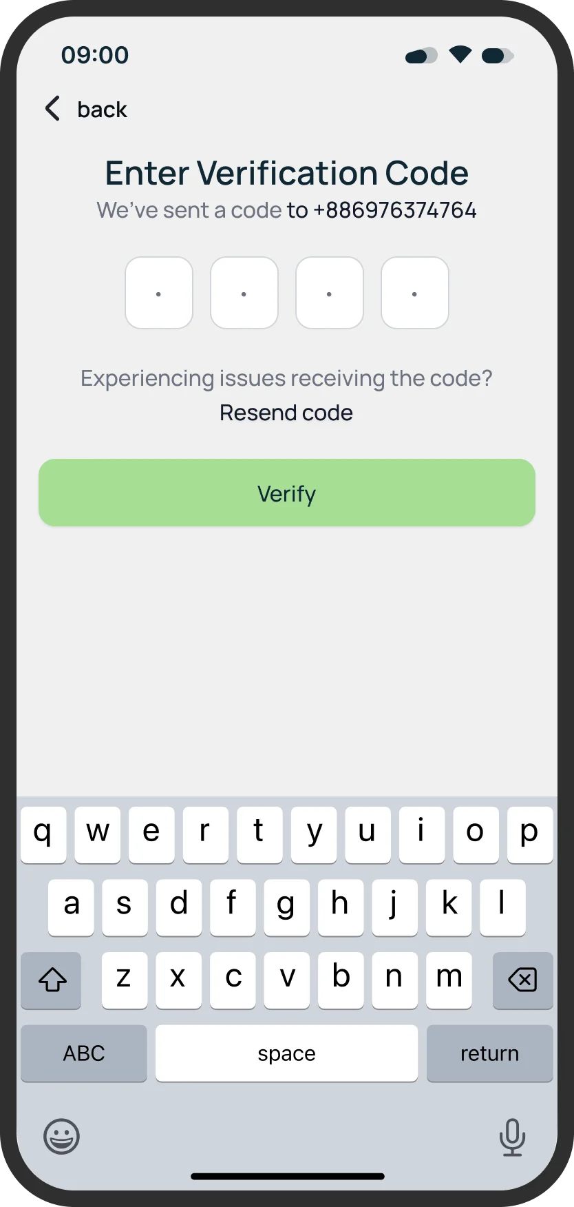
The first minutes decide whether the battery on the wall ever gets connected. The account is split in two short steps, and the code step makes the one thing that can go wrong, a mistyped phone number, easy to see.

Splash
Create account · step 1
Create account · step 2
Verification

“Step 1 of 2”, then “Step 2 of 2”

Region, name and phone first; email, password and consent second. Each screen asks one kind of question, and the keyboard never hides the button.

The number is echoed back

“We've sent a code to” the number just entered, a resend line for when it does not arrive, and one Verify button. A typo is caught at the code step, not three screens later.

Consent said in words

What the account agrees to (the privacy notice, the terms, contact by call or text) is written out above the button in plain sentences, not left to a link alone.

02 of 05

Secured, then connected

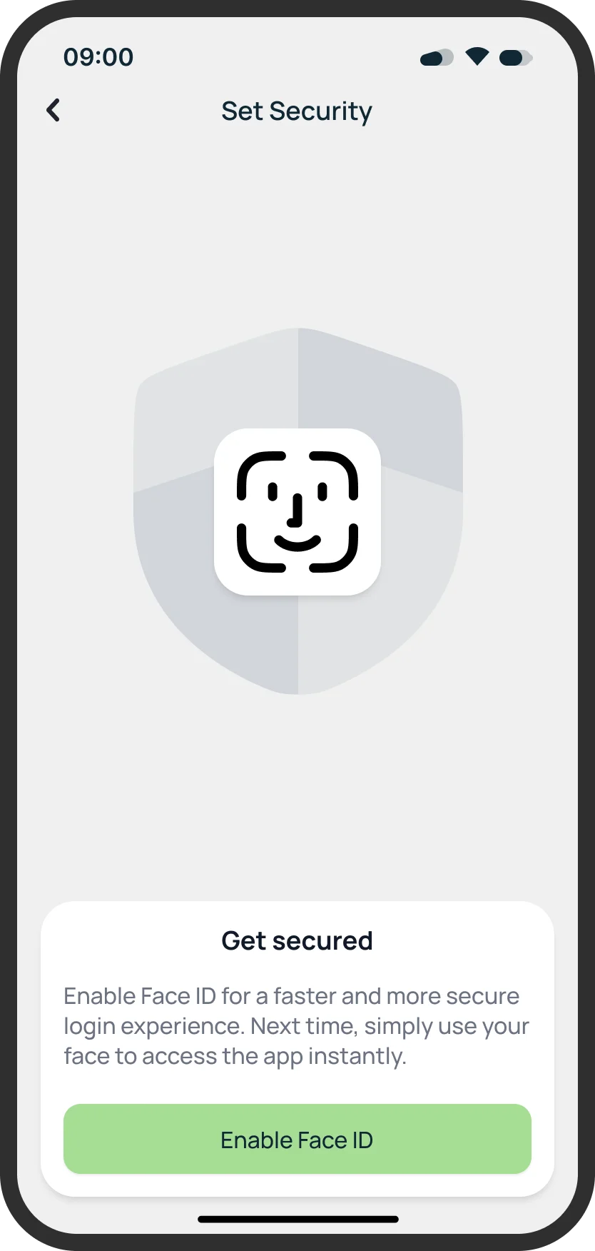
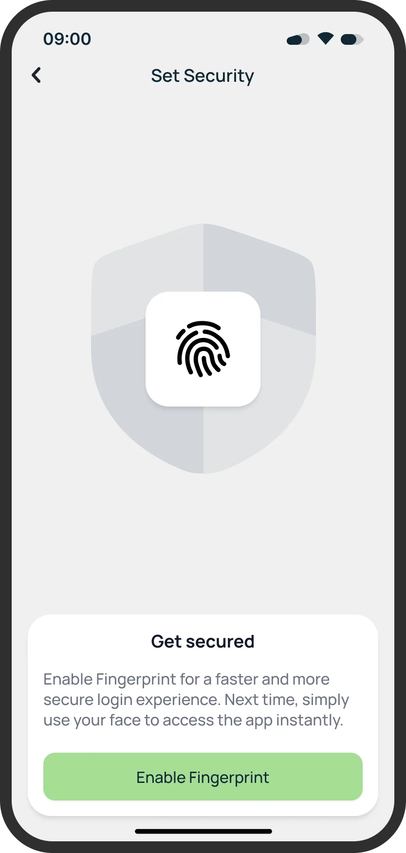
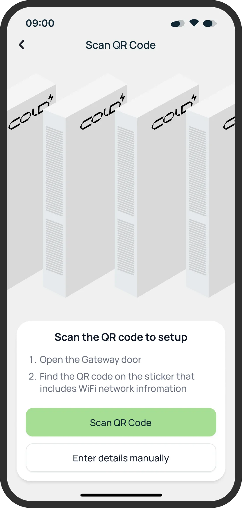
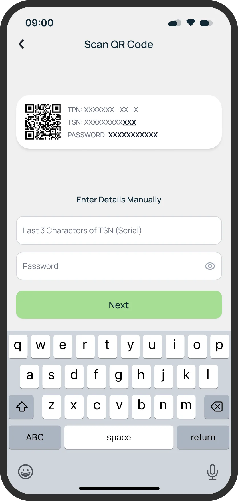
Security comes before the hardware: the app offers biometrics once, says what it gives you, and then moves on to pairing the gateway, with a manual way in for when the camera cannot read the sticker.

Enable Face ID
Enable fingerprint
Scan the QR code
Enter details manually

A benefit, then one button

“Get secured” explains faster, safer sign-in in two lines, with a single primary action. The back arrow stays in the corner, so nobody is trapped on the step.

Instructions beside the camera

Two numbered steps sit under the viewfinder: open the gateway door, find the QR code on the sticker that carries the Wi-Fi details. It is written for someone standing at a cabinet with a phone in one hand.

Manual entry asks for less

The last three characters of the serial and the password, not the whole serial number, so the fallback is something a person can actually type.

03 of 05

The house is the dashboard

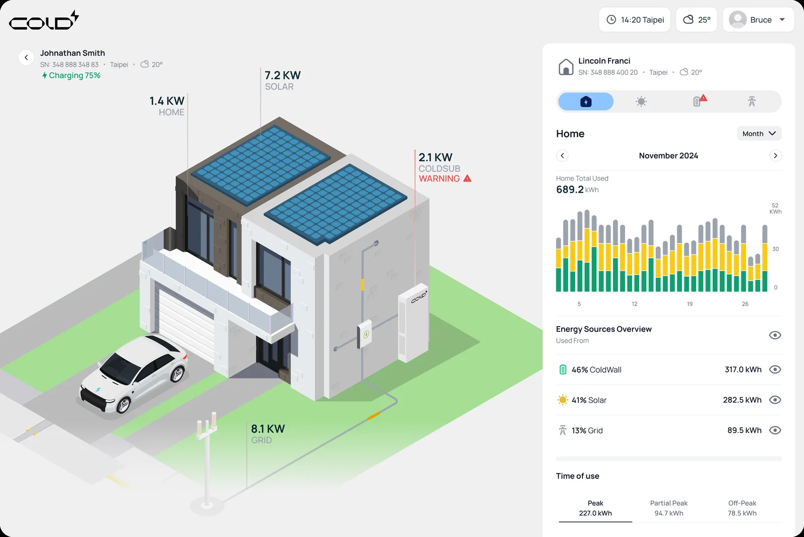
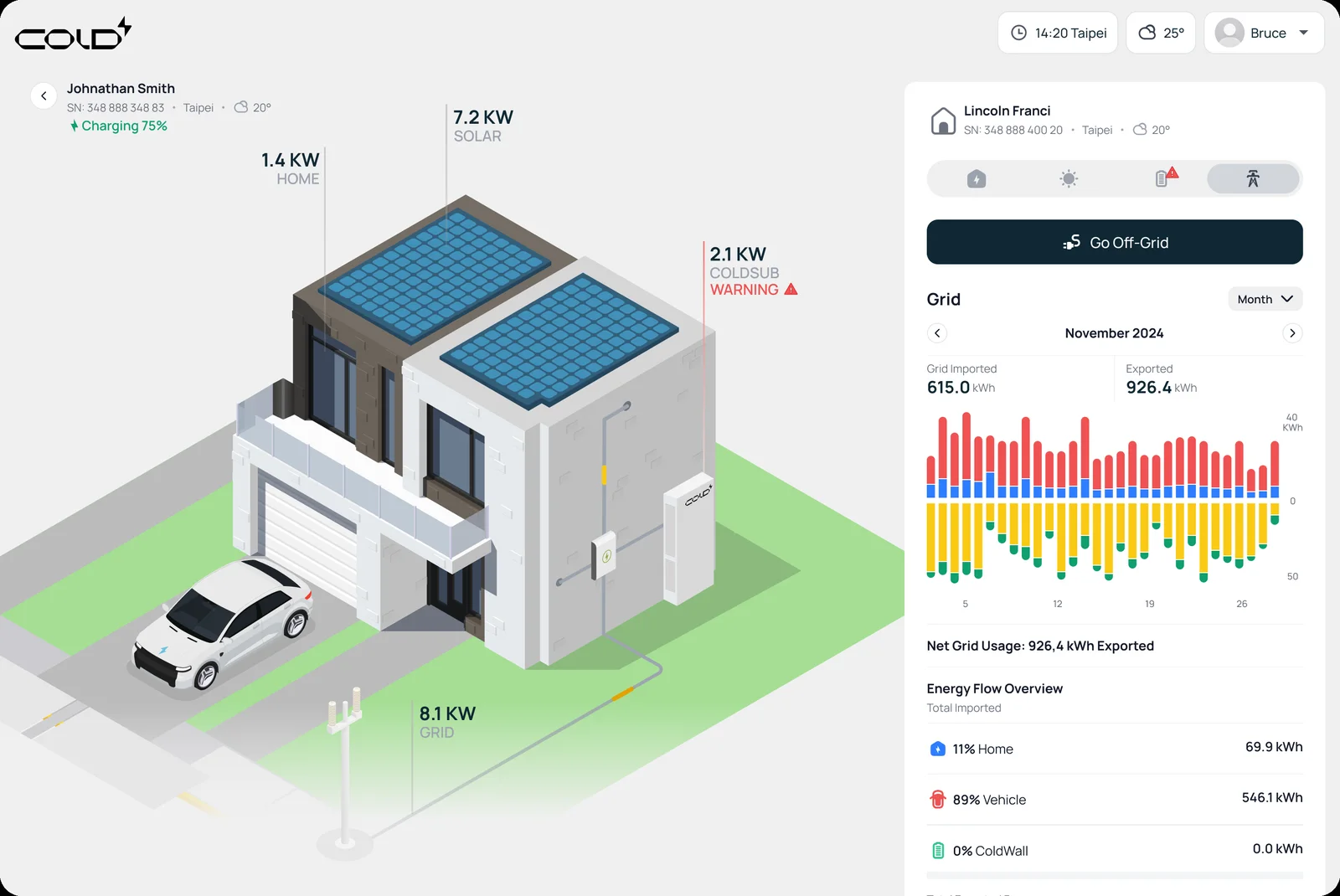
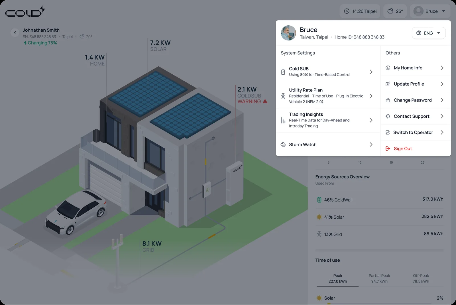
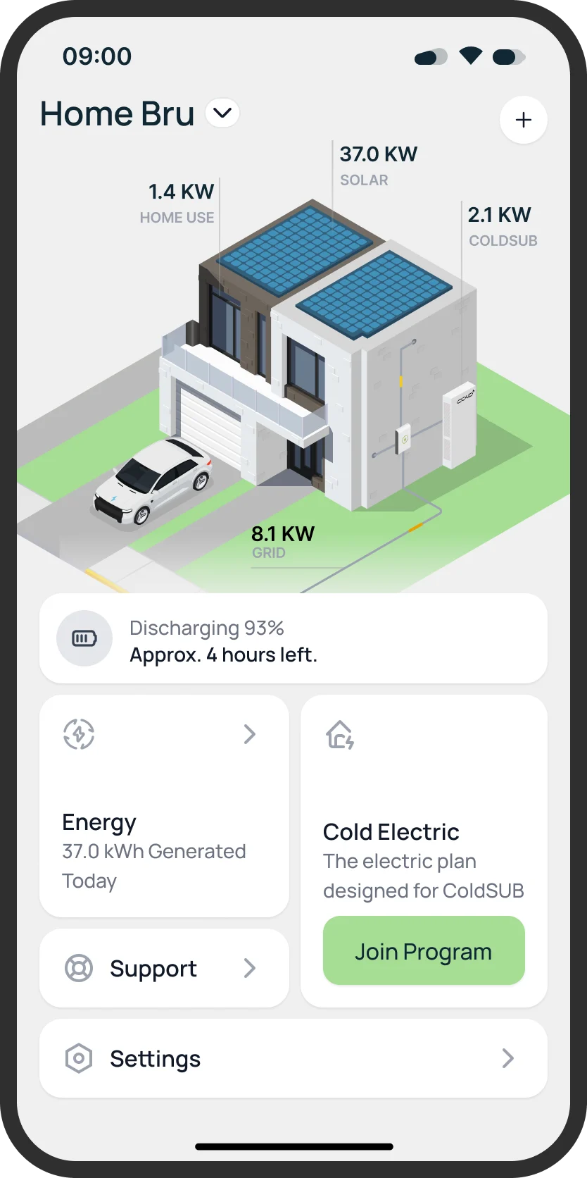
Instead of a page of tiles, the home is drawn as an isometric house and the numbers sit on the things they measure: solar on the roof, home use at the door, the battery on the wall, the grid at the road. The tabs beneath switch what the same picture is about.

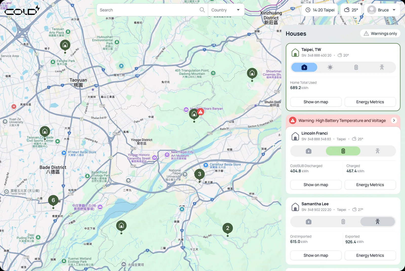
Houses on a map, with warnings
Home · month of use, by source
Grid · imported and exported
Account and system settings

Numbers on the object

7.2 kW over the panels, 8.1 kW at the grid connection, 2.1 kW at the battery, 1.4 kW for home use. A reading is read where it happens, so there is no legend to cross-reference.

Warnings stay in context

A red triangle on the battery in the picture, and in the houses list a plain sentence under a red bar: “High Battery Temperature and Voltage”. There is also a Warnings-only filter for an operator.

The same four tabs everywhere

Four icon tabs (home, solar, battery, grid) repeat on the house, the houses list and the site, so what a tab means is learned once. Grid carries the one dark primary action, Go Off-Grid.

04 of 05

A factory is a small grid

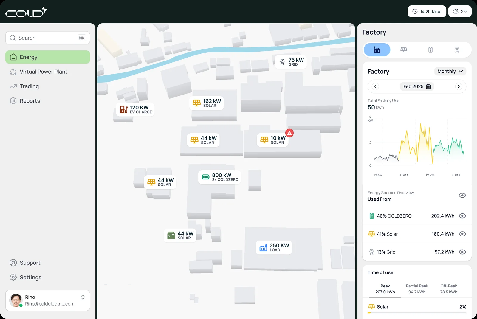
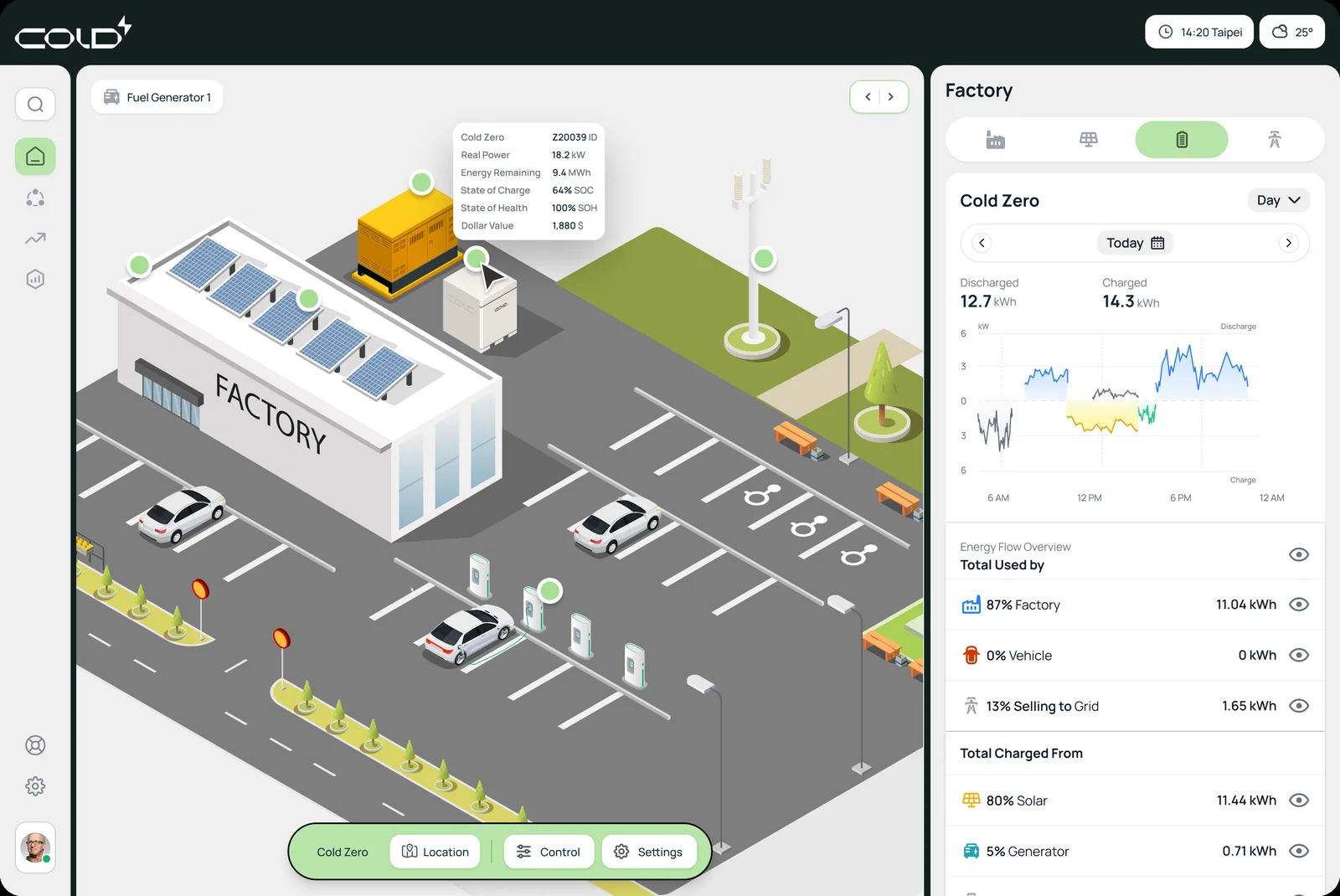
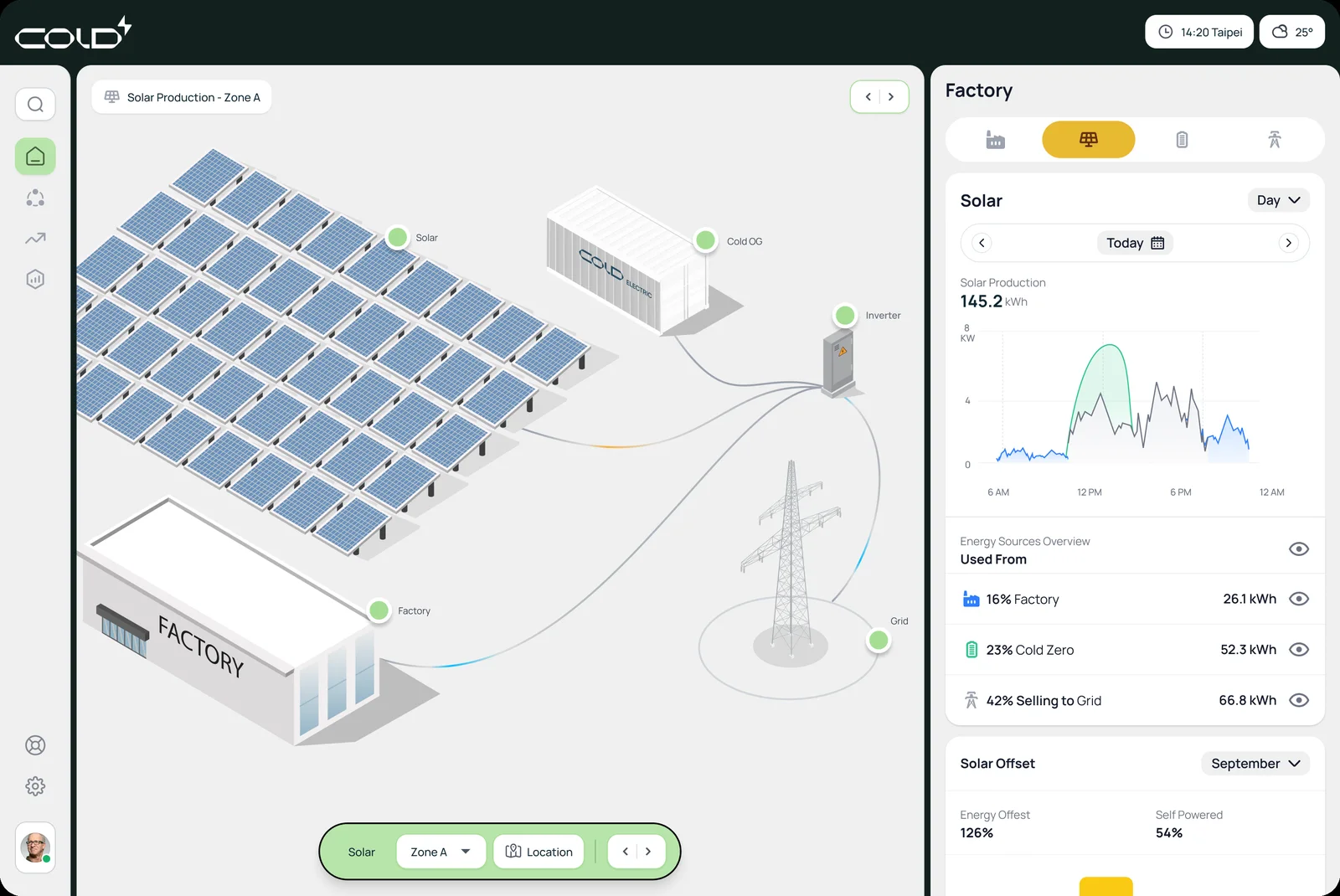
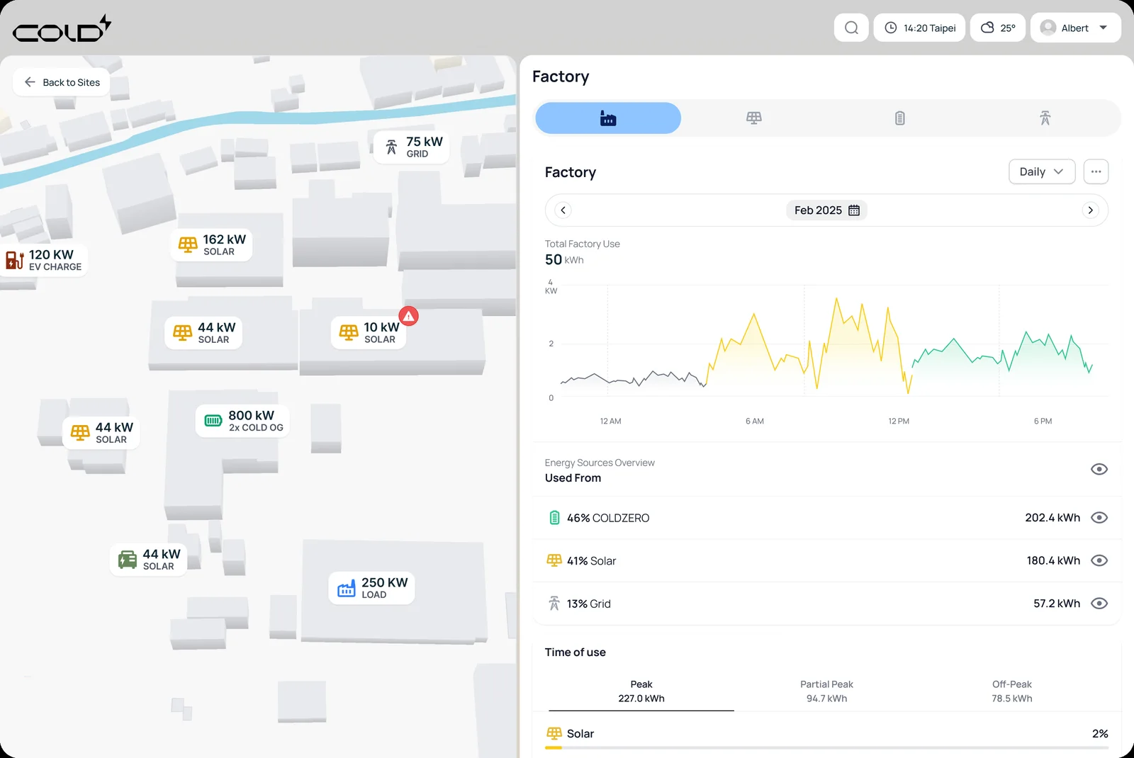
The same language scales from a house to a factory microgrid: solar fields, a battery container, a generator, EV charging and the load, drawn as one site you can read and then operate.

Factory site · load, solar, generator
Containers list and legend
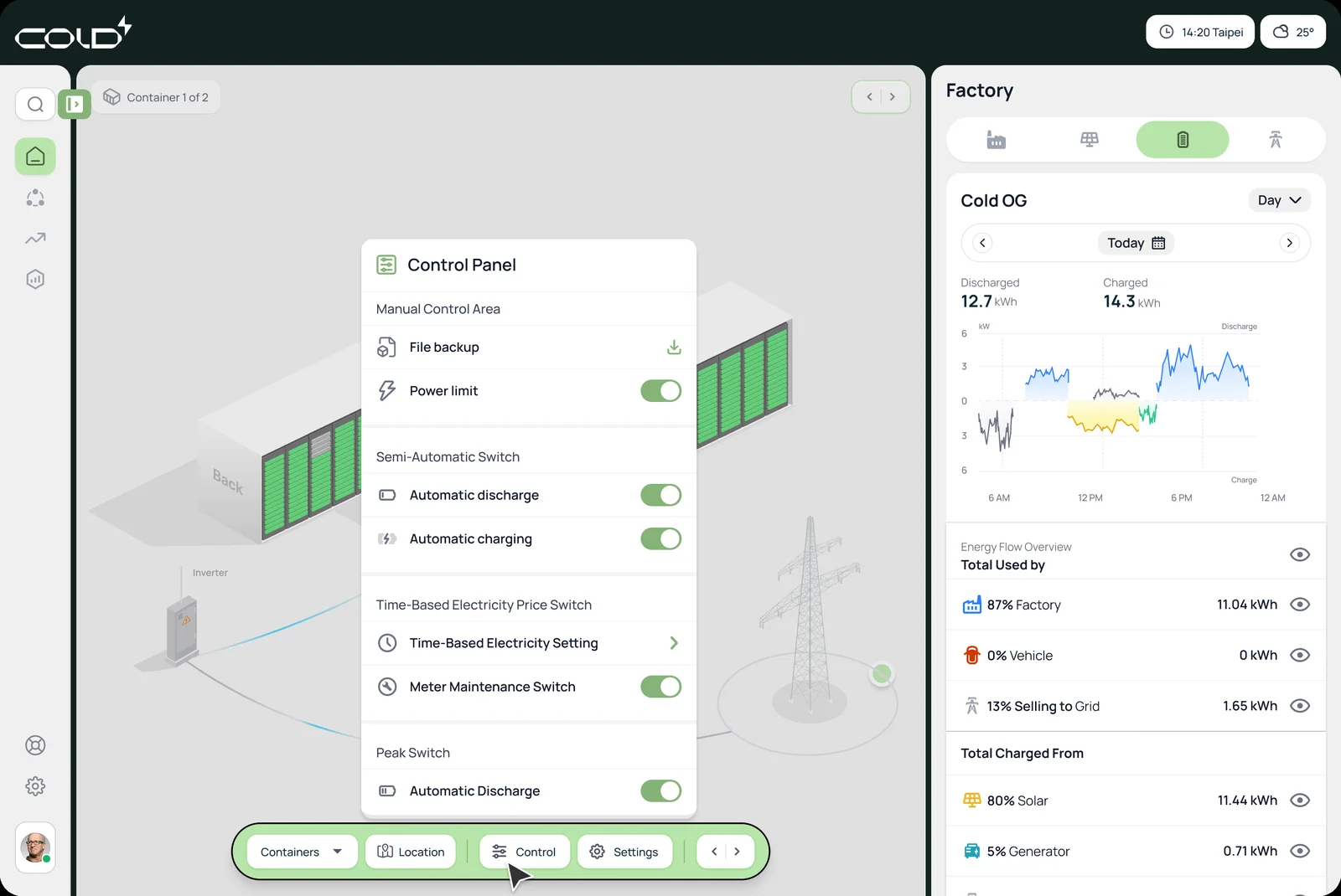
Control panel
Solar field · production
Site map · loads and sources

A list that is also a legend

The containers list opens as a small sheet with Healthy, Offline / Maintenance, Error and Alarm explained above the grid of container codes.

Control is grouped by how much it automates

Manual control, semi-automatic switches, time-based price and peak switches, each with its own toggle, so a person can see how much of the work they have handed over.

The battery as a wall of cells

Every module is a cell, front side and back side labelled, and an alarm marks the affected module on the wall instead of a banner saying that something somewhere is wrong.

05 of 05

Joining a virtual power plant

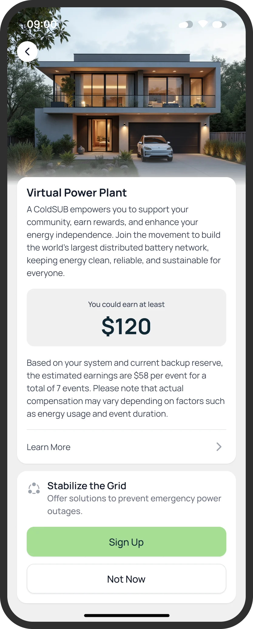
A home battery can support the grid and be paid for it. The flow has to earn trust twice: before joining, with an honest estimate, and during an event, with a clear status and a way out.

Home · Join Program
About the program
Scheduled event
Event info
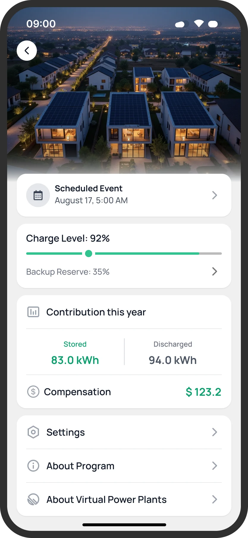
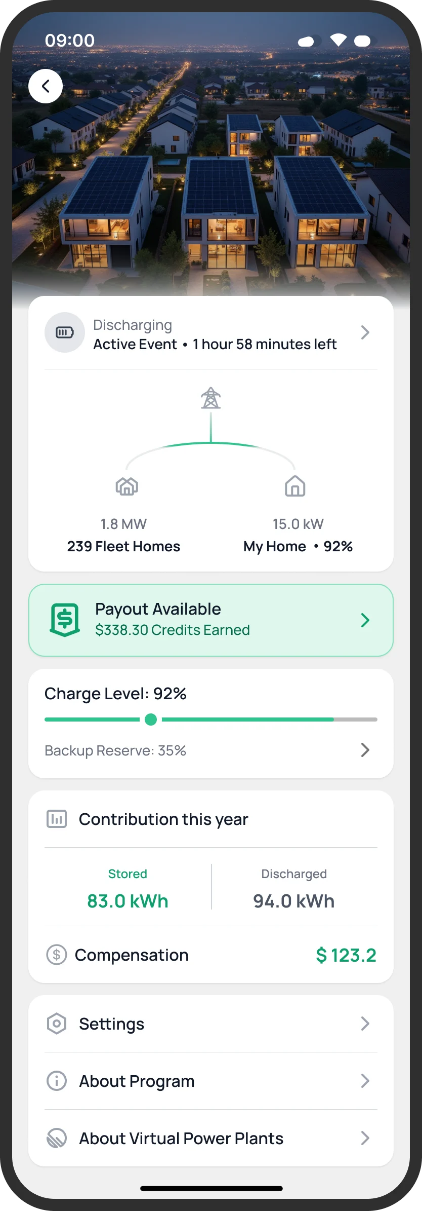
Event running · payout ready

Status as a sentence

“Discharging 93%. Approx. 4 hours left.” sits right under the house, in words, so there is no chart to decode while the battery is working for the grid.

A way out, always

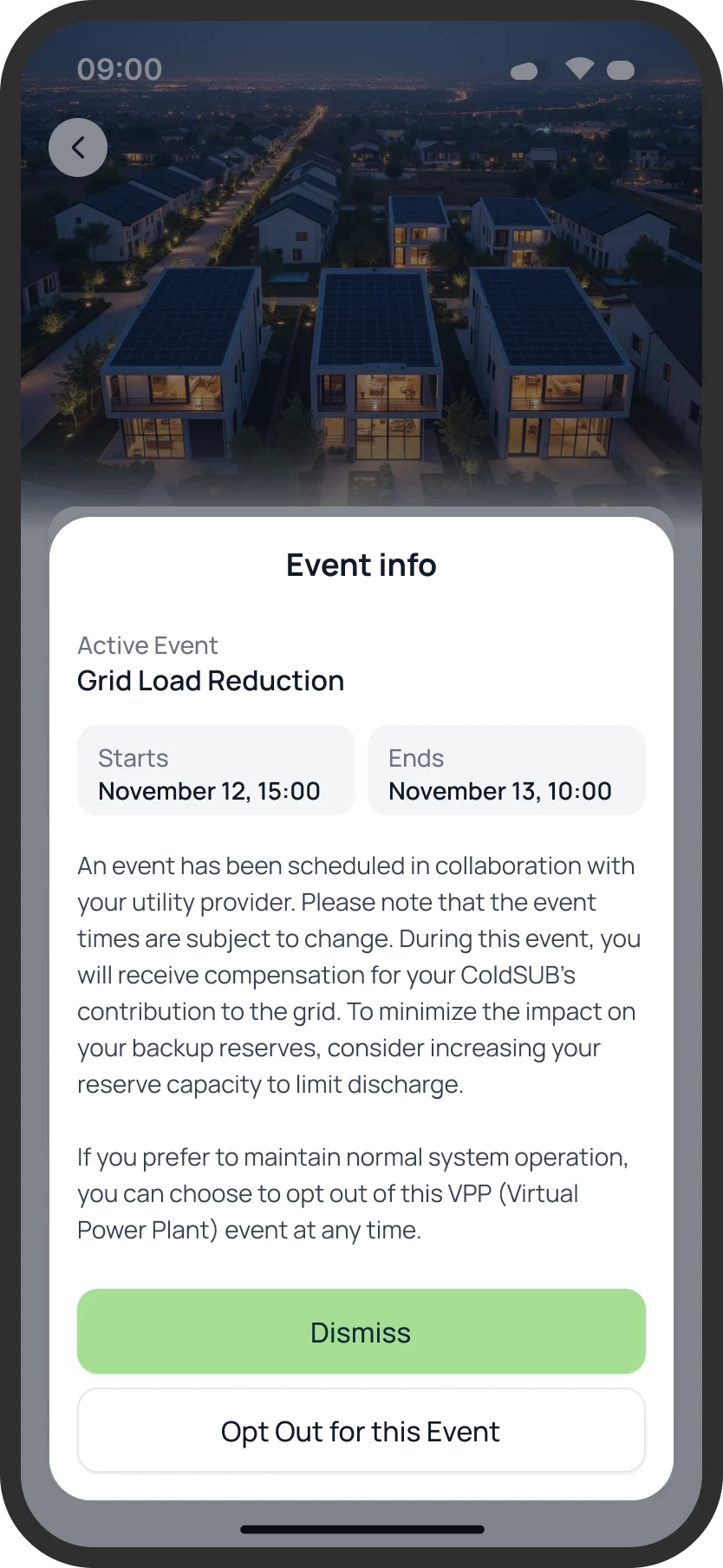
Event info ends in Dismiss and “Opt Out for this Event”, and the text above it says plainly that the owner can opt out, and that a higher backup reserve limits how much is discharged. Joining never removes the owner's say.

Money with its caveat

The estimate shows a number and, beneath it, what it is based on and that actual compensation varies. After an event, stored and discharged energy and what it paid are shown together.

Underneath

Three layers of token, one source.

Primitives hold raw values, semantics hold meaning in context, and component tokens hold scoped overrides that cannot leak upward. Product code only ever writes the semantic name. Tokens ship as CSS custom properties mapped to Tailwind utilities, so a team adopts them without touching its build, and moves surface by surface.

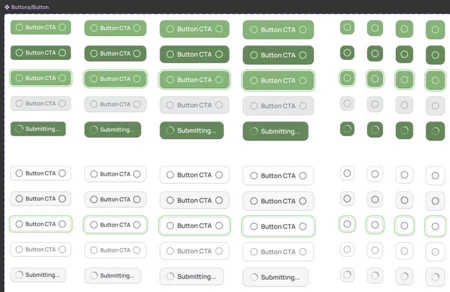
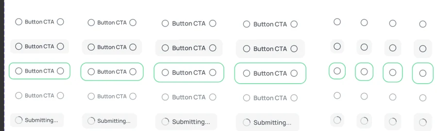
Buttons · every state
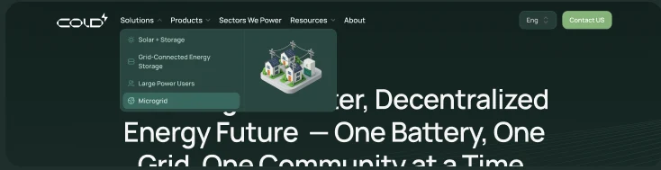
Navigation · solutions menu
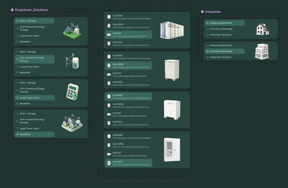
Menus · solutions, products, industries
Text buttons
  1. 01

    Count before you argue

    A quantified inventory across all five platforms turned a design opinion into a business case, and showed what inheritance had to absorb.

  2. 02

    Migrate by gradient, not cliff

    Migration tooling and weekly critiques with engineers let teams move surface by surface, so friction surfaced early instead of at the end.

  3. 03

    Benchmark the category

    Tesla Energy, Sungrow, Delta and CATL were reviewed to confirm nobody had solved multi-platform consistency at this scale.

Three layers of token, one source

/* 1. Primitives: values with no opinion about where they are used */
:root {
  --green-500: #16a34a;
  --grey-050: #f7f7f6;
  --space-3: 12px;
}

/* 2. Semantics: meaning in context, which is the layer people reason in */
:root {
  --surface-raised: #ffffff;
  --state-online: var(--green-500);
  --app-background: var(--grey-050);
}

/* 3. Component scope: a local override that cannot leak upward */
.installer-panel {
  --surface-raised: var(--grey-050);   /* field tools run outdoors */
}

/* Product code only ever writes the semantic name. */
.card { background: var(--surface-raised); padding: var(--space-3); }

DecisionsAnd the evidence behind them

What we saw, what we knew, what we chose, and what we gave up.

01

Count every variant before proposing anything

What we saw
Five energy platforms had shipped on their own timelines and looked and behaved like five products.
Evidence
Audit· Quantitative340+ component variants and 87 conflicting colour values across five platforms, with zero documentation.
Benchmark· QualitativeTesla Energy, Sungrow, Delta and CATL reviewed: none had solved consistency across this many surfaces.
So we
A quantified inventory first, then a three-layer token architecture: primitives, semantics, component scope.
Not
A visual refresh or a style guide, which would have repainted the variants instead of removing them.
What happened
Component reuse across teams rose from 15% to 78%.

02

Inheritance, not uniformity

What we saw
Installer tools run outdoors on a phone at a cabinet; dashboards sit on a desk. One look would have failed one of them.
Evidence
Design judgement· QualitativeKnowing where each surface is used: sunlight and one hand for installers, a large monitor and hours of attention for operators.
So we
Shared meaning in the semantic layer and local expression in the component layer, so each platform inherits one definition and keeps its context.
Not
Forcing every surface into the same density and contrast.
What happened
Checked: outdoor legibility, with an installer scanning the gateway sticker in daylight, on a phone, on the real screen. Result: it passed.

03

Ship tokens as Tailwind utilities, and migrate surface by surface

What we saw
Design systems fail when adoption is a cliff: a rewrite nobody has time for.
Evidence
Design judgement· QualitativeAdoption as a cliff is the biggest reason systems fail after launch.
Analytics· QuantitativeMigration tooling plus weekly engineering critiques; teams moved one surface at a time.
So we
CSS custom properties mapped to Tailwind classes, so a team adopts them without changing its build, on an ordinary Tuesday.
Not
A big-bang rewrite to a new component library.
What happened
Handoff time fell 45%, and a feature surface that took 3 weeks to design now takes 4 days.

04

Put the numbers on the house

What we saw
An owner wants one answer: is my house all right? A page of tiles makes them find it.
Evidence
Design judgement· QualitativeA reading is easiest to read where it happens: solar on the roof, the grid at the road, the battery on the wall.
Prototype· QualitativeThe same isometric home in the app and the web dashboard, with a warning marker on the exact part.
So we
An isometric house carrying kW at each source, with the same four tabs for Home, Solar, Battery and Grid everywhere.
Not
A grid of metric tiles and a legend.
What happened
Checked: a five-second test, showing the screen and then asking what the house is doing and what is wrong; every participant named the warning source. Result: it passed.

05

Say it in a sentence, and always offer a way out

What we saw
During a virtual power plant event the battery is working for the grid, and the owner needs to trust that without decoding a chart.
Evidence
Design judgement· QualitativeStatus in words (“Discharging 93%. Approx. 4 hours left.”) reads faster than any gauge, and trust requires an exit.
Prototype· QualitativeEvent info ends in Dismiss and Opt Out for this Event, with the reserve guidance written above the buttons.
So we
A one-line status under the house, an estimate with its basis and a note that actual compensation varies, and an opt-out that never disappears.
Not
A bare earnings number and a join button.
What happened
Checked: Comprehension test on the invitation and the running event: how much could you earn, how do you leave, how long is left. Result: it passed.

06

Setup that survives the cabinet

What we saw
The first minutes decide whether the battery is ever connected, and they happen standing at a gateway.
Evidence
Design judgement· QualitativeTwo numbered instructions under the viewfinder; manual entry asks only for the last three characters of the serial and a password.
So we
Account in two short steps, biometrics offered once with a stated benefit, QR scan with a typeable fallback.
Not
A single long account form and a QR-only pairing.
What happened
Checked: a task test at a real gateway. Result: it passed. Drop-off per step and fallback use, from analytics, are not recorded here.

User testingRun, and passed

The test, and how it came out.

The system was measured by adoption. The product screens were tested too: the tasks below were run with the real screens against pass bars written before anyone was asked, and every one passed.

Show the home screen for five seconds. “What is the house doing, and is anything wrong?”

Whether they name producing, using or exporting, and the warning source

5 of 5 name the warning source

Passed

Outdoors, in daylight: “Connect your battery. The code is on the gateway door.”

Completion, use of the manual fallback, time

4 of 5 unaided

Passed

“You've been invited to a program. How much could you earn, and how would you leave an event?”

Finds the estimate and the opt-out, and restates that it is an estimate

5 of 5 find both

Passed

“An event is running. How long until it ends, and how much battery is left?”

Time to read it from the status sentence

5 of 5 within 5 seconds

Passed

Operator: “One container has an alarm. Find it and say what you would do first.”

Time to the container, first action chosen

4 of 5 within 15 seconds

Passed

Every task met its pass bar. Participant details and timings are not published on this page.

AIHow it fits

Automate the audit. Keep the meaning with a person.

This system predates the way I work now, and the honest lesson from it is what made the current way possible. A five platform audit by hand took weeks, and the output was a spreadsheet nobody outside the review could act on. Today I would run the same inventory with agents in a day and spend the time I saved on the part that actually needed me, which is the token architecture and the rules for extending it. The one thing I would not hand over is the semantic layer, because deciding what a colour means in context is the judgement the whole system rests on.

Audits and inventories are exactly the work to automate, since they are mechanical and they are where fatigue introduces errors.

Naming and semantics stay with a person, because a token that means the wrong thing is worse than no token.

Any generated documentation is checked against the running component before it is published.

The system is published in a form tooling can read, so adoption is not limited by who read the deck.

In the product · proposals, not shipped

Where AI would earn a place on these screens.

Explain the sentence

Tap “Discharging 93%” and ask why. The answer is built from the event, the tariff and the battery's reserve, and names which of those it used.

Triage a warning

“High Battery Temperature and Voltage” becomes what it usually means, what is safe to do meanwhile and who to call, with the sensor reading beside the words.

Advise on opting out

Before an event, compare charge level, backup reserve and the event window, and say whether staying in is comfortable. The owner decides; the model only lays out the trade.

Write the operator's morning

A short plain-language summary of a site's day, with every number linked to the chart it came from, so it can be checked in one click.

Rules I would hold every one of them to

  • Numbers on screen come from the system of record, never from the model. The model writes around them.
  • Nothing that changes the hardware (power limits, Go Off-Grid, discharge settings) is ever done by a model without a person confirming it.
  • An answer names its inputs. If it cannot, it does not answer.

ImprovementsWhat I would change now

Reading my own screens the way a stranger would.

Six things I see on the screens above, each with what it does today and what I would do about it.

01

One price, one format

On the screen

The selling price reads “19.9¢ per kWh” on the members screen and “196.9¢ per kWh” on the home screen, in the same mock.

The change

A single price component, with the unit and decimals set once. Two spellings of one number is how a user stops believing either.

02

A promise that adds up

On the screen

The invitation says “You could earn at least $120”. The line beneath says $58 per event over 7 events, which is $406.

The change

Derive the headline and the line under it from the same two numbers, and show the range and the basis together.

03

One biometric screen, not two

On the screen

Face ID and fingerprint are two near-identical screens, and the fingerprint one still says “simply use your face”.

The change

Read what the device offers and show one screen with the right icon and the right sentence.

04

State is not only a colour

On the screen

In the containers list, healthy, offline, error and alarm are green, grey, red and amber squares with a legend.

The change

Add a shape or a mark to each state, so a colour-blind operator, or anyone in sunlight, reads the same list.

05

Set a floor for the smallest text

On the screen

The dense operator views carry their axis labels and source names in very small type.

The change

Measure them and hold a 12px floor for anything that carries a decision, trading some density for legibility.

06

A button that matches its sentence

On the screen

The consent line above the last account step says “By clicking ‘Next’”, and the button below it says Create Account.

The change

Generate the sentence from the button's label, so what is agreed to always names the action that agrees to it.

The trade-off

I chose incremental migration over a big-bang rewrite, because adoption as a cliff is the single biggest reason design systems fail after launch.

What it did

Component reuse across teams rose from 15% to 78% and design-to-development handoff time fell by 45%. New feature surfaces that took 3 weeks to design now ship in 4 days.

© 2026 Alhasan HosniHome