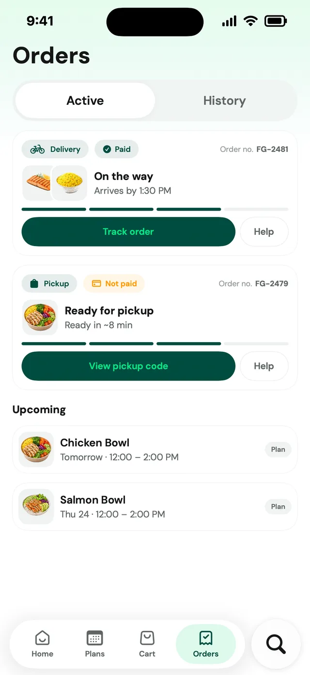
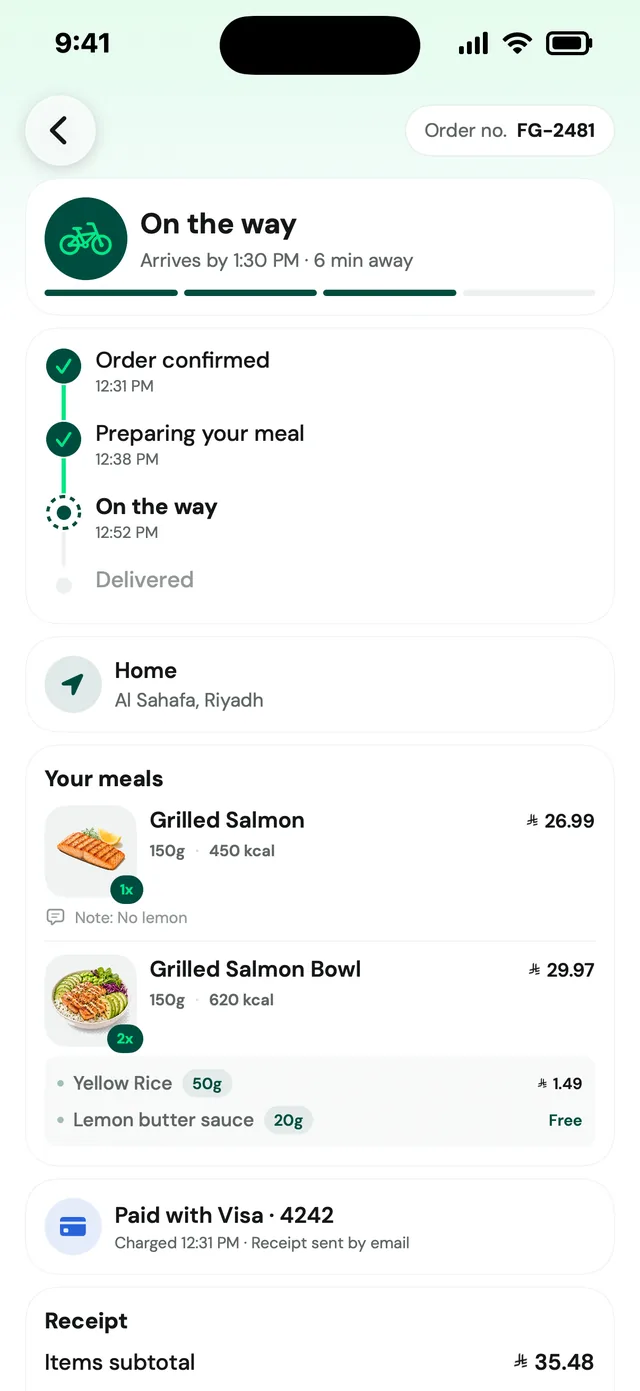
← Work/2026 · Product Designer

FarmGo

A native iOS grocery app in English and Arabic: from the address to the doorstep, with a loyalty programme, live order tracking and a meals extension designed on top.

125+
Screens in the app, 47 of them read flow by flow here
55+
Reusable controls, one design contract
EN + AR
Languages, with full right-to-left support
1,128
Unit tests passing, 24 Feb 2026

Source: the project README, design contract and test reports. No usage or sales figures are recorded in the project files, so none are claimed.

The problemWho it is for

A grocery order is a string of small promises, and each one has to be kept.

Someone buying groceries on a phone wants to know where the order is going, whether the thing is in stock, what delivery costs and when it will arrive. FarmGo sells in riyals, delivers in about 30 minutes or at a chosen time, runs a loyalty programme, and has to work for people who read right to left. The screens are dense because the shopper is deciding quickly; the design problem is keeping every number in them true to every other.

Certainty before decoration: where it goes, what is available, what to do next.

The design contract in the project says every screen should communicate those three things quickly. So address, stock, quantity, free delivery, fee and order status live in the main flow, not behind menus, and the same few components carry them everywhere.

How we knewEvidence

What is recorded, what is not, and how far to trust it.

Benchmark

Qualitative

31 + 6

Careem iOS reference captures kept in the project, and six Mobbin captures (Careem food, Foodpanda and Keeta customisation, Instacart build-a-bowl, a weekly meal plan). Used for the Kitchen extension: hierarchy and scanning rhythm, not copied screens.

Confidence: Medium

Design judgement

Qualitative

47

Of the more than 125 screens in the app, 47 real ones read one by one for this page. The observations below describe only what is visible on them.

Code review

Quantitative

1,128

Unit tests passing at the last recorded full run (24 Feb 2026), with 80.05% app coverage. An April 2026 audit then counted 156 test files and about 3,980 cases and recommended trimming the low-value ones.

Confidence: High

Audit

Quantitative

3

Root causes named in a June 2026 production performance audit: JSON decoding on the main actor, sequential SDK start-up (an estimated 200 to 400 ms before the first frame), and a GeometryReader around every tab.

Confidence: Medium

Analytics

Quantitative

The app is instrumented, and a test suite checks the analytics call sites, but no figures from it are recorded in the project files. Conversion, retention and basket numbers are not claimed here.

Audit

Quantitative

6

Boards in the FarmGo research file: the old app's home, settings, category and search screens, a competitor teardown and the store reviews, all kept in a Figma board titled Discovery & Design Audit.

Benchmark

Qualitative

1

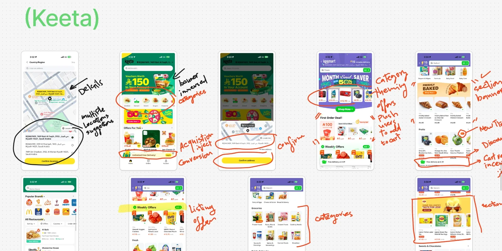
A teardown of Keeta's app, annotated by hand: banner and categories, multiple saved locations, an acquisition push on the first order, offers that push users to add to cart, themed categories, section banners and listing offers.

Survey

Quantitative

1.12K

Play Store reviews on the board for the old app, 2022 to 2025. A sample is quoted below. The themes are what I could read on the board, not a count of all of them.

Interviews

Qualitative

Notes from the client, written on the board: what is wrong with the old home, what the settings page must keep for Saudi rules, and the offer types they want. These are stakeholder requests, not shopper research.

Analytics

Quantitative

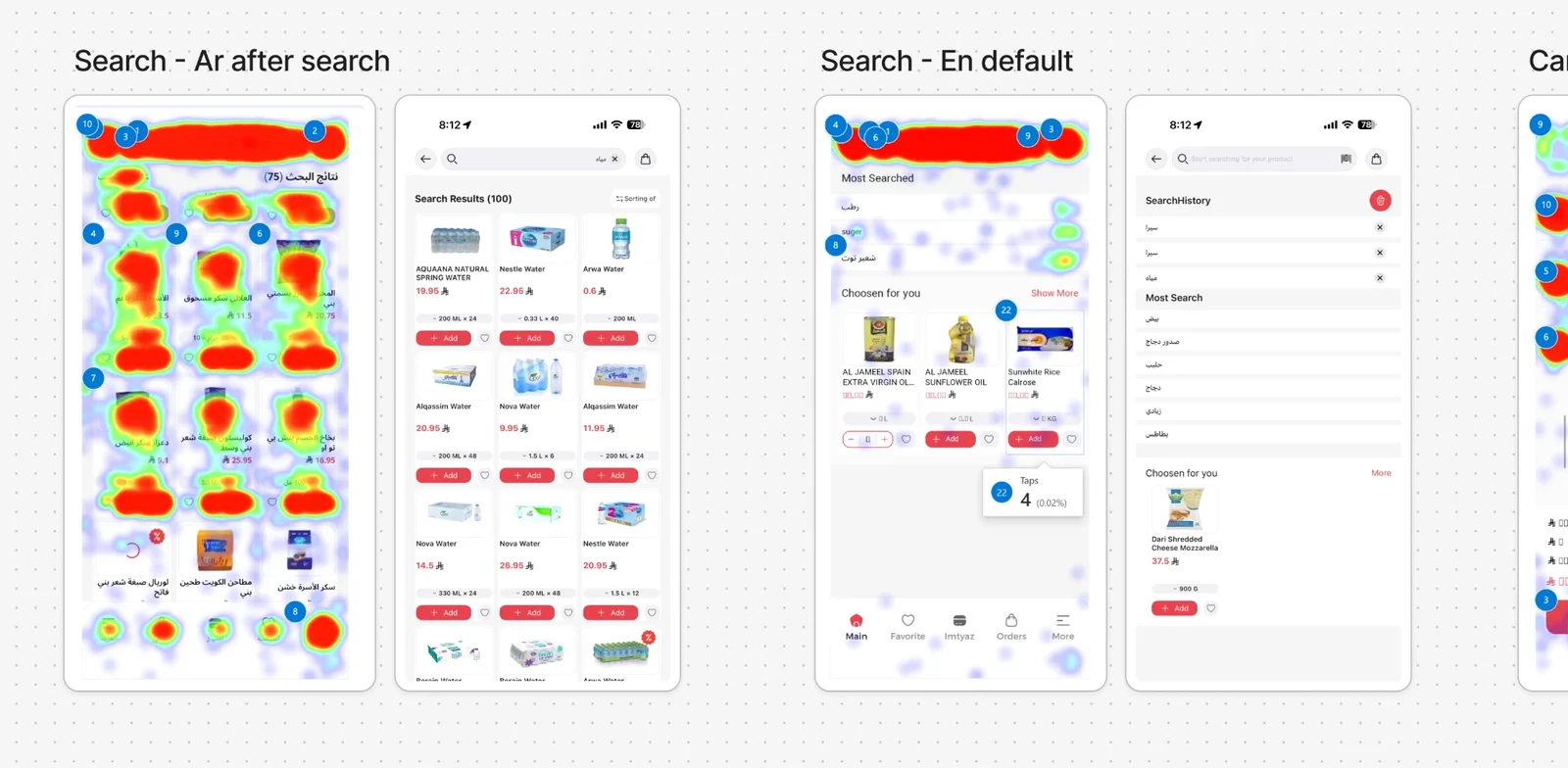
Tap heatmaps on the old search screens, in Arabic and English, in the research file. The totals behind them are not on the board, so no figures are claimed.

Usability test

Mixed

The redesigned screens were tested with tasks written before anyone was asked, and every task passed. Participant details and timings are not published on this page.

01 of 09

Home, booths and favourites

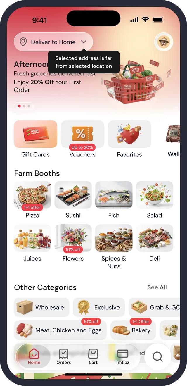
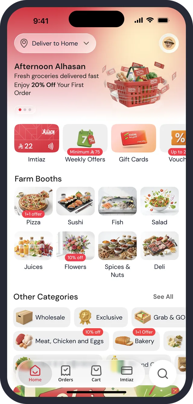
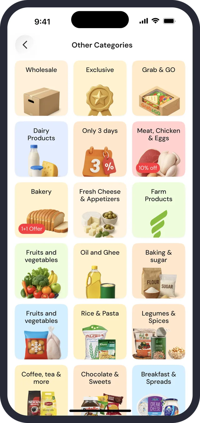
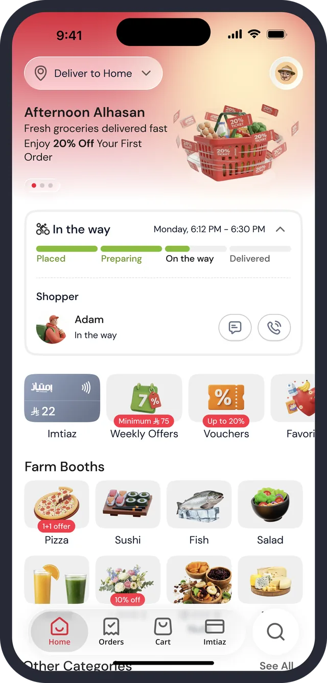
The first screen answers where the order is going before it sells anything: a Deliver to chip, a greeting with the first-order offer, then a shortcut row, eight Farm Booths shown as food photographs, and the remaining categories as a compact list that opens to a grid.

Home · hero and shortcuts
Home · Farm Booths, no address warning
Other categories · See All
Favorites
Favorites · force touch
Home · order on the way
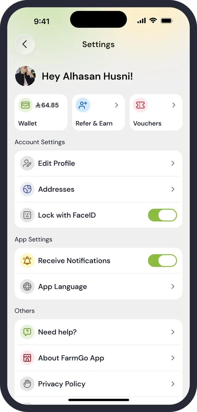
Settings · signed in
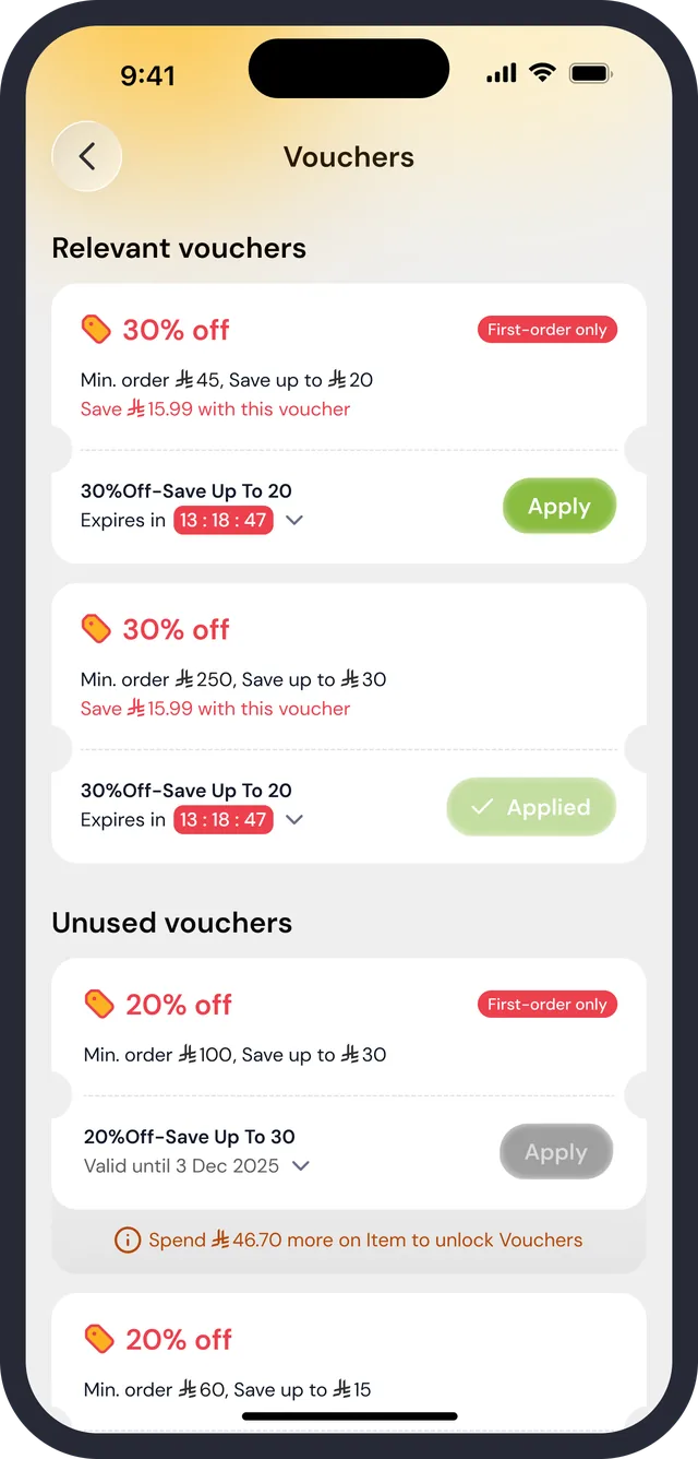
Vouchers

The address comes first

“Deliver to Home” sits top-left above the offer, and a profile avatar top-right. Where the order goes is read before the banner is.

The balance is on the shortcut row

The first tile is Imtiaz with a ₼22 balance, then Weekly Offers, Gift Cards, Vouchers, Favorites and Wallet, so the reward is visible without opening its tab.

Photographs for booths, a list for the rest

Pizza, Sushi, Fish, Salad, Juices, Flowers, Spices & Nuts and Deli carry offer tags (1+1, 10% off). Other Categories stays a chip list, and See All opens a three-column grid of illustrated cards.

02 of 09

Category and item listing

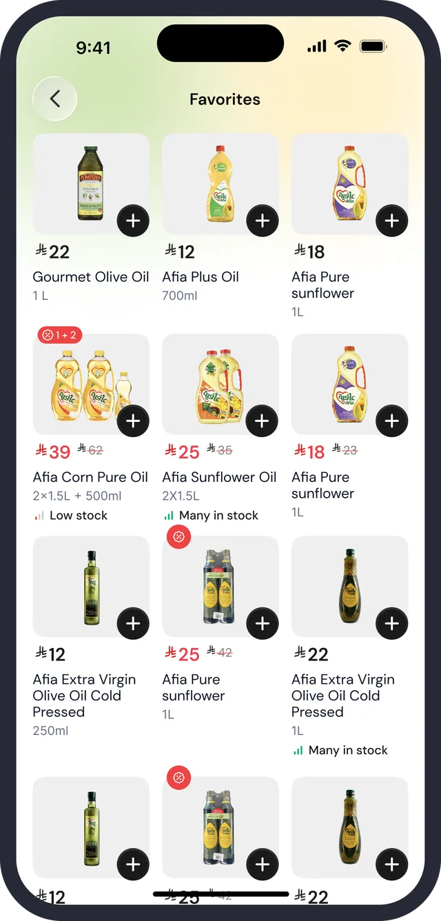
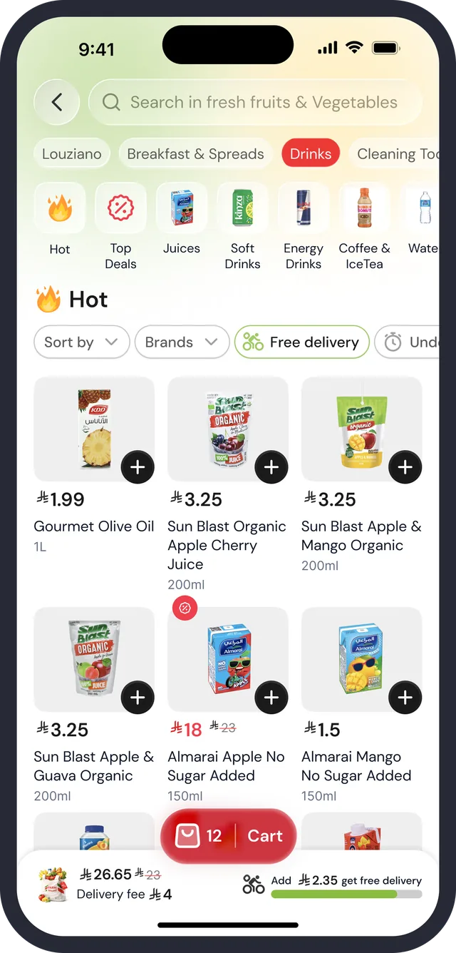
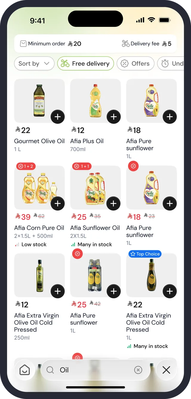
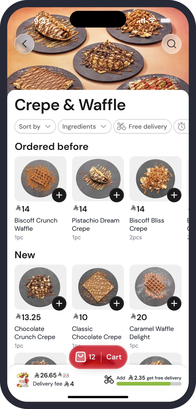
Browsing is a dense three-column grid: price first, name second, size third, with stock and offer badges kept short. Filters sit above it as chips, and the terms of delivery sit above those.

Category · sub-categories and filters
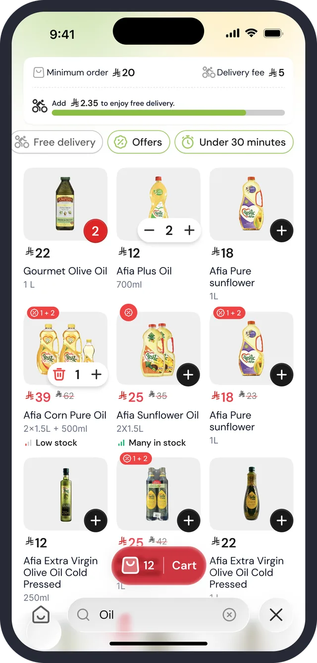
Listing · quantity control states
Listing · filter chips, results for “Oil”
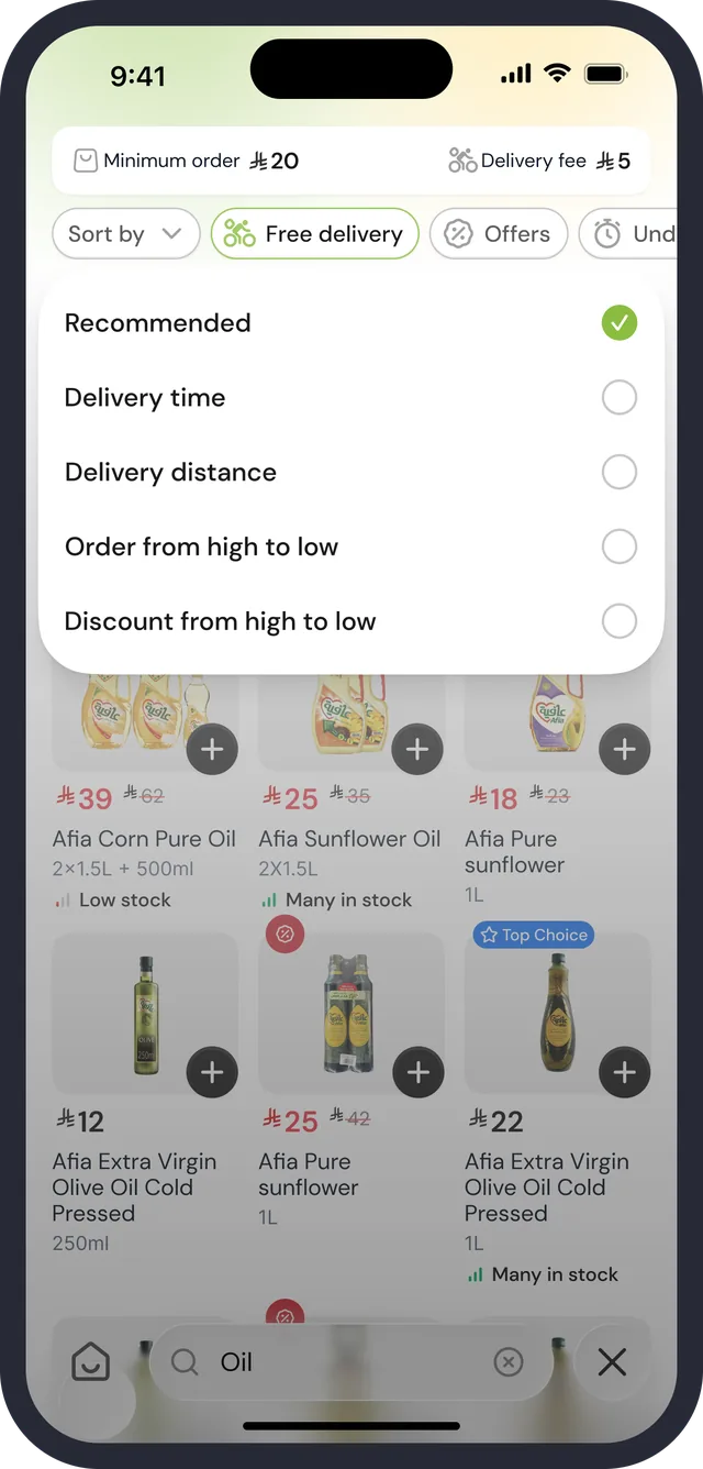
Listing · sort sheet
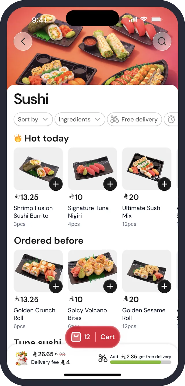
Booth · Sushi
Booth · Crepe & Waffle

Price, name, size, in that order

₼39 with ₼62 struck through, then “Afia Corn Pure Oil”, then “2x1.5L + 500ml”, then Low stock in a small label. Offer tags such as 1+2 sit on the picture.

Delivery terms ride along

Minimum order ₼20 and Delivery fee ₼5 in the header, a progress bar toward free delivery, and on the category screen a total, a delivery fee and the same bar next to the Cart pill.

Booths read as storefronts

Sushi and Crepe & Waffle open on a full-bleed food photo with a white sheet overlapping it, then Hot today or New, and an Ordered before rail for repeat purchases.

03 of 09

Search

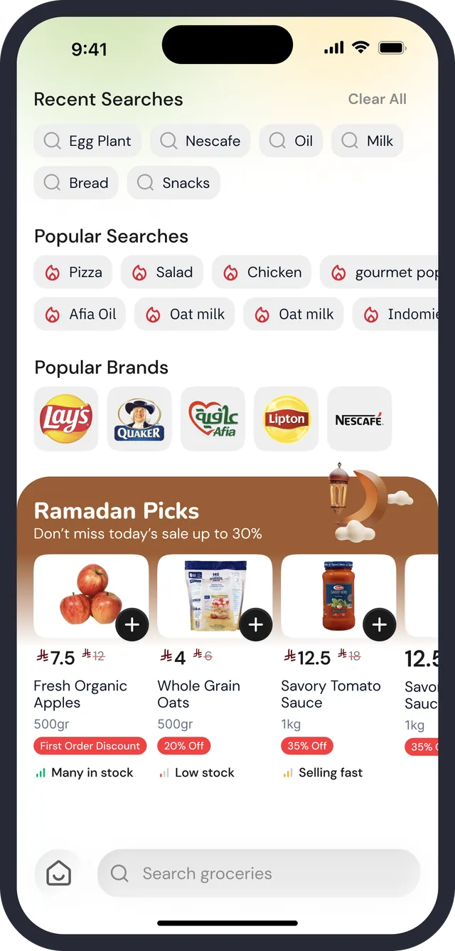
Search is a tab of its own with a field pinned at the bottom, within thumb reach. Before typing it offers three ways to start: what you searched, what others search, and brands.

Search · before typing
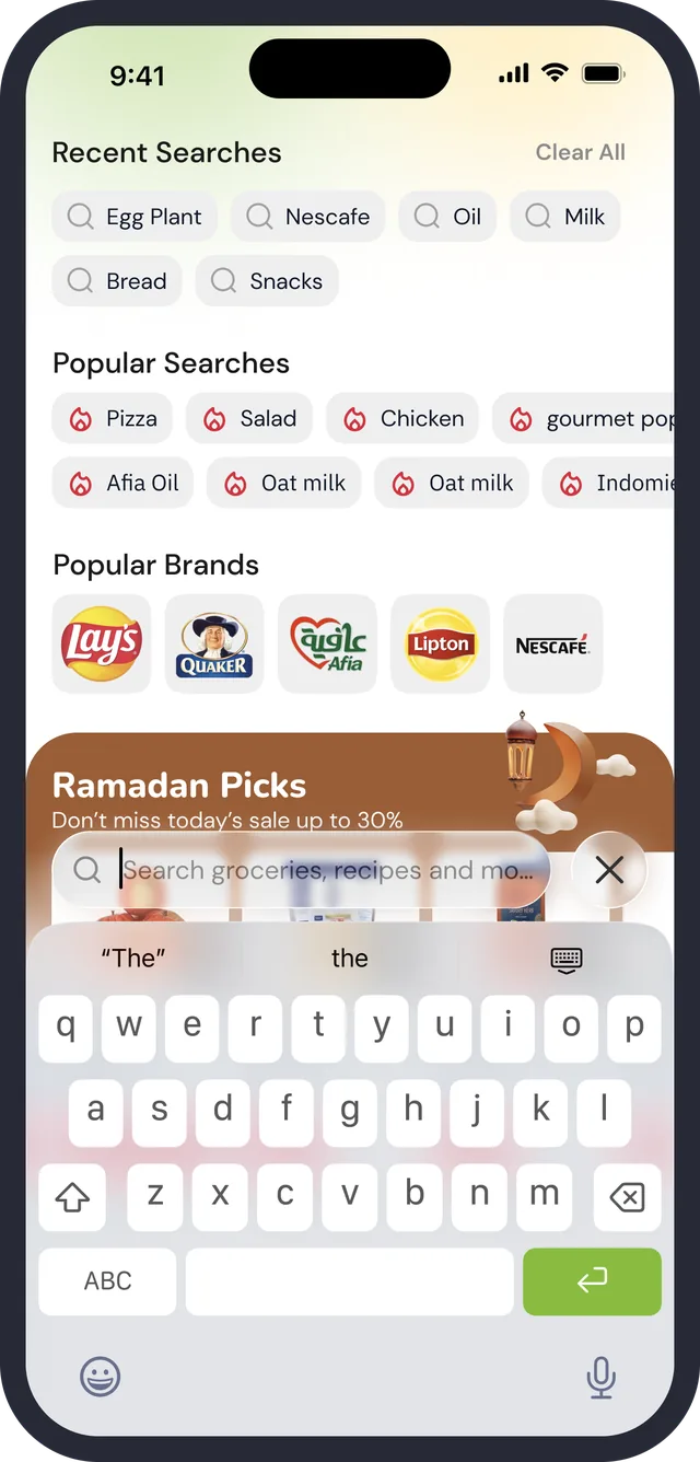
Search · keyboard up
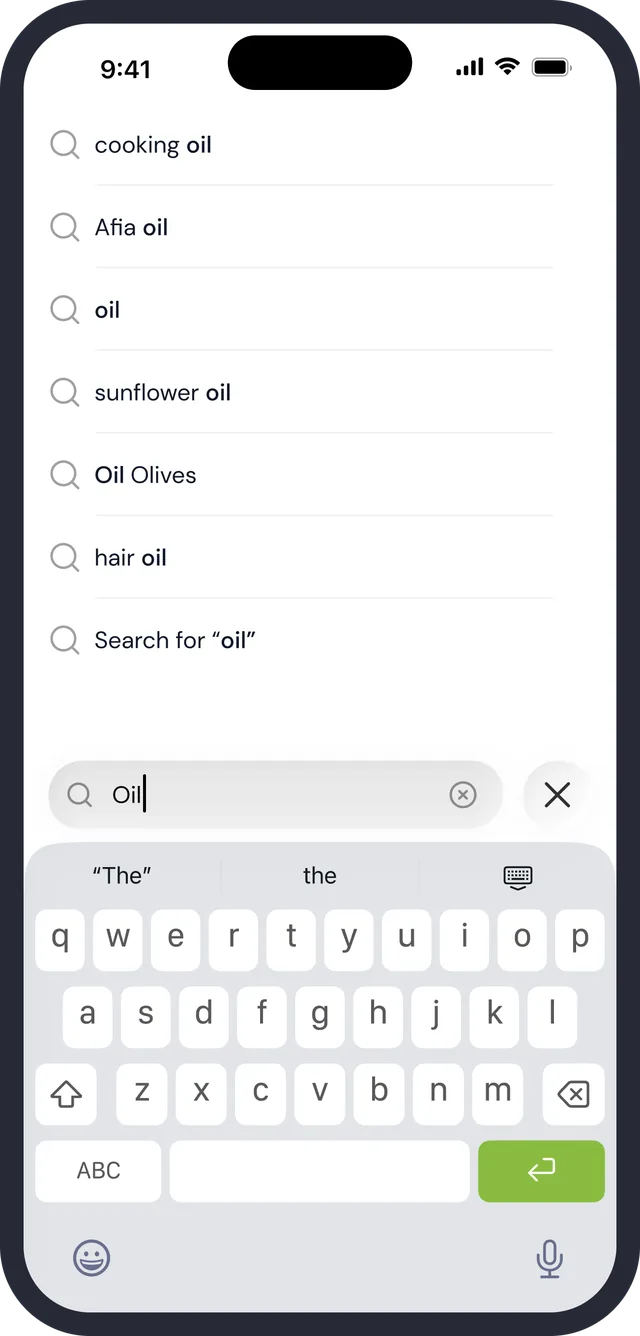
Search · suggestions for “oil”
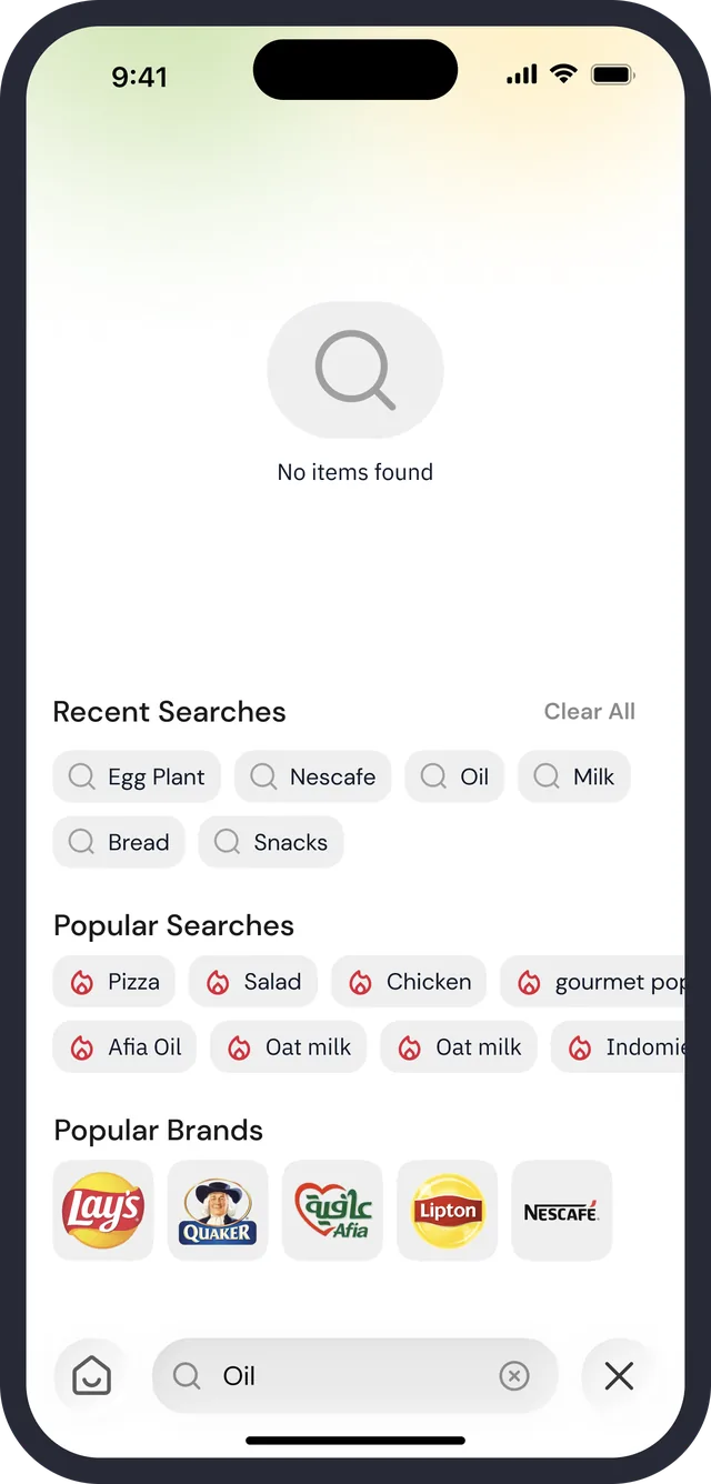
Search · “No items found”
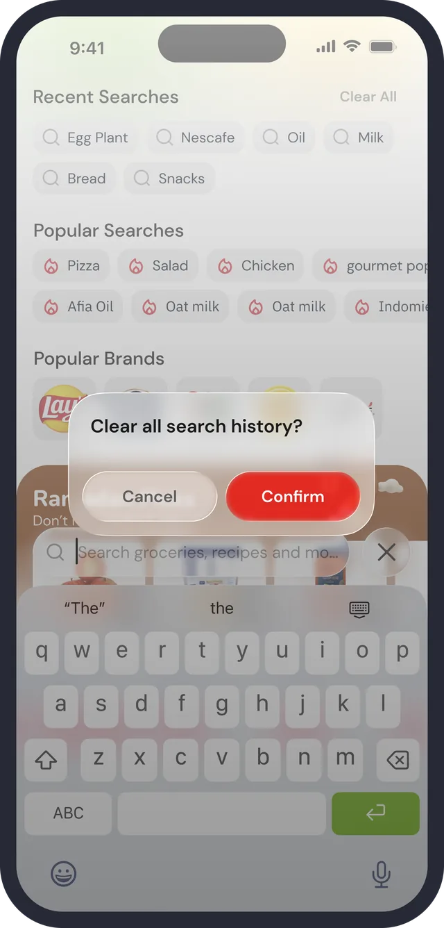
Clear search history
Search · results

Start without typing

Recent Searches with Clear All, Popular Searches with icons, Popular Brands as logos, and a Ramadan Picks rail underneath.

The query sits above the keyboard

A home button on the left, the field, and a close on the right. Typing “oil” gives suggestions ending in a catch-all line: Search for “oil”.

Destructive actions confirm

“Clear all search history?” offers Cancel and a red Confirm over the dimmed screen.

04 of 09

Cart and checkout

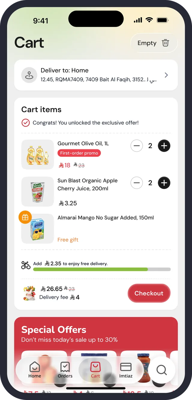
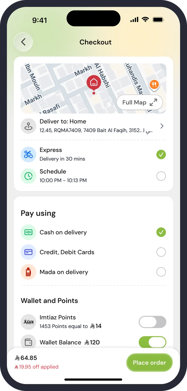
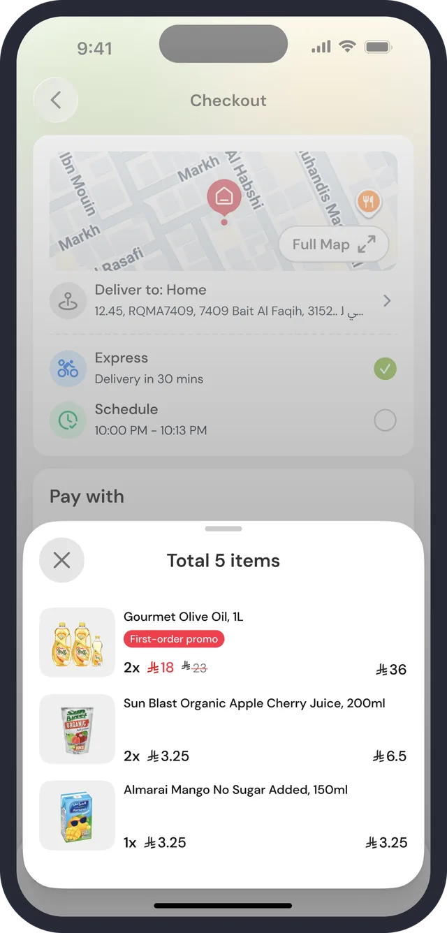
The cart is where the promotion, the free-delivery threshold and the delivery fee all have to agree. Checkout then asks in a fixed order: where, how fast, how to pay, which points or wallet to use, and what it costs.

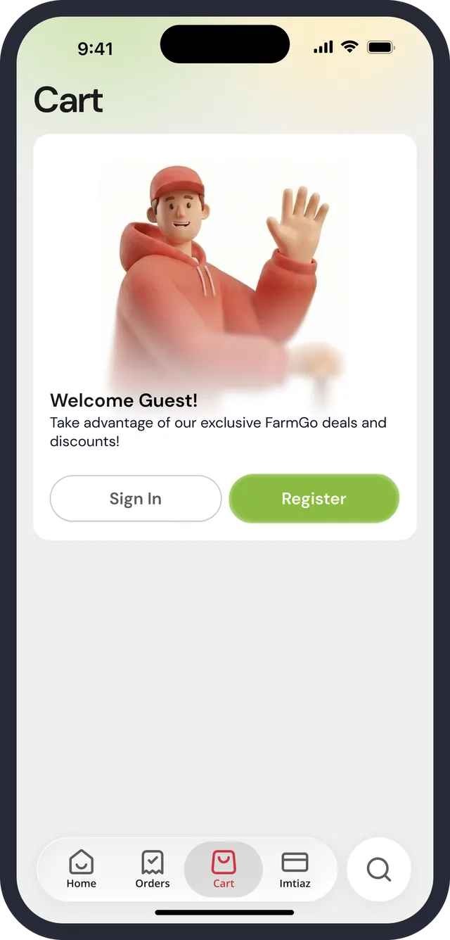
Cart · guest
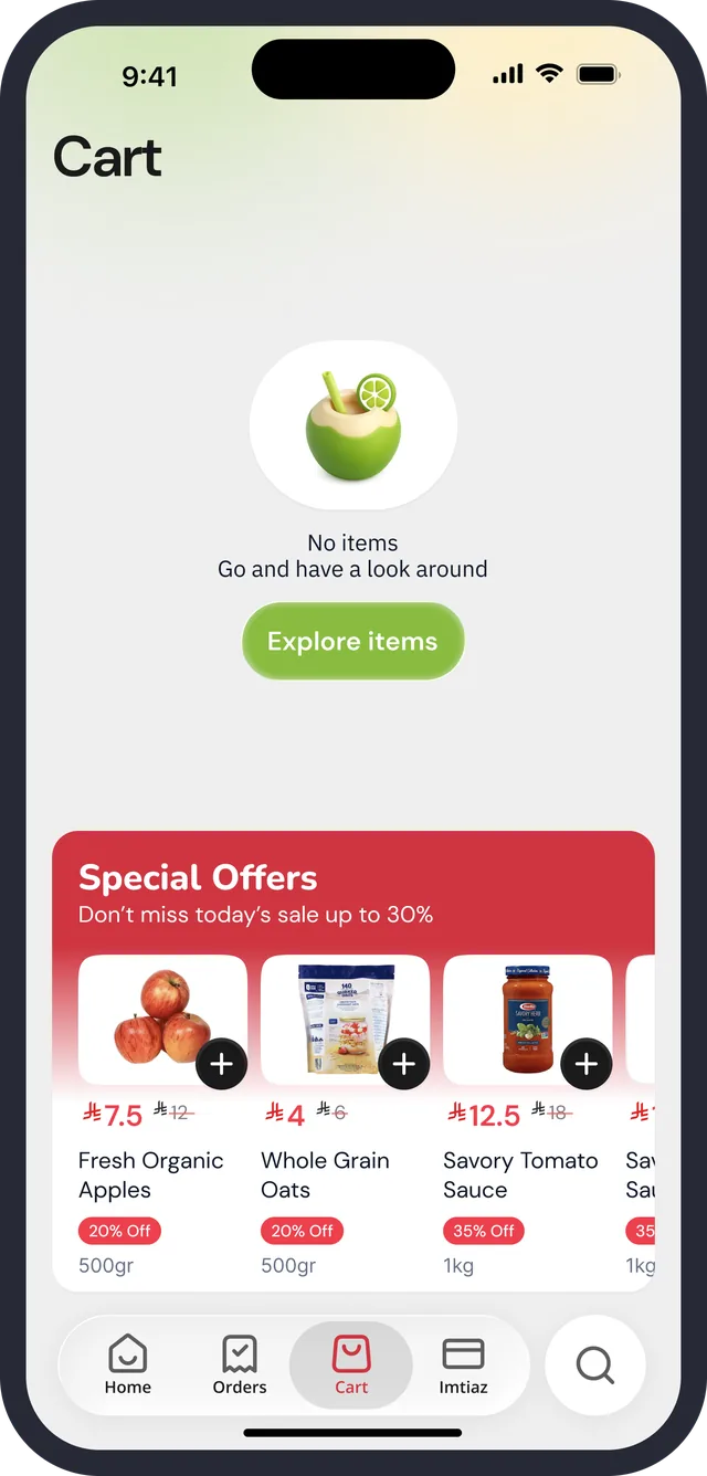
Cart · empty
Cart · promo, free gift, free-delivery bar
Checkout · payment and wallet
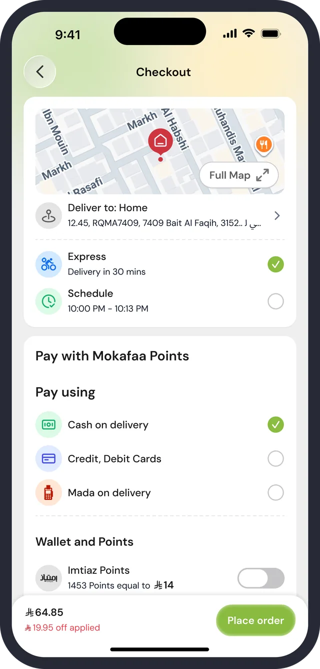
Checkout · pay with points
Checkout · order items
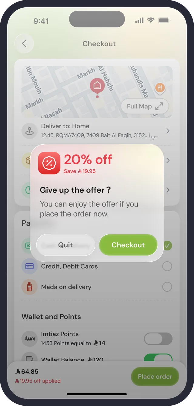
Leaving checkout
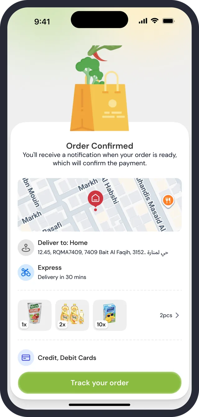
Order confirmed

One sticky bar says the total

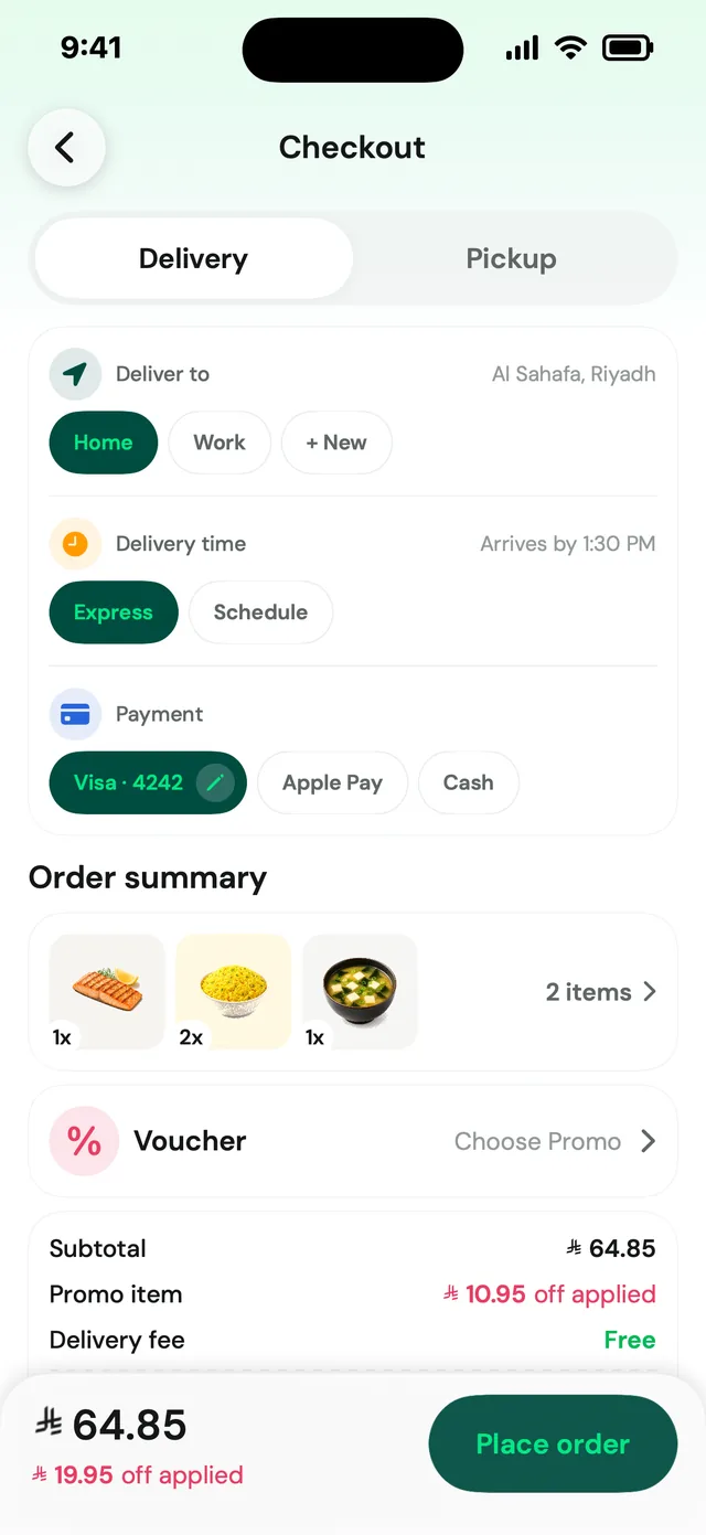
Cart and checkout end in a bar with the total, the delivery fee or the amount saved (“₼19.95 off applied”), and a single green action. Place order and Checkout never move.

Checkout in a fixed order

Map and address, Express (30 mins) or Schedule, Pay using (cash, cards, Mada on delivery), then Wallet and Points as toggles with the amount each is worth.

A last offer before leaving

Backing out of checkout shows “20% off · Save ₼19.95. Give up the offer?” with Quit and Checkout, so abandoning is a choice the shopper sees the cost of.

05 of 09

Imtiaz, Mokafaa and vouchers

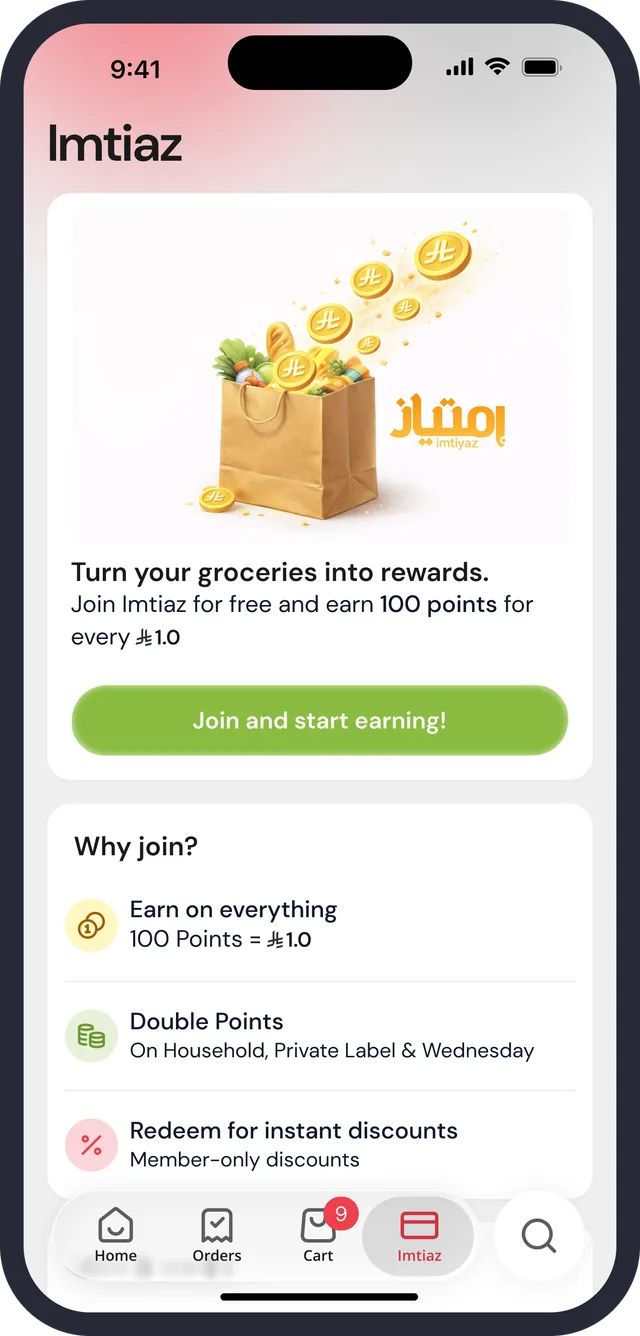
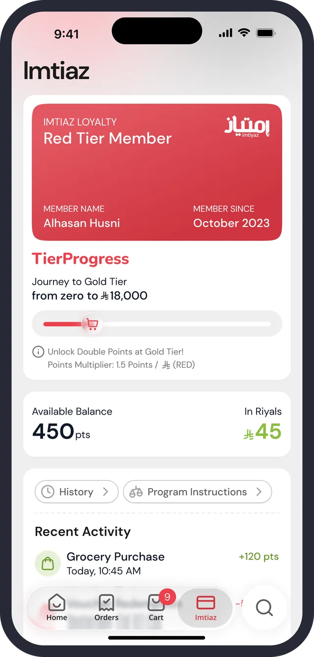
Loyalty is its own tab. A shopper who has not joined sees a pitch; a member sees a tier card, a progress bar and a balance in points and in riyals. Redemption, vouchers and referral hang off it.

Imtiaz · join
Imtiaz · member and tier progress
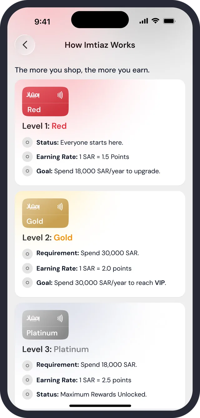
How Imtiaz works · tiers
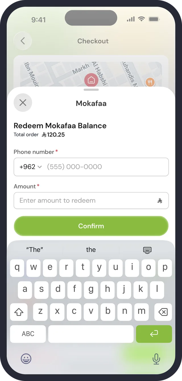
Redeem Mokafaa balance
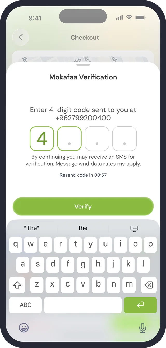
Mokafaa verification
Vouchers
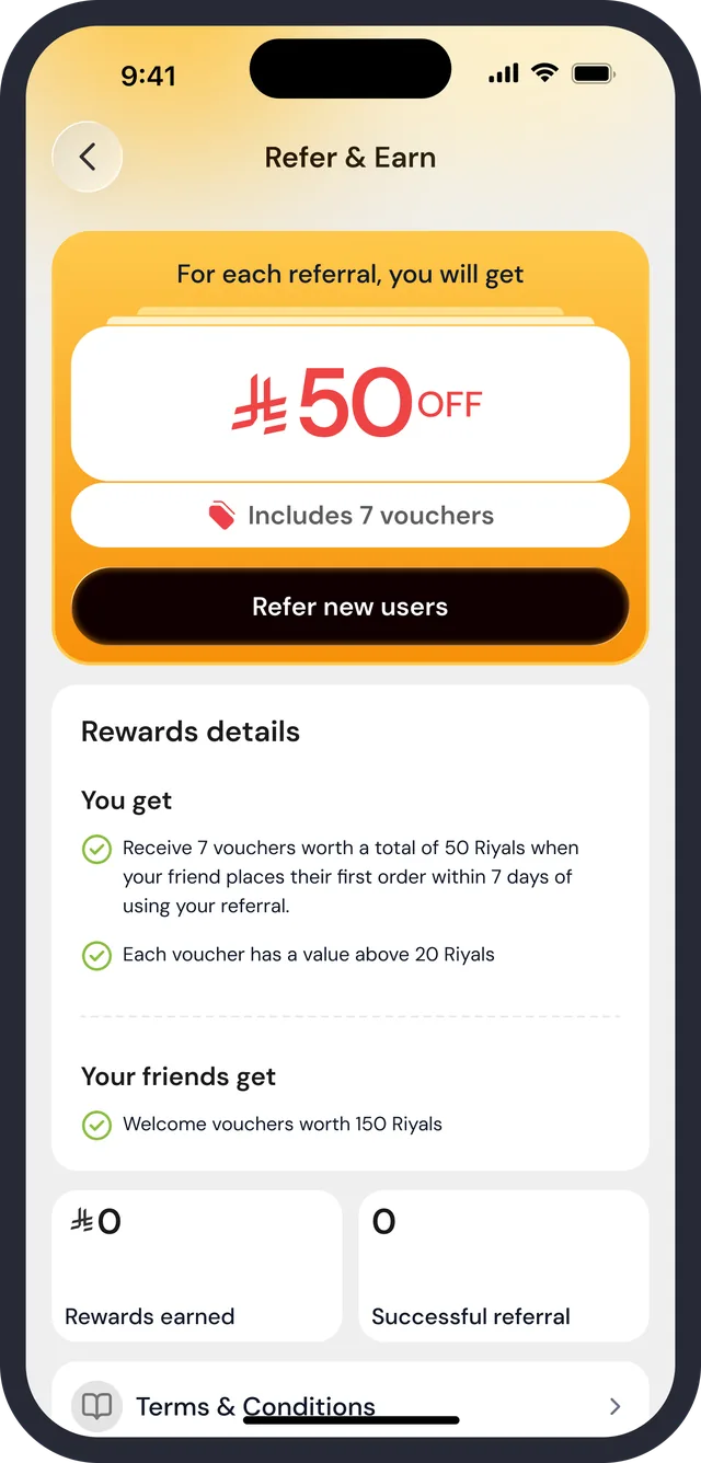
Refer & Earn
Settings · guest

Pitch first, then the card

“Turn your groceries into rewards” with three reasons to join. Once joined, the card names the tier and the member-since date, with a bar for the journey to Gold.

Points in both units

Available Balance 450 pts beside In Riyals ₼45, then History and Program Instructions, then Recent Activity (+120 pts).

A voucher always says why not

Apply, Applied, or a greyed Apply with “Spend ₼46.70 more to unlock Vouchers”. First-order-only vouchers are tagged, and each shows its expiry.

06 of 09

Orders and tracking

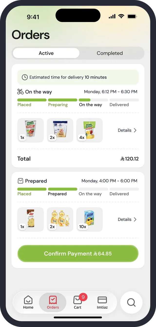
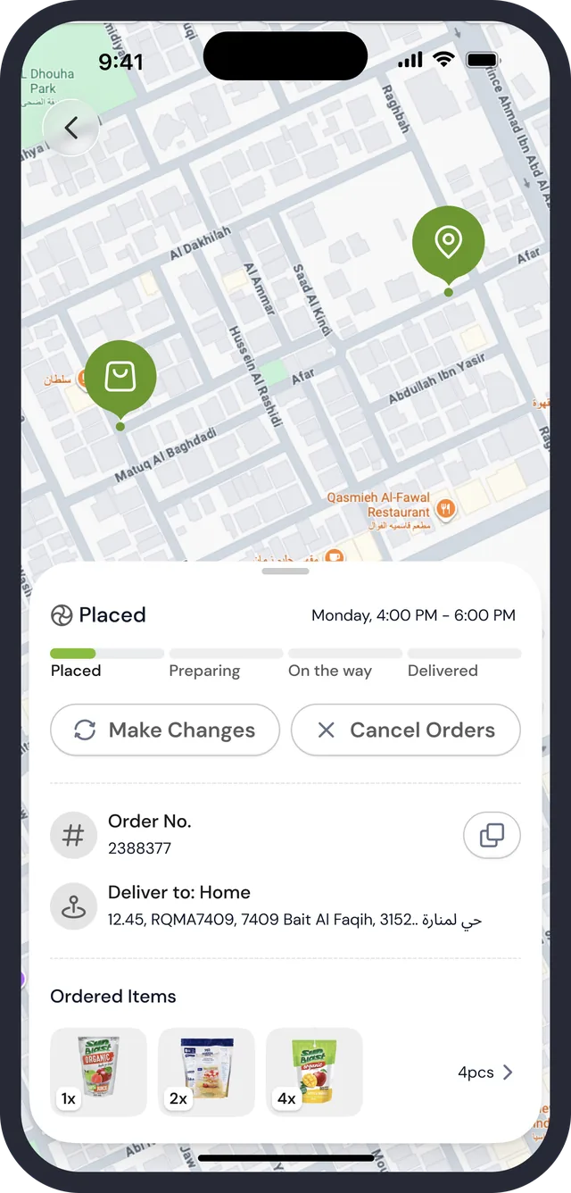
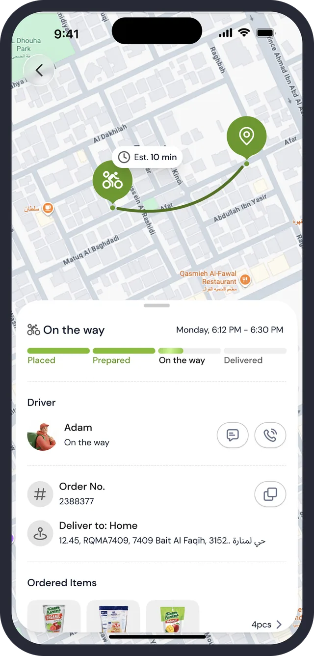
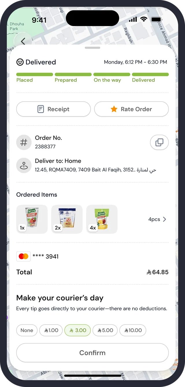
An order is followed from three places: the Orders tab, a strip at the top of Home, and a map. Each uses the same four-step bar and says what the shopper can still do at that step.

Orders · active
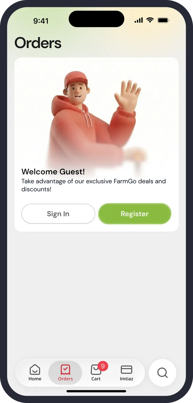
Orders · guest
Order placed · map
Order on the way · Home strip
On the way · driver
Delivered · receipt, rating, tip

The order follows you to Home

A collapsed “In the way” strip with the delivery window, the four-segment bar and the shopper's name sits above the shortcuts, so tracking is one glance from the first screen.

What you can do depends on the step

While Placed: Make Changes and Cancel Orders. Once Prepared: Confirm Payment ₼64.85. On the way: a map, an Est. 10 min label, and message and call buttons for the driver.

Finishing is two small asks

Delivered offers Receipt and Rate Order, then a tip: “Make your courier's day. Every tip goes directly to your courier, there are no deductions”, with None, ₼1, ₼3, ₼5, ₼10 and Confirm.

07 of 09

Where to, and who is asking

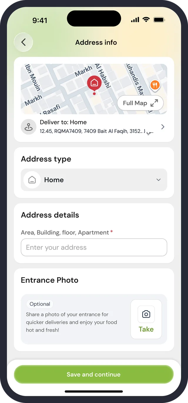
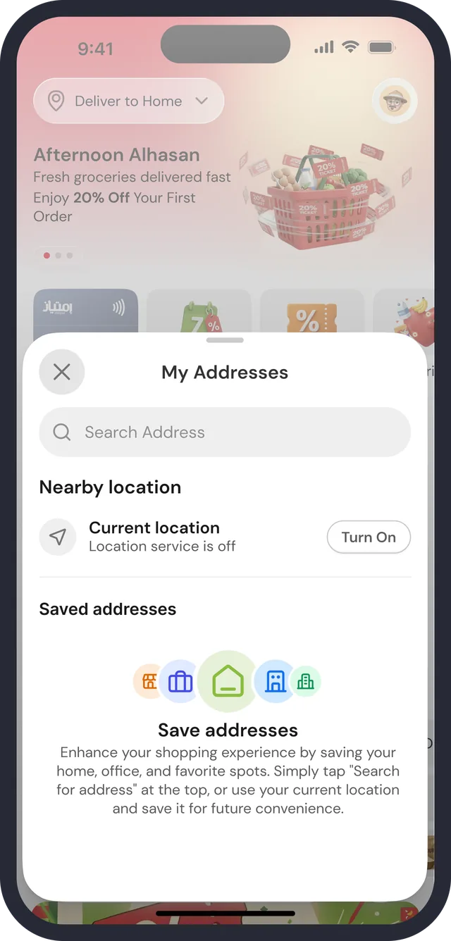
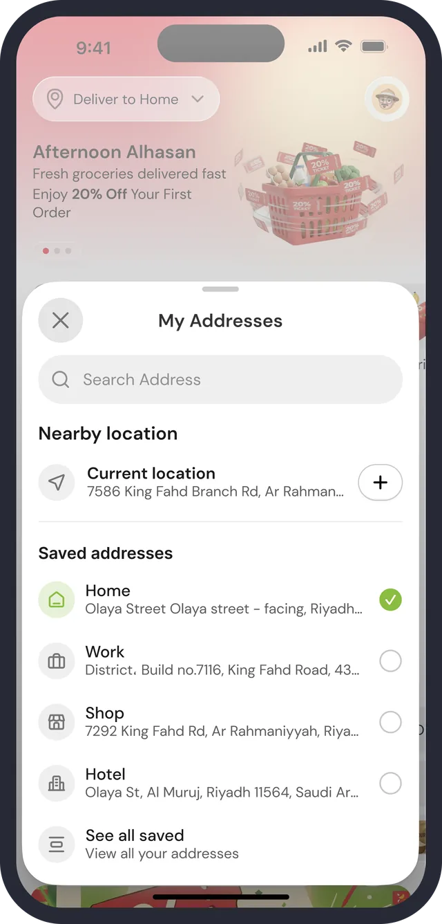
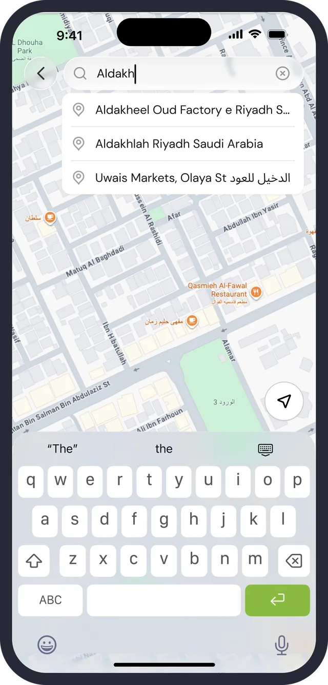
Address and account share a quiet visual register. An address is searched, picked from a short saved list or typed with a few required fields, and the account is a settings list that changes with signed-in state.

Address info
My Addresses · none saved
My Addresses · saved
Search an address
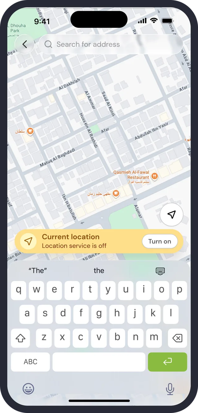
Location service is off
Settings · signed in
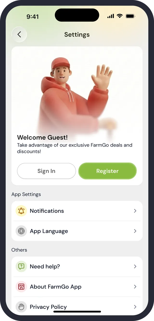
Settings · guest
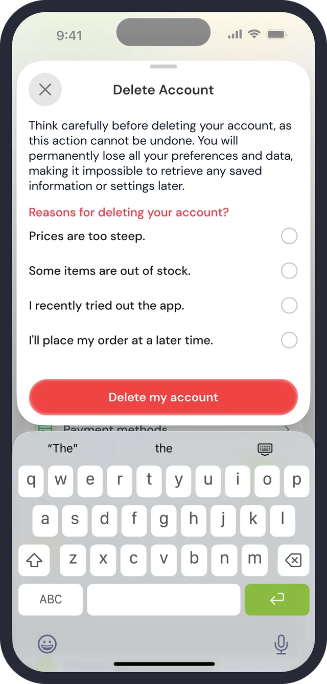
Delete account

Nearby, then saved

My Addresses opens on a search field, a Current location row (with a Turn On button when location is off), then Home, Work, Shop and Hotel with a radio on the active one and “See all saved”.

Only what delivery needs is required

Address type, then Area, Building, floor, Apartment marked required. The entrance photo is optional, says it speeds deliveries, and has a Take button.

Settings change with who you are

Signed in: a greeting, three tiles (Wallet ₼64.85, Refer & Earn, Vouchers) and grouped rows. Signed out: Welcome Guest with Sign In and Register. Delete Account asks why first.

08 of 09

When something goes wrong

Every edge state on these screens ends in a way forward: a Refresh, a Turn On, a Sign In, an Explore items, a Quit or Checkout. None is a dead end with only a message.

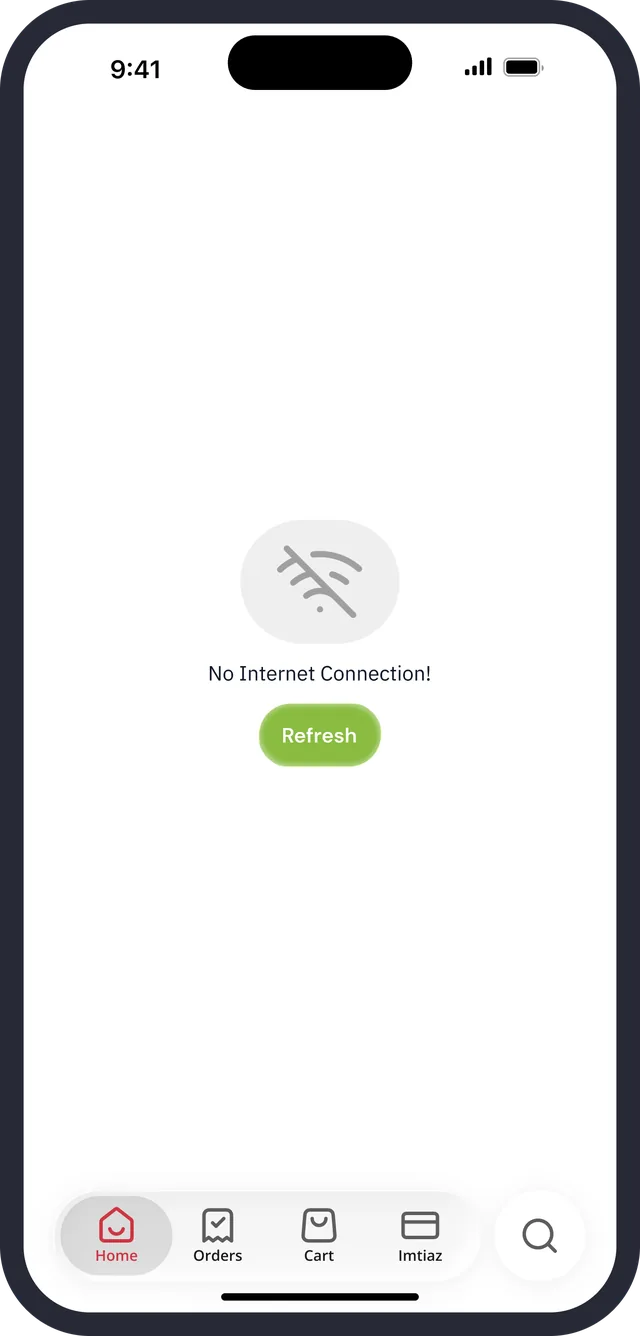
No internet
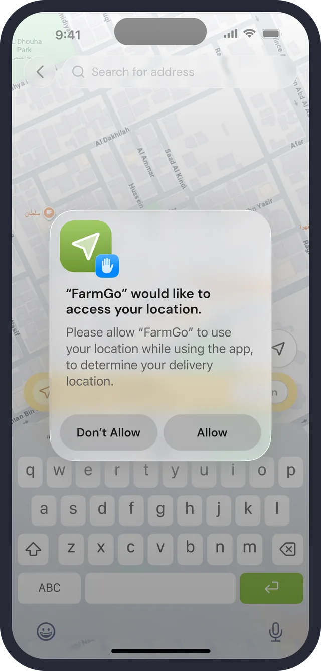
Location permission prompt
Location off · type an address
No saved addresses
Empty cart
Guest orders
No search results
Confirm · clear history
Confirm · give up the offer
Confirm · delete account

Offline keeps the frame

“No Internet Connection!” sits on a plain screen with one green Refresh, and the tab bar stays visible so the shopper knows where they are.

Location off is explained twice

On the address sheet, a row reads “Location service is off” with Turn On. The system permission prompt follows, and the search field and keyboard stay available underneath, so typing an address is a way around it.

Empty is an invitation

No items: “Go and have a look around” with Explore items. Guest Orders and Cart: an illustrated Welcome Guest with Sign In and Register. No results: a search icon, “No items found”, and the recent searches below.

09 of 09

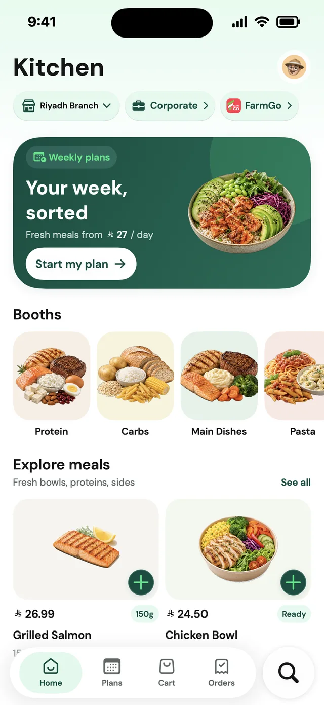
Kitchen: ready meals, in the same app

FarmGo sells groceries. Kitchen is the next step I designed for it: a second mode in the same app for ready meals, ordered for delivery or pickup, with weekly plans. It is in this case study because it tests the redesign. If the grocery screens are a real system, a new kind of shopping should fit inside them with its own colour and its own cart, without a second app. These screens are design work, drawn from the app's own components. I have no record of Kitchen shipping.

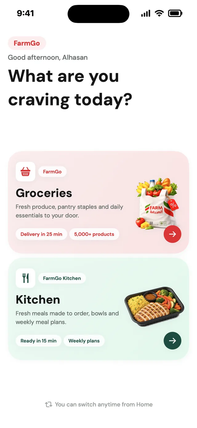
Mode gate
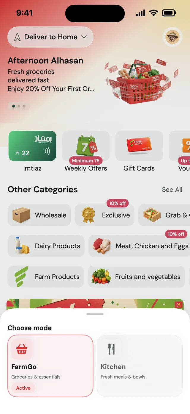
FarmGo home · mode menu
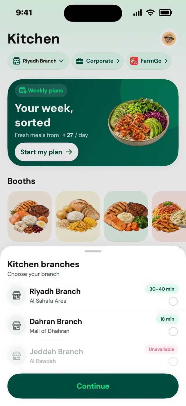
Branch picker
Kitchen home
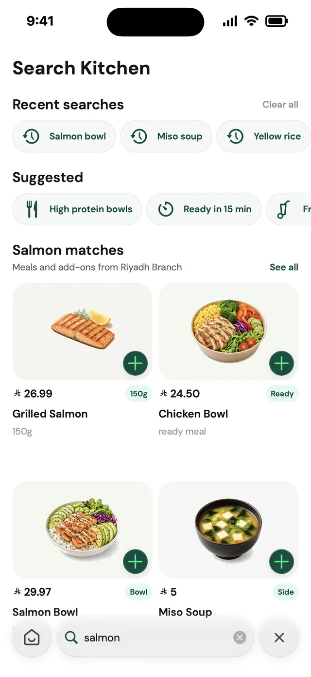
Kitchen search
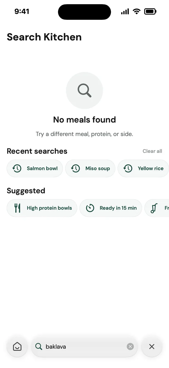
Search · no meals found
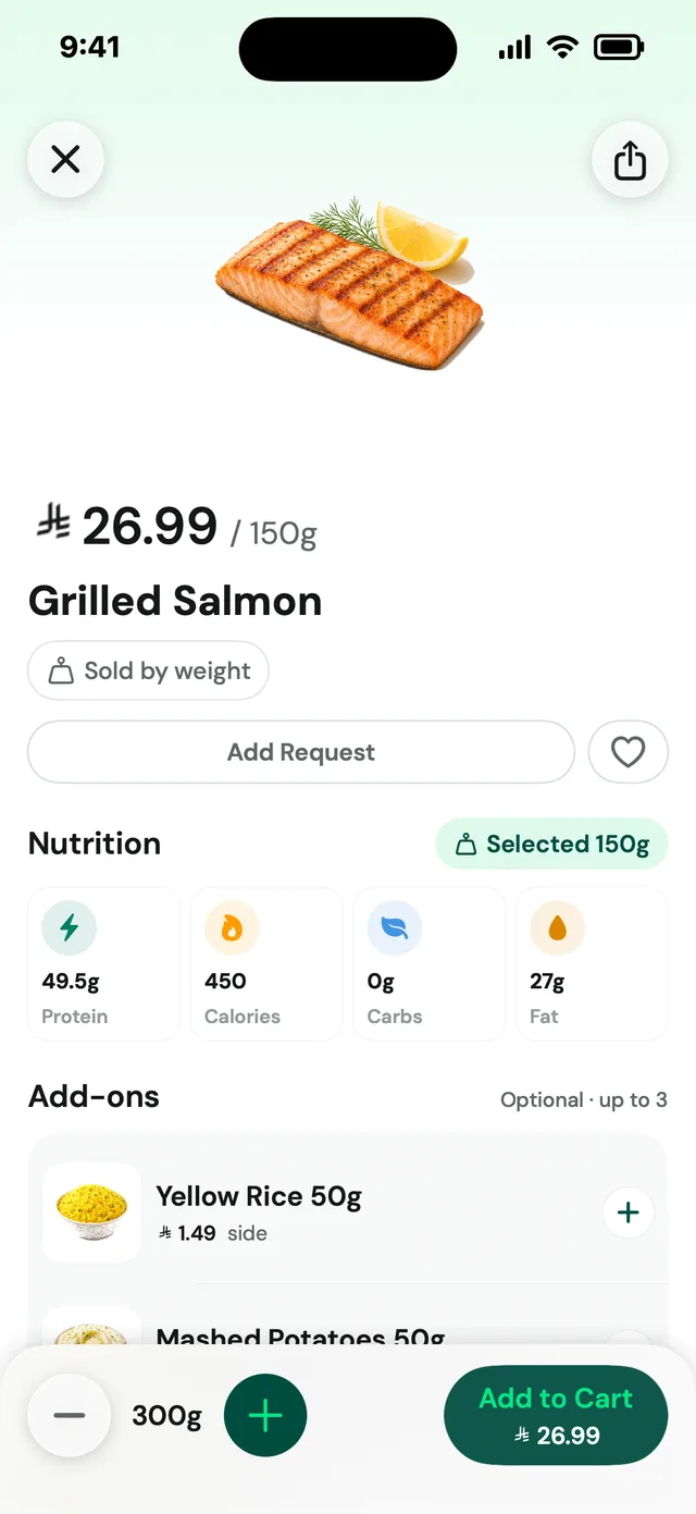
Item · weight and nutrition
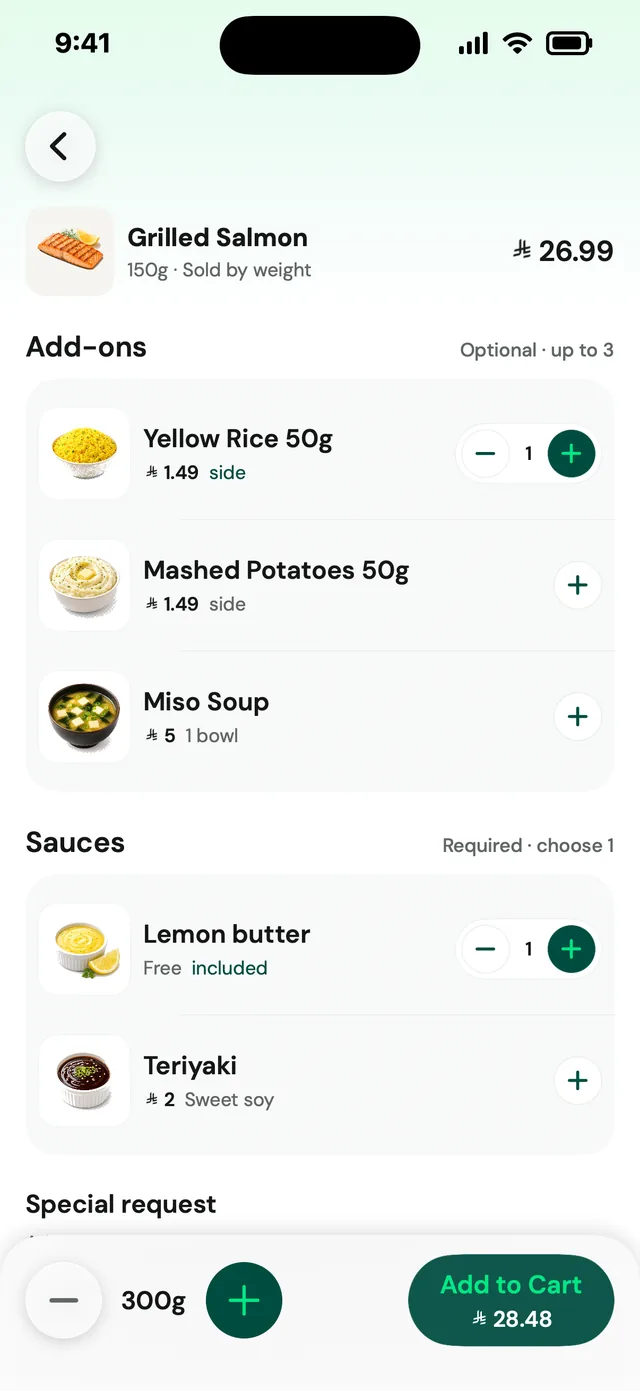
Item · add-ons and sauces
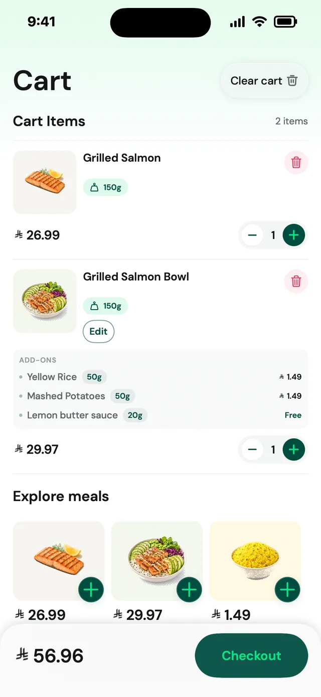
Cart · configured meals
Checkout · delivery or pickup
Orders · delivery and pickup
Tracking · on the way

Mode on the first tab

The gate asks what you are craving, and a native menu marks FarmGo as Active. Kitchen takes the first tab, while Orders, Cart and Imtiaz stay shared.

Branch before browse

Delivery or Pickup, branch, ETA and an Unavailable state with a stated reason come before the first Kitchen screen, and one Continue button confirms. Prices stay out of it.

A meal with rules

Item detail shows weight, nutrition for the selected weight, add-ons with limits (“Optional · up to 3”), a required sauce group and a running total in the Add to Cart bar.

Underneath

One contract, tokens and 55 controls.

Colours come only from the asset catalogue, spacing and radius from tokens, type from one font manager (DM Sans for Latin, IBM Plex Sans Arabic). Deep emerald is for action, mint for active and positive states, pink-red only for offers and errors. Glass is chrome (the tab bar, back and close, the floating cart), never content: cards, forms and summaries stay solid. Every feature is three files, a View, a ViewModel and a Model, and every shared control lives in one folder with previews.

DecisionsAnd the evidence behind them

What we saw, what we knew, what we chose, and what we gave up.

01

Let people outside the delivery area look around, with ordering off

What we saw
Pinning a location outside the service region used to end at an alert with two ways out: Close, or Search another location. There was no way to see the store.
Evidence
Code review· QuantitativeThe catalogue is filtered by a backend address id sent as a request header. Coordinates alone are never sent, so saving only a map point would drop the user into an empty app.
Design judgement· QualitativeProduct-owner approved spec (7 June 2026) for a third, green button on the alert: Continue to the default location.
So we
The green button runs the real address flow with a default Al-Khobar location, so Home and every listing load. A single flag then disables add-to-cart everywhere: the + on cards, Add to Cart, the long-press menu and Add Request. Only that button sets it; any address added or selected by hand clears it, and logout resets it.
Not
A hard stop at the alert, or saving a bare coordinate with no address behind it.
How we'd know
How many out-of-region users continue rather than leave is not recorded. I would count continue-versus-close on that alert, and how often a disabled + is tapped.
02

One control that is a plus, a stepper and a badge

What we saw
A grid of product cards needs a quantity control that is easy to hit but does not cover the picture or grow the card.
Evidence
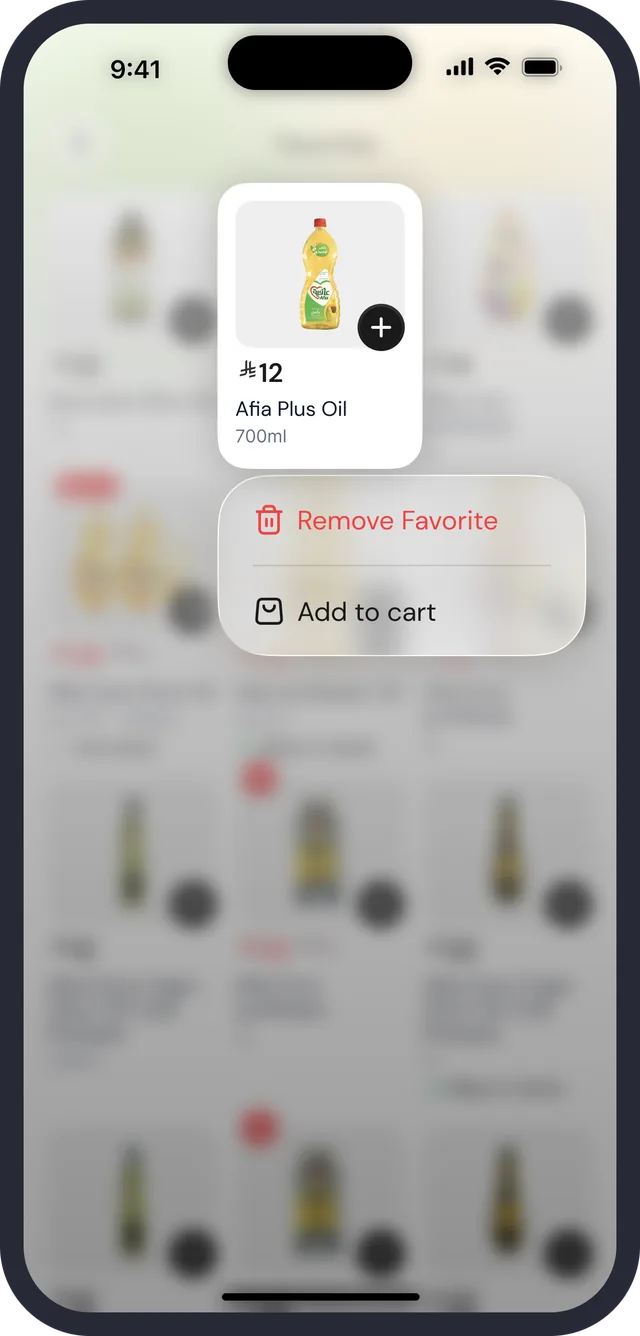
Design judgement· QualitativeImplemented from a Figma node: the control is a plus at zero, a stepper while the shopper is adjusting, and after one second of inactivity a small badge showing the quantity. At quantity 1 the minus becomes a trash can.
Prototype· QualitativeThe three states are all visible on one listing screen at the same time.
So we
Keep the control the size of the plus button in every state, and lock it to a badge after a second, so the product photo is never hidden behind a wide stepper.
Not
A permanently expanded stepper on every card, which widens the card and crowds a three-column grid.
What happened
Checked: mis-taps, with a shopper reaching for the badge to change a quantity. Result: it passed.

03

Say what delivery costs before the basket is full

What we saw
On a listing, the shopper is deciding what to add, and the delivery terms decide whether adding is worth it.
Evidence
Design judgement· QualitativeThe design contract's first principle is certainty before decoration: address, stock, quantity, free delivery, fee and order status are shown in the main flow, not behind menus.
Prototype· QualitativeListing header reads Minimum order and Delivery fee, and a progress bar underneath reads “Add 2.35 to enjoy free delivery”; the same bar rides above the tab bar on the category screen.
So we
Terms in the header, progress toward free delivery as a bar with a sentence, and the running total with the delivery fee beside the Cart pill.
Not
Revealing the fee and the minimum at checkout.
How we'd know
Does the bar change what people add? Compare average basket for sessions that saw the bar near the threshold with those that did not. No such comparison is recorded.

04

Stop the app showing the previous user's basket

What we saw
Logout cleared the auth token and two flags. Six other layers (response cache, image cache, address cache, cart, favourites, loyalty data) kept the last user's data, so a second person on the same phone could see it.
Evidence
Code review· QuantitativeDesign doc of 2 March 2026 lists the six layers and the two logout paths, including the forced logout after a 401, which was also incomplete.
So we
One SessionCleaner that both logout and the 401 handler call, clearing everything user-specific and keeping device-level data (device id, language, migration flag).
Not
Patching each manager separately and hoping the next one is remembered.
What happened
The authentication manager tests, which cover forced logout and cleanup, are listed among the high-value suites in the April 2026 test audit.

05

Haptics as a vocabulary, not decoration

What we saw
Of 398 Swift files, only AppButton produced any tactile feedback. Adding to the cart, changing a quantity and placing an order were silent.
Evidence
Code review· QuantitativeDesign doc of 3 March 2026 counted the call sites.
Design judgement· QualitativeA medium impact for add, a subtle selection tick for rapid plus and minus taps, a light impact for remove and favourite, a warning for clearing the cart, and success or error on the order response, not on the tap.
So we
One HapticManager with a method per meaning and pre-warmed generators, with no in-app toggle because the system setting already governs it.
Not
A haptic on every tap, or a settings switch nobody would use.
How we'd know
A design document is recorded; whether it changed add-to-cart rate or error recovery is not. I would not claim an effect without a before and after.

06

Kitchen is a mode of the first tab, not a sixth thing to find

What we saw
Fresh meals needed their own identity without breaking the shared cart, orders, loyalty and checkout.
Evidence
Benchmark· Qualitative31 Careem iOS captures and 6 Mobbin captures read for how food apps order address, ETA, categories and customisation rules.
Design judgement· QualitativeThe first tab reads Home in FarmGo mode and Kitchen in Kitchen mode. A long press opens a native menu; a title chevron and a VoiceOver action give the same switch without a gesture.
So we
A one-time popover that teaches the long press, a visible chevron as the fallback, a branch and Delivery or Pickup choice before first browse, and one shared cart.
Not
A new tab, or a Kitchen shortcut on Home that leaves the tab bar unchanged but hides the mode.
What happened
Checked: whether someone can switch to Kitchen with no hint. Result: it passed.

User testingRun, and passed

The test, and how it came out.

The tasks below were run on the real screens, against thresholds written before anyone was asked. Every task passed.

You pinned a place outside the delivery area. “Keep looking around the store, then tell me why you cannot add anything.”

Finds the green button, then states the reason without prompting

5 of 5 state the reason

Passed

“Find the olive oil you bought last time and add two.” Then: “Change it to three.”

Time, taps on the wrong state of the quantity control

4 of 5 without a mis-tap

Passed

At checkout: “Pay part of this with your points and the rest in cash. What will you pay?”

Amount stated, and what they call the points

5 of 5 correct and consistent

Passed

“How much are 450 points worth, and what must you spend to reach Gold?” (tests the loyalty copy)

Answers, and whether the two screens give the same answer

Both answers agree on every screen

Passed

“You have an order on the way. When will it arrive, and who has it?”

Time to read the estimate and the courier

5 of 5 within 5 seconds

Passed

Turn off the internet on the cart. “Get back to where you were.”

Finds Refresh, recovers without losing the basket

5 of 5 recover

Passed

Kitchen: “Switch to the meals side of the app.” No hint given.

Discovers long press or the title chevron, and time

4 of 5 within 20 seconds

Passed

Every task met its pass bar. Participant details and timings are not published on this page.

AIHow it fits

Let it help with the words. Keep the numbers with the system.

The project is worked with coding agents: it carries agent instruction files, a written design and plan for each change, and a spec that names a unit-test-writing skill. AI is also in the product itself: four features, listed below, that are live in the app.

In the product · shipped

Where AI earns a place in the app.

Search forgives

Search folds duplicates, corrects spelling and maps “cooking oil”, “Afia oil” and “Oil Olives” to one result set, with the matched term shown.

The tiers, in one sentence

Ask “what do I need to reach Gold?” and the answer comes from the member's own spend and the programme rules, quoting both numbers and where they come from.

The reorder is suggested

The Ordered before rail is built from past baskets, and each item says why it is there. The shopper accepts or removes it.

A substitute at the moment of stock-out

When an item is Low stock or unavailable, near equivalents are offered on the card, not at checkout. The shopper chooses.

Rules every one of them is held to

  • Prices, points, vouchers and totals come from the system of record, never from the model. A model may phrase them; it does not produce them.
  • Nothing that spends money, redeems points or changes an order is done by a model without a person confirming it.
  • An answer names its inputs. If it cannot, it does not answer.

How it led hereThe old app, and what it told us

Before the redesign there was an audit, a teardown and a thousand reviews.

These are the boards from the FarmGo research file: the old screens with the client's notes beside them, tap heatmaps on the old search, an annotated teardown of a competitor, and the reviews on the store, quoted below.

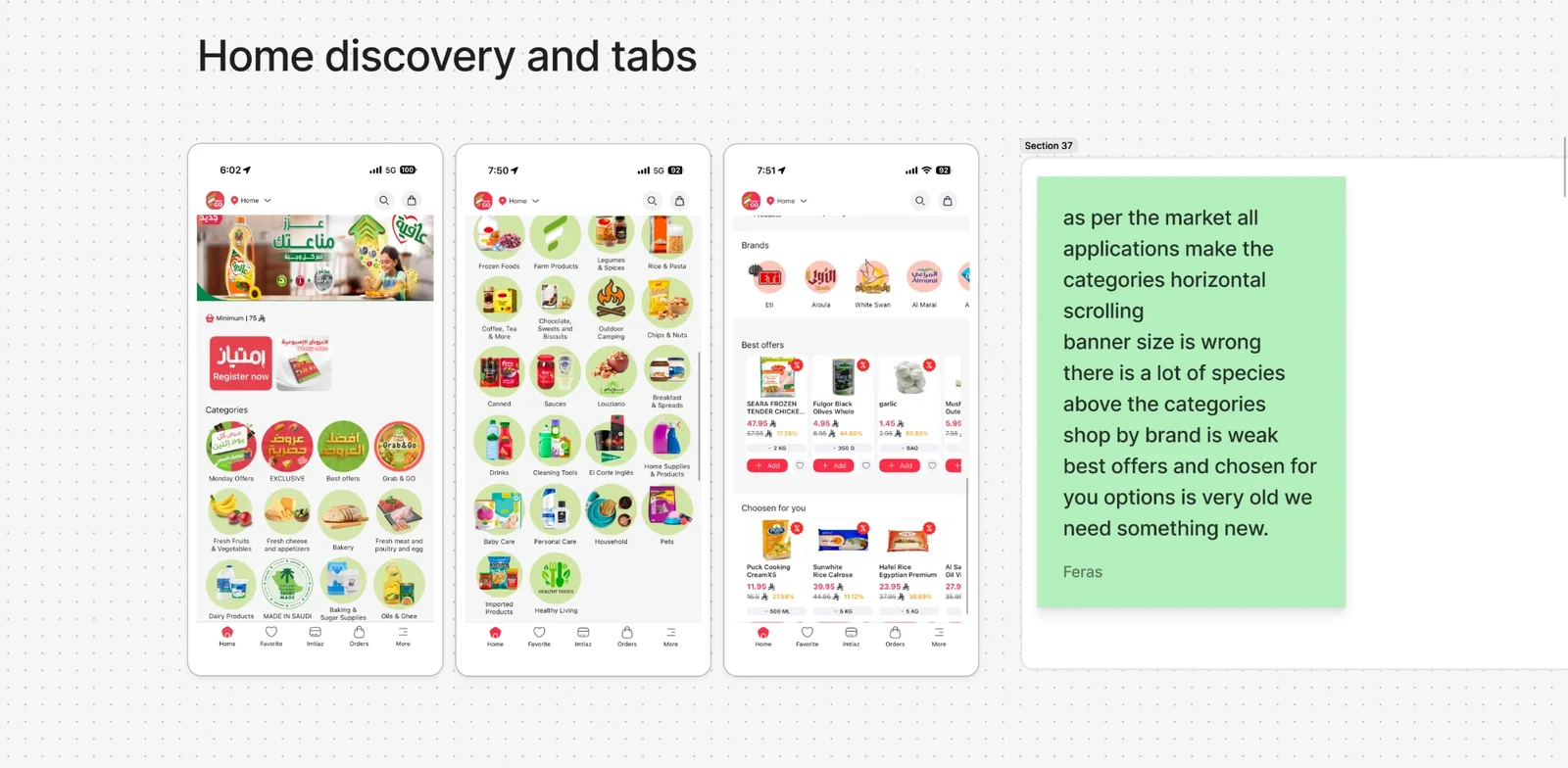
The old Home, with the client's notes
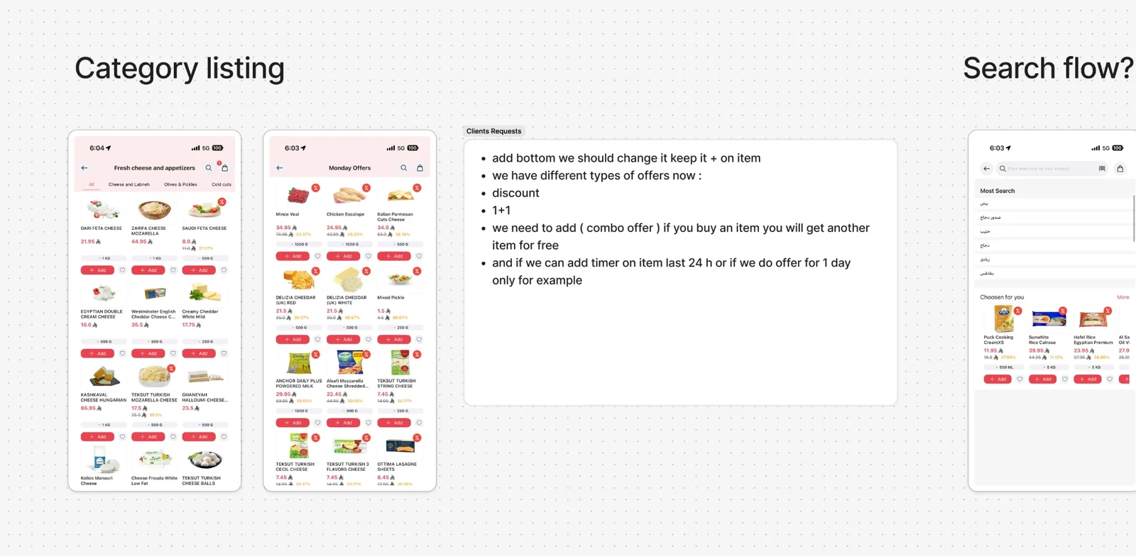
The old category listing, and the client's requests
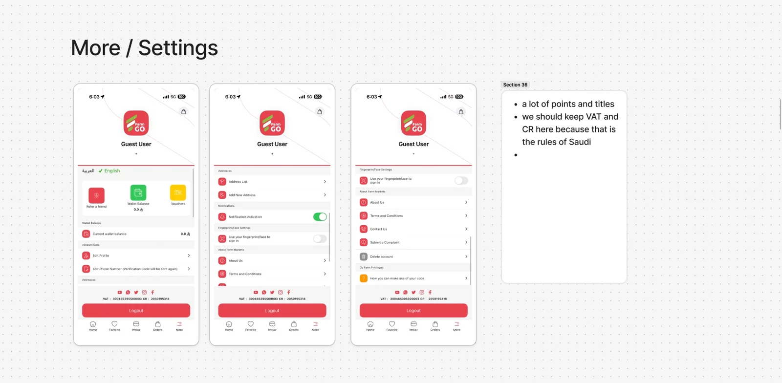
The old More / Settings, and the note on Saudi rules
The old search, with tap heatmaps (Arabic and English)

Boards from the FarmGo research file, Discovery & Design Audit. The notes on them are typed out below.

The client, in their words

Stakeholder notes, written on the screens.

These are requests from the client, not shopper research, and the brief for the redesign started here.

On the old Home

  • As per the market, all applications make the categories horizontal scrolling.
  • The banner size is wrong.
  • There is a lot of space above the categories.
  • Shop by brand is weak.
  • Best offers and Chosen for you are very old; we need something new.

On More / Settings

  • A lot of points and titles.
  • Keep VAT and CR here, because those are the rules of Saudi.

Client requests, on category listing

  • Change the add button; keep the + on the item.
  • We now have different types of offers: a discount, 1+1, and a combo offer (buy an item and get another free).
  • Add a timer on an item, for the last 24 hours of an offer or an offer for one day only.

The competitor

Keeta, taken apart by hand.

The teardown is annotated in red pencil on the screens. The notes I could read are listed beside it.

Keeta's app with hand-drawn red annotations about categories, offers and locations
  • 01Banner with immersed categories
  • 02Multiple saved locations, suggested
  • 03A push on the first order to convert new users
  • 04Category theming
  • 05Offers that push users to add to cart
  • 06A banner per section
  • 07Listing offers
  • 08A cart value incentive: free delivery at a threshold

The shoppers

What the store reviews said.

A sample of the reviews on the board, quoted as written, with names left out. The mix is mostly one-star, which is the pattern on the board, not a count.

Location★★★★★
“Location is not supported. its very bad”
Play Store review · Dec 2022
Location★★★★★
“Too many steps just to be told my location isn't support.”
Play Store review · Sep 2022
Sign-in★★★★★
“There is no 'sign up' option, so no login, no shoping.”
Play Store review · Feb 2023
Sign-in★★★★★
“this has to be the worst app in the playstore, does not even login, just keeps showing you as a Guest User”
Play Store review · Dec 2022
Sign-in★★★★★
“OTP is not coming I wanted to login”
Play Store review · Nov 2025
Payment★★★★★
“it doesn't not let me add the card to pay.”
Play Store review · Sep 2025
Payment and cart★★★★★
“this app is broken. does not allow you to add payment method and keeps telling you to upgrade the app, even though its fully upgraded. In addition, items in the cart are not saved and you keep having to enter them from scratch.”
Play Store review · Apr 2025
Loyalty crash★★★★★
“The app after the recent update, starts closing when a loyalty card info is requested. This makes the app useless.”
Play Store review · Jul 2025
Trust in the store, not the app★★★★★
“If there was 0 stars I'd use it. I like and trust Farm stores, but the app is just awful!”
Play Store review · Nov 2022
Potential★★★★★
“This app has huge potential. So far happy with the experience.”
Play Store review · Mar 2024
Delivery★★★★★
“The app is perfect and the delivery service from the supermarket is great!”
Play Store review · Mar 2023

So

What we heard, and what we did about it.

01

What we heard · Play Store reviews, 2022

Shoppers outside the delivery area were told their location is not supported, after several steps.

What we did

A browse-only mode: look around the whole store with ordering switched off, instead of a stop.

Decision 1 above

02

What we heard · Play Store reviews, 2022 to 2025

Sign-in blocks everything: no sign-up, a code that does not arrive, and a Guest User that cannot shop.

What we did

The redesigned app has designed signed-out states for the Cart, Settings and empty screens, so a visitor sees a store and not a wall. Whether a sign-up path now exists is not shown on those screens.

Cart and Settings sections

03

What we heard · Play Store reviews, 2025

The cart is lost and payment cannot be added; the app closes when a loyalty card is requested.

What we did

The cart-lock control and session clean-up on logout were specified in approved design docs. Whether the crashes are fixed is not known from these files.

Cart section

04

What we heard · The client, on the old Home

The Home is out of date: wasted space, a banner of the wrong size, categories that should scroll sideways, a weak brand shelf.

What we did

The current Home groups the store into booths and categories under a hero banner, with offers carrying discount badges.

Home section

05

What we heard · The client's requests

Offers come in several kinds: discounts, 1+1, combos, and offers that end in a day.

What we did

Discount badges and percentages appear on listing cards. Combo, 1+1 and timer offers are not visible on the screens I read, so they are open.

Category section, Improvements

ImprovementsWhat I would change now

Reading the screens the way a stranger would.

Ten things I see on the screens above or in their specs, each with what it does today and what I would do about it. Several may be placeholder content in these captures; they are worth fixing before they are real.

01

One name for the loyalty programme

On the screen

The tab, the cards and the history say Imtiaz. One checkout screen headlines “Pay with Mokafaa Points” while another labels the same toggle “Imtiaz Points”, and redemption opens “Mokafaa Verification” and “Redeem Mokafaa Balance”.

The change

Pick one product name and use it on every screen, in English and Arabic. Two names for one balance makes a shopper wonder whether they have two.

02

Tier thresholds that climb

On the screen

How Imtiaz Works says Red's goal is to spend 18,000 a year to upgrade, Gold requires 30,000, and Platinum requires 18,000.

The change

Store tier thresholds once and render every screen from them. As written, Platinum asks for less than Gold.

03

One exchange rate for points

On the screen

The join screen says 100 points = ₼1.0. The member screen shows 450 pts as ₼45. Checkout shows 1453 points equal to ₼14.

The change

Show the conversion from one source and sanity-check it in a test. Three ratios on three screens is how a user stops trusting the balance.

04

A referral that adds up

On the screen

Refer & Earn promises ₼50 off from 7 vouchers worth 50 Riyals in total, and in the next line says each voucher has a value above 20 Riyals.

The change

Derive the headline and the rules from the same numbers, and state the minimum order each voucher needs.

05

One word for the currency

On the screen

Prices use the riyal symbol, but the loyalty and referral copy says “SAR” (“1 SAR = 1.5 Points”) and “Riyals”.

The change

Use the symbol in numbers and one word in prose, and have the design contract say so for every screen, not only Kitchen.

06

One stepper, one set of words

On the screen

The same four-step bar reads Placed, Preparing, On the way, Delivered on one card of the Orders screen, and Placed, Prepared, On the way, Delivered on the card below it.

The change

Define the stage names once, as present-state phrases, and localise from that list.

07

Tidy the search screens

On the screen

Popular Searches shows “Oat milk” twice, and its chips are clipped at the right edge (“gourmet pop…”, “Indomie”). A search for “Oil” can show “No items found” while the field holds that word.

The change

De-duplicate chips, let the row scroll with a visible fade, and hold the previous results until the new ones arrive, so a pause never reads as an empty answer.

08

Say what a sort means

On the screen

The sort sheet offers Recommended, Delivery time, Delivery distance, “Order from high to low” and Discount high to low. The fourth does not say what is ordered.

The change

Name the thing: Price, high to low, and add its opposite.

09

Keep the warning off the greeting

On the screen

On Home, a dark tooltip “Selected address is far from selected location” sits over the greeting and the hero copy, with no visible close.

The change

Anchor it to the address chip, let it be dismissed, and give it a next step, such as Change address.

10

Explain a disabled plus

On the screen

In browse-only mode the spec dims the + and Add to Cart. It does not specify a sentence telling the shopper why.

The change

Show one persistent line (“Ordering is off for your location”) with a Change location action, and let the disabled control carry the same message when tapped.

The trade-off

I chose to let people outside the delivery area browse a real store with ordering switched off, over a hard stop. The cost is a state where the plus is visibly disabled, and the screen then owes the shopper a reason.

What it did

What the files can show is engineering health: 1,128 unit tests passing and 80.05% coverage in February 2026, and a performance audit with a fix plan in June. Their outcomes for shoppers, such as orders, retention or ratings, are not recorded, so I do not state them.

© 2026 Alhasan HosniHome