


















← Back/Case study · iOS app

Snaptek 5.0

From a screenshot organiser to a notebook that wears your colour. Snaptek started in April as a way to turn screenshots into notes you can find again. Five months and 369 commits later, version 5.0 lets the whole app wear your colour. This is how it got there: the sketches, the wrong turns and the rules I kept.

Role
Founder: product, design and the SwiftUI build
Timeline
26 Apr – 23 Sep 2026
Platforms
iPhone, iPad, Apple Watch, Chrome
Status
5.0 is live
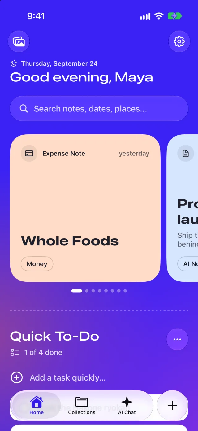
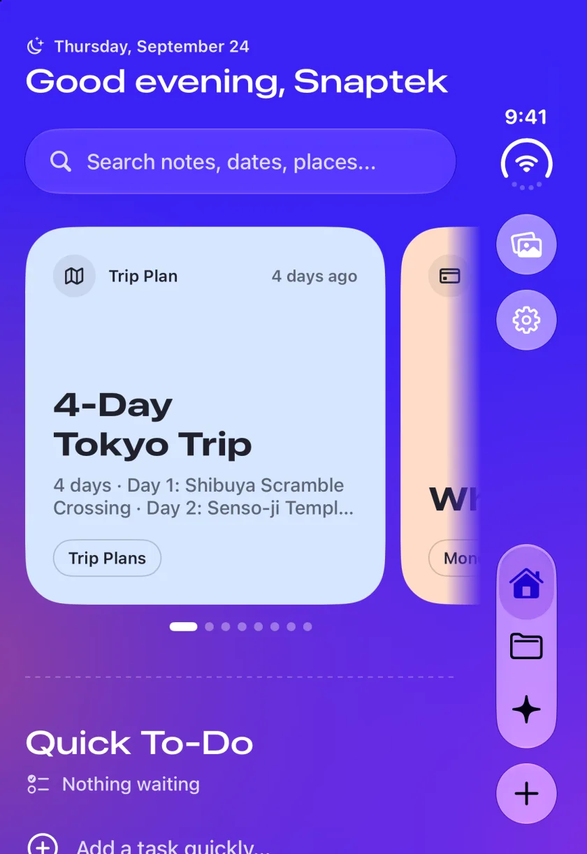
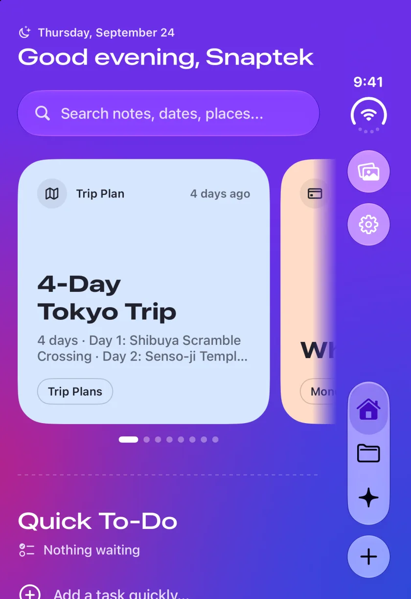
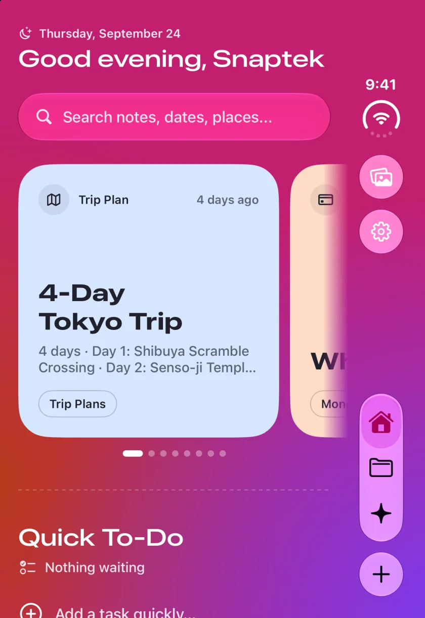
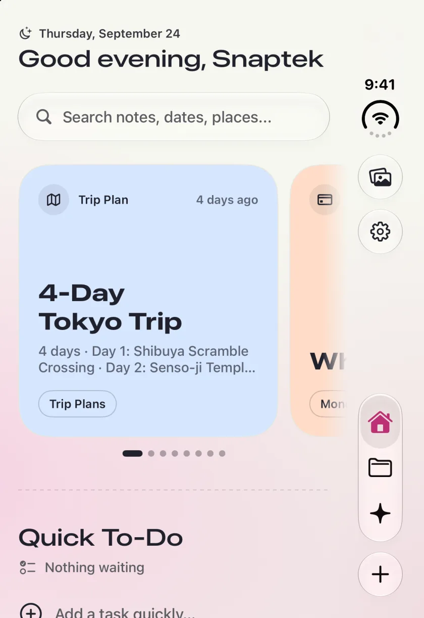
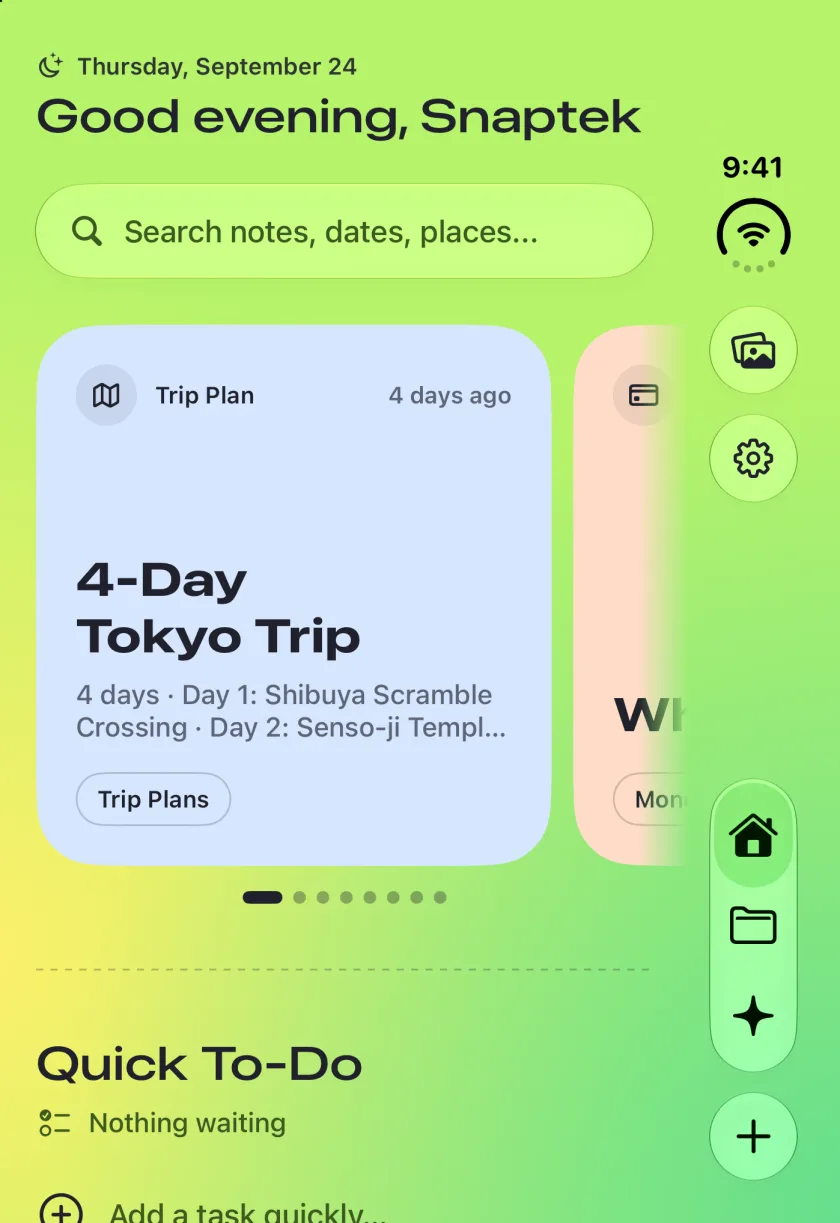
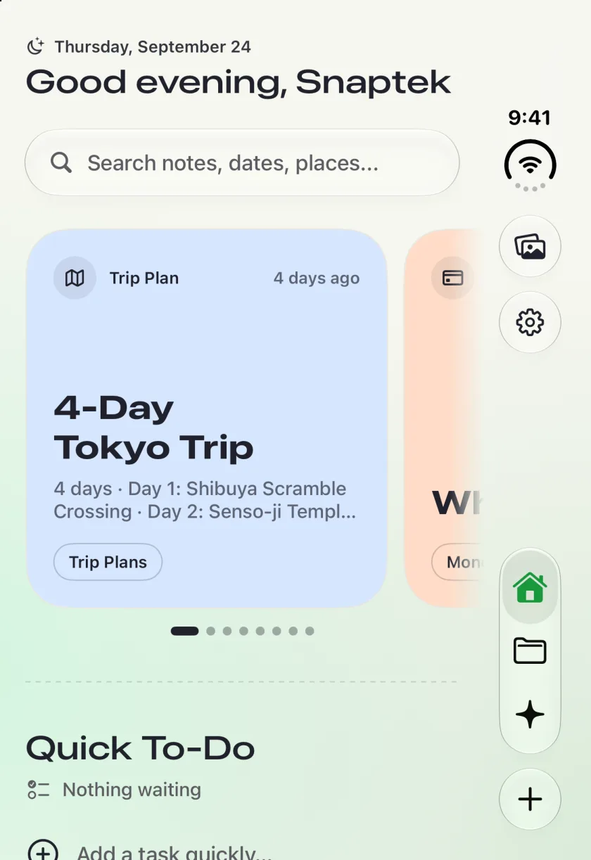
Home in Electric
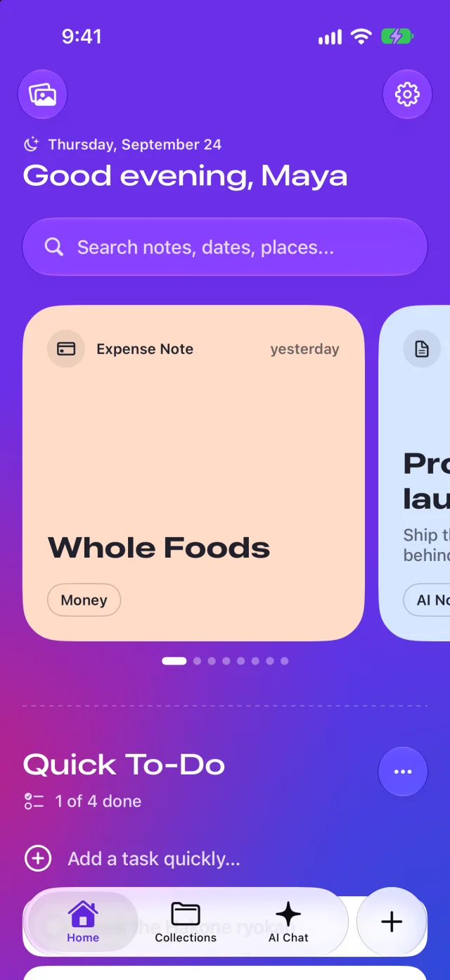
Home in Grape
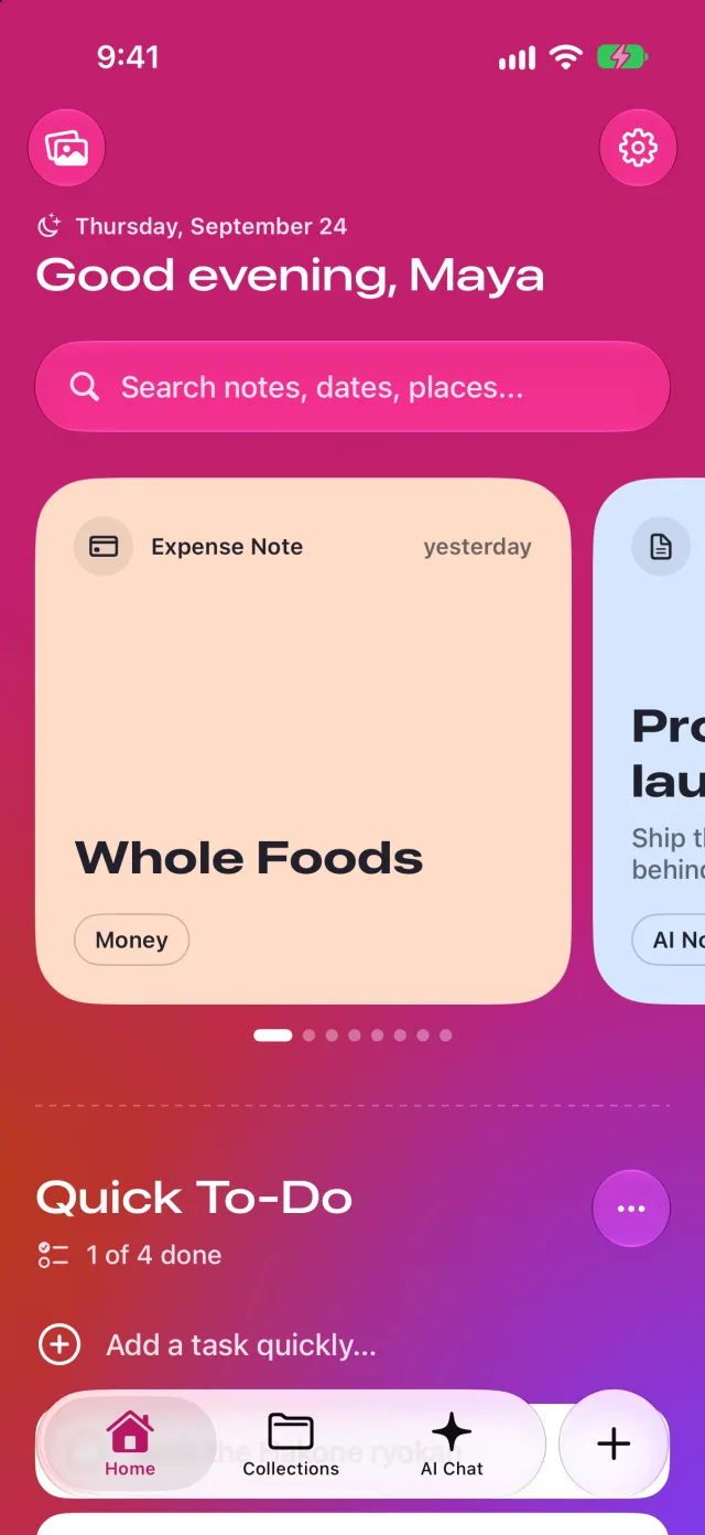
Home in Fuchsia

Why it exists

I built it to fix my own problems.

I love technology. I read about it constantly, and about design, and I follow the tech news. I also travel a lot, and I love planning a trip. Every one of those habits leaves something behind, and for years I kept losing it.

01

Where did my money go?

I had trouble tracking my spending. I could never quite see where my money was going.

02

Where did I save that?

Screenshots and posts saved on different platforms. I remembered the thing, but not where I had saved it.

03

That article, that design

I read a lot about technology and design, and follow the tech news. What I wanted to keep ended up scattered.

04

The trip in my head

I travel a lot and love planning trips, and every plan I made was one more thing to save and find again.

Two problems, one habit.

Two of them hurt most. I had trouble tracking my spending, and I could not remember where I had saved a screenshot or a post, because I saved them on different platforms and each one kept its own pile.

So I built the app I wanted: a notebook that takes what I would otherwise screenshot and files it where I can find it again, and that keeps track of what I spend.

A selfie under Tokyo Tower at night
A portrait in front of a ferris wheel
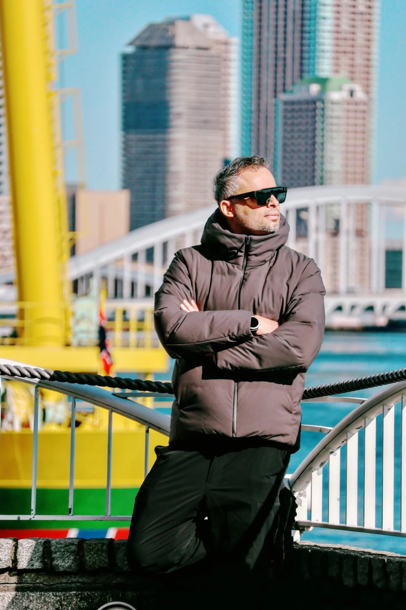
A portrait in front of a yellow and green ship

From the road.

How I knew

One user, and he was the designer. I felt every one of these problems every week, so I never had to guess the pain. The limit is the same: it is one person's habits. This page makes no usage claims, only the story of what I built and why.

The person behind the app.

Travel, photography and technology are why Snaptek exists. They are also where its ideas come from: every trip, every photo and every article is something I wanted to keep.

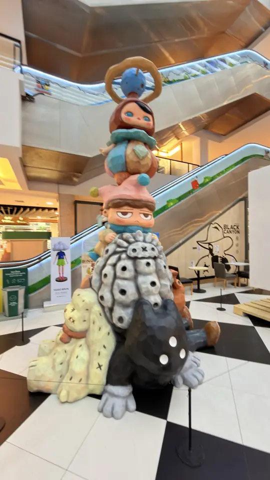
  • A stacked designer toy sculpture in a shopping mall
  • A temple spire seen through a fisheye lens
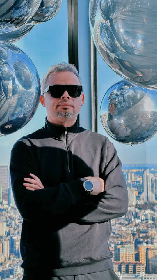
  • A portrait against a high-rise skyline
  • Tokyo Tower lit orange at night
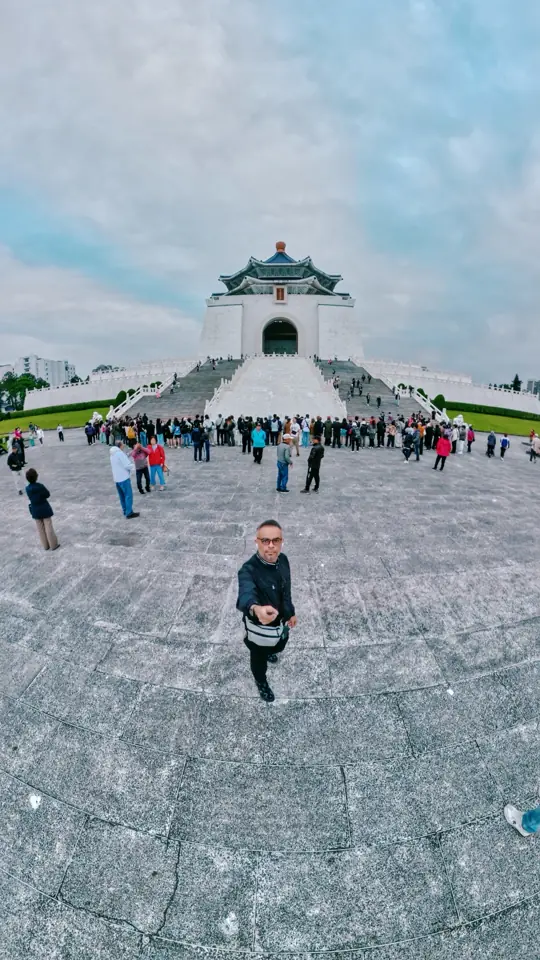
  • A wide-angle selfie in a huge stone plaza
  • A portrait on a Kyoto street with a pagoda behind
  • A ginkgo-lined path in autumn
  • A tower lit red at night
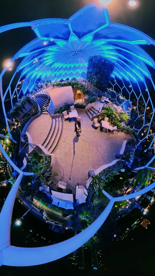
  • A tiny-planet panorama of a glowing blue dome garden
  • Walking up a street toward a pagoda
  • A harbour full of boats below green hills
  • A hillside town with a winding road
  • A narrow alley lit by red lanterns
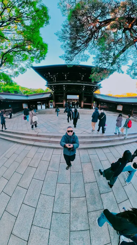
  • A wide-angle selfie before a shrine gate
  • A steel tower above a reflecting pool
  • Standing on a mountain road
  • Skyscrapers against a soft evening sky
  • An orange-roofed hall above a patterned garden
  • A quiet street with yellow trees
  • A portrait on a street lined with yellow ginkgo
  • A white bridge over a river and tall buildings

Photographs from my travels: temples and towers, street scenes at night, animals, art toys and flowers.

The website

Your life, in colour.

The Snaptek website opens the way the app does: the headline inflates into soft balloon letters, the icons build themselves, and butterflies land on the letters. It is the live hero from snaptek.app.

The hero of snaptek.app, live.

Two founders.

Snaptek is built by two people. I design it and build the iPhone, iPad and Apple Watch apps, and Malak is developing the Android app.

Taipei · Product, design and iOS

Alhasan Hosni

Founder

Started Snaptek to fix his own problems with saving, finding and spending. Designs the product and builds the SwiftUI apps for iPhone, iPad and Apple Watch.

  • Product
  • Design
  • SwiftUI

Saved is not found.

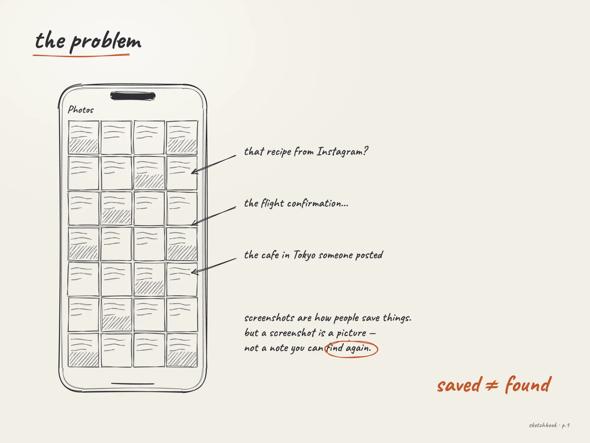
Screenshots are how most of us save things: a recipe from Instagram, a flight confirmation, a café someone posted. But a screenshot is a picture, not a note. It sits in the camera roll with thousands of others, and when you need it, you scroll.

Sketch of a camera roll full of screenshots
Sketch, redrawn for this case study

Let the app do the filing.

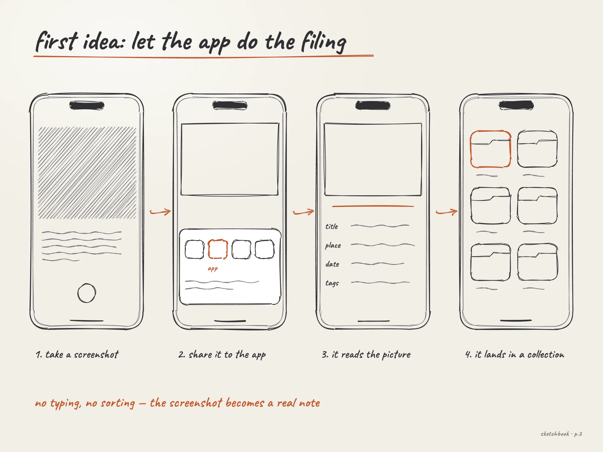
The first version was called Screena. You take a screenshot, share it to the app, it reads the picture and files it as a card with a title, a place, a date and tags. No typing, no sorting.

Day one had three tabs, Recent, Folders and Settings, and one promise on the welcome screen: “Turn screenshots into organized knowledge.”

Sketch: take a screenshot, share it, the app reads it, it lands in a collection
Sketch, redrawn for this case study

Notes want shapes.

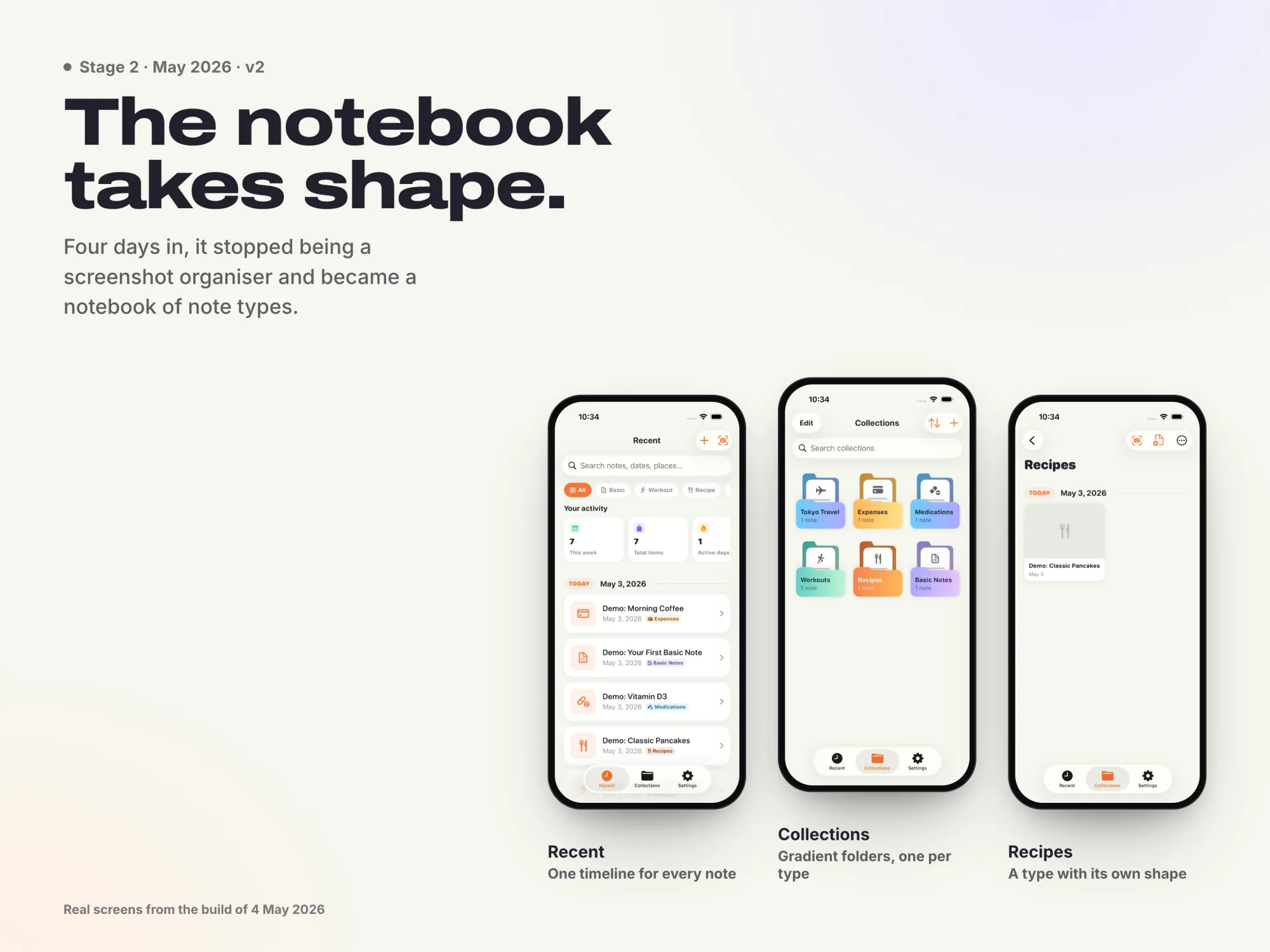
The cards I cared about weren’t generic. A recipe wants ingredients and steps, a workout wants sets, a medication wants a schedule. So Snaptek stopped being a screenshot organiser and became a notebook of note types, each with its own shape.

Real screens from the build of 4 May.

Real screens from the 4 May build: Recent, Collections and Recipes

Home, and a face for every collection.

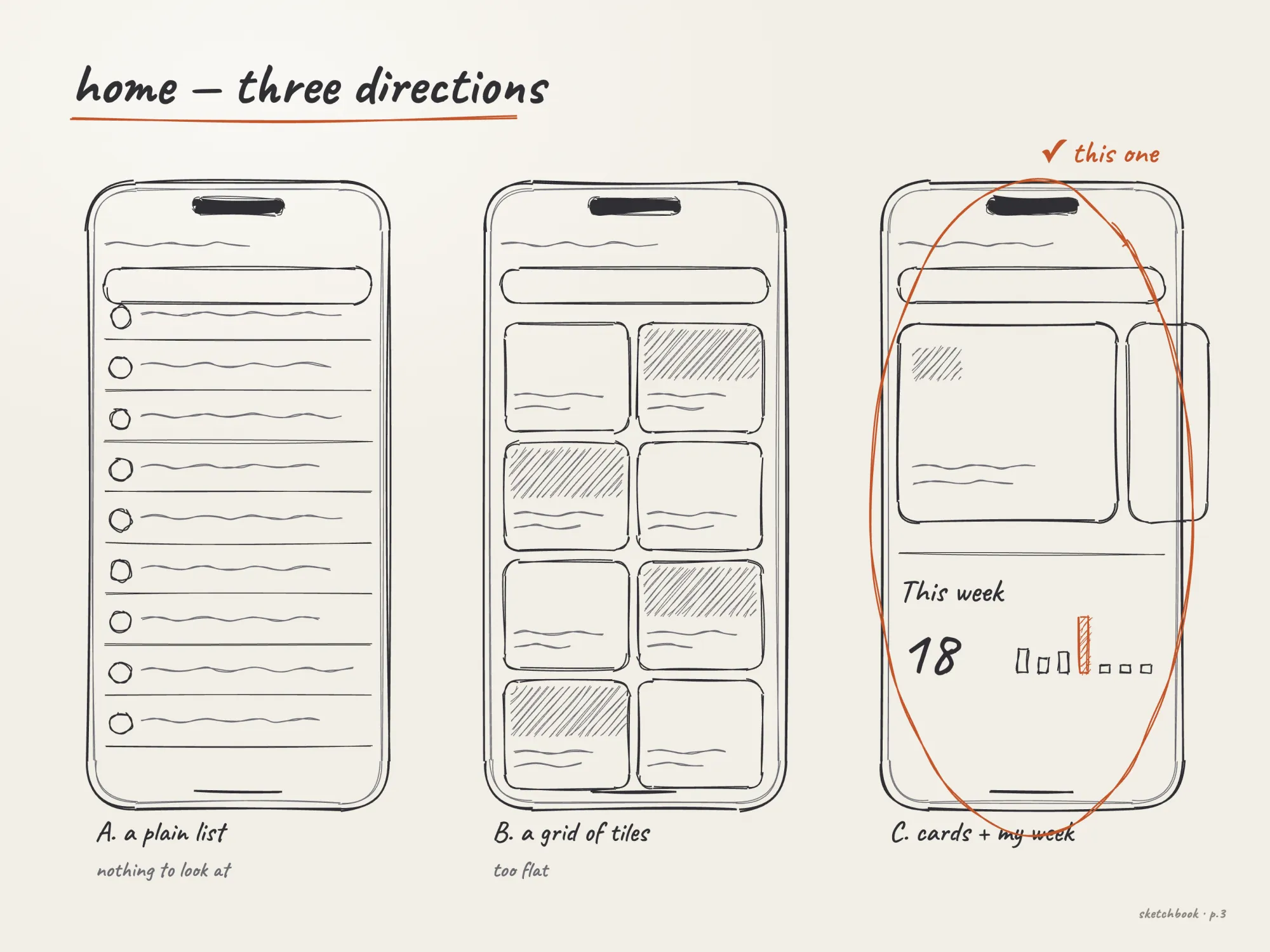
Sketch of three Home directions: a list, a grid of tiles, and cards with this week
Sketch, redrawn for this case study

Three directions for Home: a plain list had nothing to look at, a grid of tiles was too flat. Cards with a summary of your week won, because Home should tell you something before you tap anything.

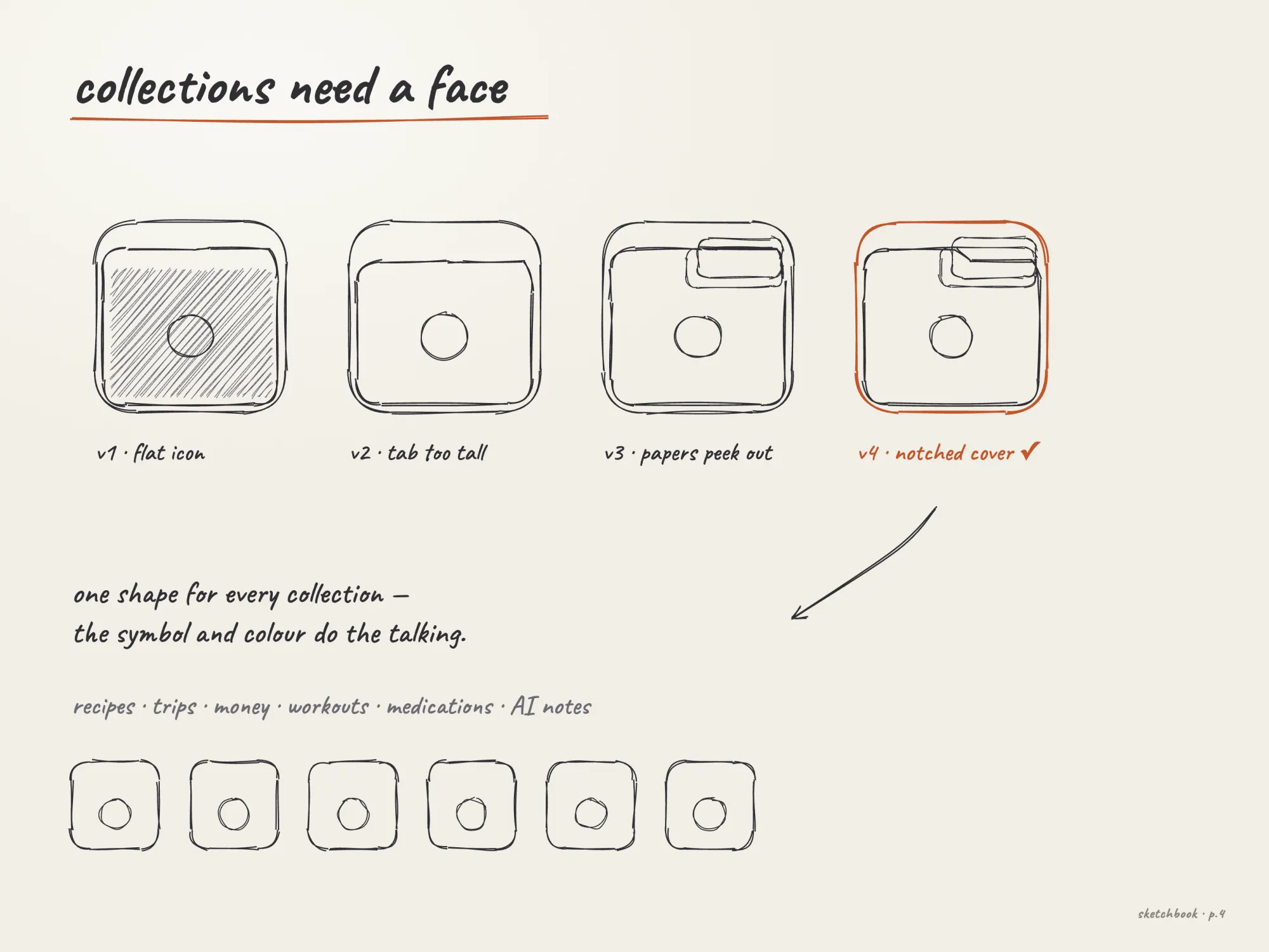
Sketch of four folder shapes, ending in the notched cover
Sketch, redrawn for this case study

One folder shape for every collection, so the symbol and the colour do the talking. Papers peek out of a notched cover. Once it was right I froze it: the shape never changes again, only its colours.

Eight turns.

Dates from the project history, April to September 2026.

  1. Apr 26v1.0

    Screena

    Screenshots in, organised cards out.

  2. Apr 30v1.5

    Typed notes

    Recipes, workouts, pills and expenses.

  3. May 3–7v2

    Everyday

    Apple Health, languages, currencies, AI Notes.

  4. May 10v3.0

    AI assistant

    A new Home, widgets and Live Activities.

  5. May 22v3.6

    Money

    Expenses grows into accounts, cards and transfers.

  6. Jul 15

    On the device

    The assistant moves to Apple Intelligence.

  7. Aug–Sepv4.2–4.4

    Craft

    A card per note type, glass buttons, concentric corners, Siri.

  8. Sep 235.0

    Vibe

    The whole app wears your colour.

Rules that stuck.

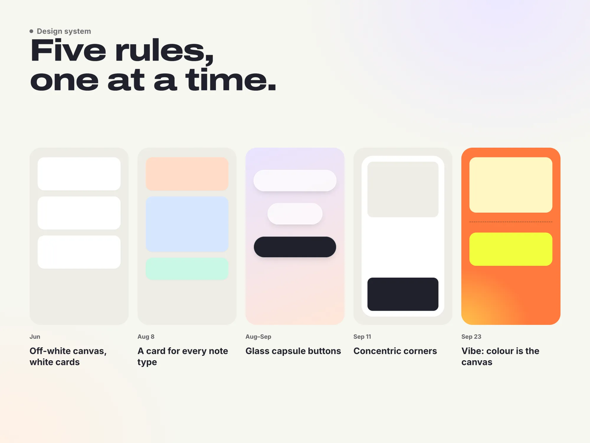
  1. 01A warm off-white canvas with white cards.
  2. 02A dedicated card for each note type instead of one card for everything.
  3. 03Every button a glass capsule.
  4. 04Concentric corners: an inner corner is the outer radius minus the gap.
  5. 05In 5.0, colour stops being an accent and becomes the canvas.
The five system rules as swatches, from off-white canvas to colour as the canvas

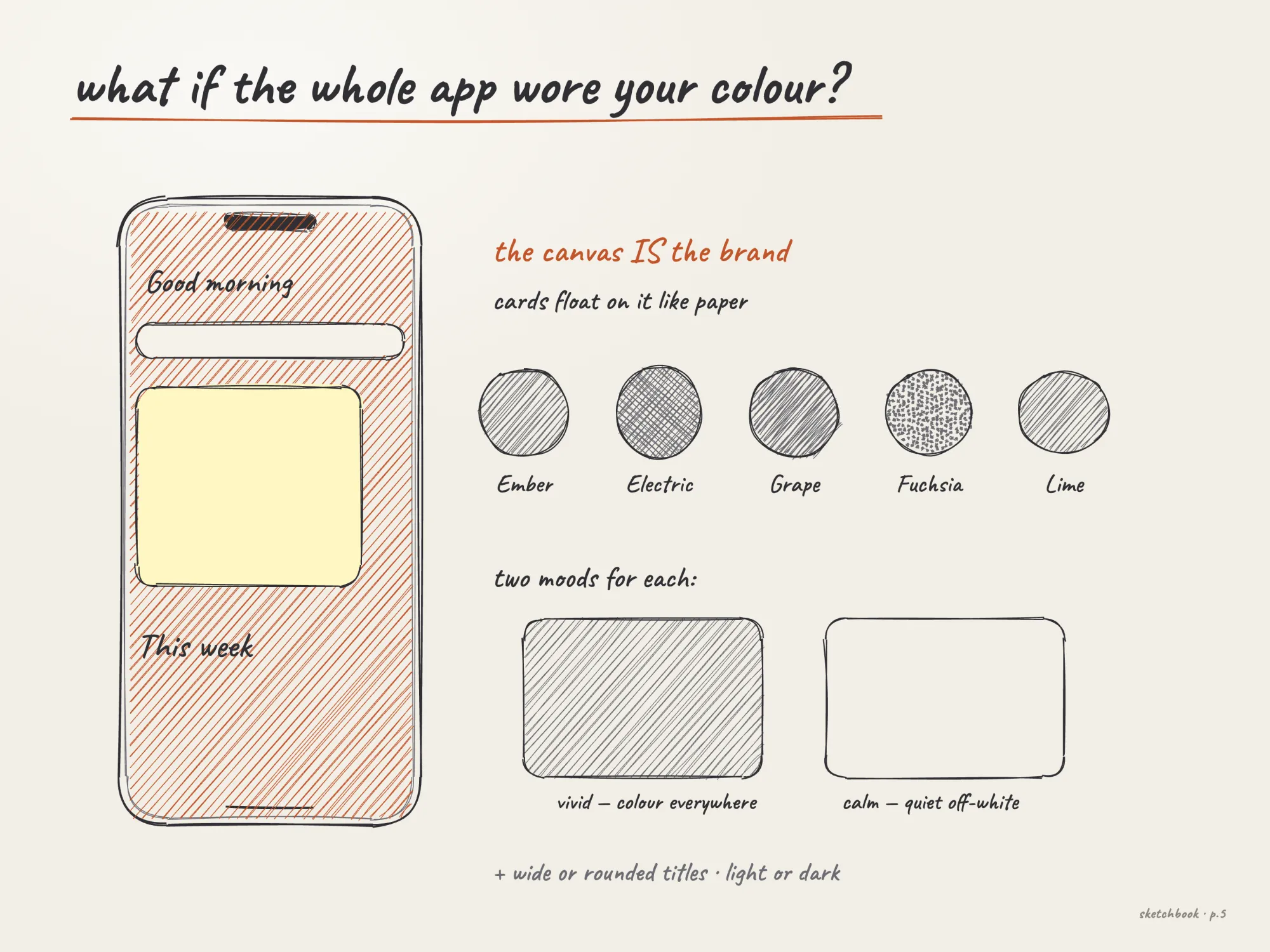
What if the whole app wore your colour?

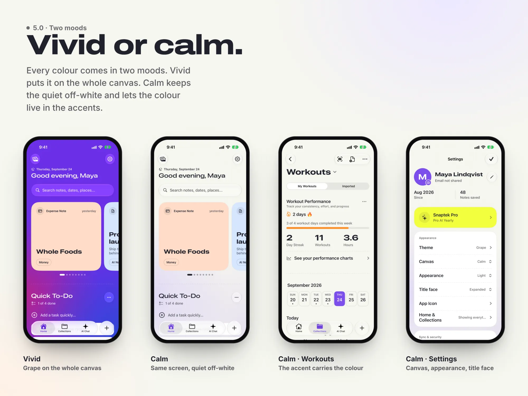
The canvas is the brand. Five colours, Ember, Electric, Grape, Fuchsia and Lime, each in vivid or calm, with wide or rounded titles, light or dark. Cards float on the colour like paper.

Sketch: the canvas is the brand, five colour swatches, vivid and calm
Sketch, redrawn for this case study

Pick a colour. The whole app wears it.

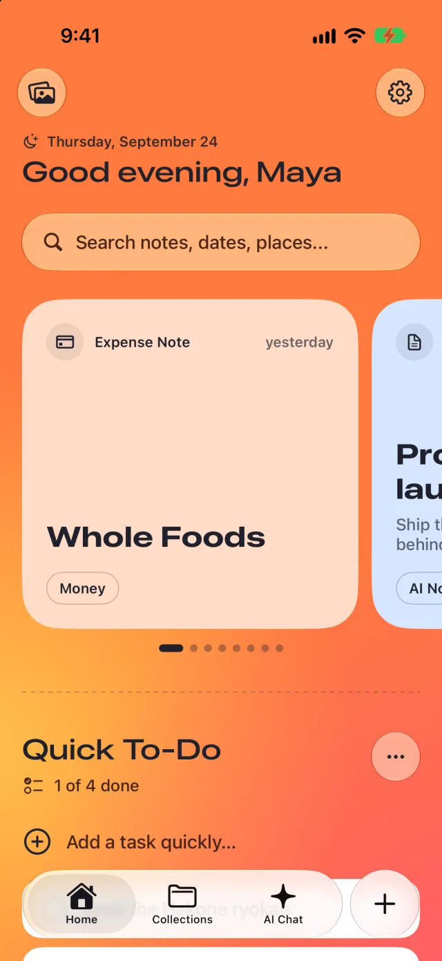
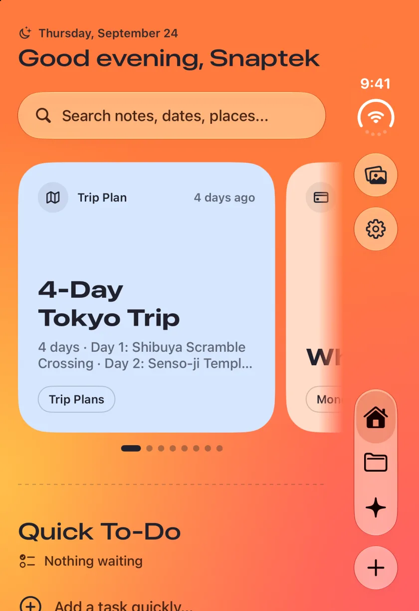
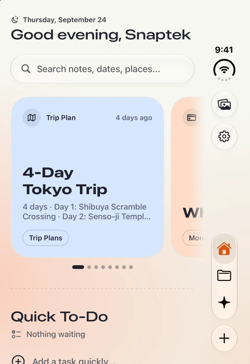
Five colours, each in two moods. Vivid puts the colour on the whole canvas. Calm keeps the quiet off-white canvas and lets the colour live in the accents. Same screen, same notes. These are real screens from the 5.0 build on iPhone Duo’s outer display, and every combination is contrast-checked.

Colour: Ember
Snaptek Home on iPhone Duo in Ember, vivid

Screen recording, onboarding

Vivid and calm side by side: Home, workouts and settings

In the app the choice comes first. Onboarding asks for a colour before anything else, and swiping recolours the whole screen as each card settles. One glass capsule holds the colours, and the chosen dot opens into a pill with its name. Vivid or calm is the smaller choice, so it sits up by the wordmark instead of stacking another row above Continue.

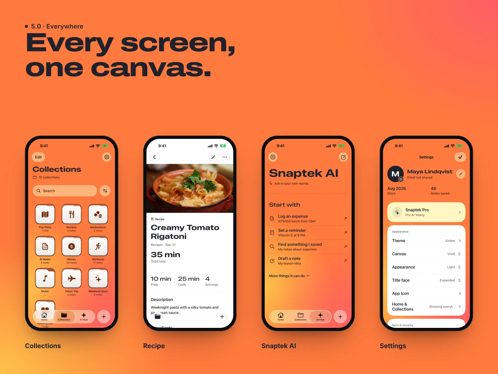
Colour for the canvas, cards for objects.

Sections sit directly on the colour, separated by dashed rules. Cards are only for objects, and glass is only for controls that float. The custom sync engine went too: 5.0 syncs through the CloudKit mirror.

Collections, a recipe, Snaptek AI and Settings, all on the Ember canvas
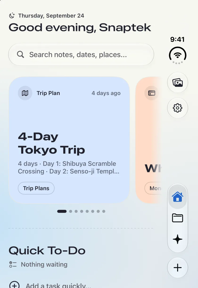
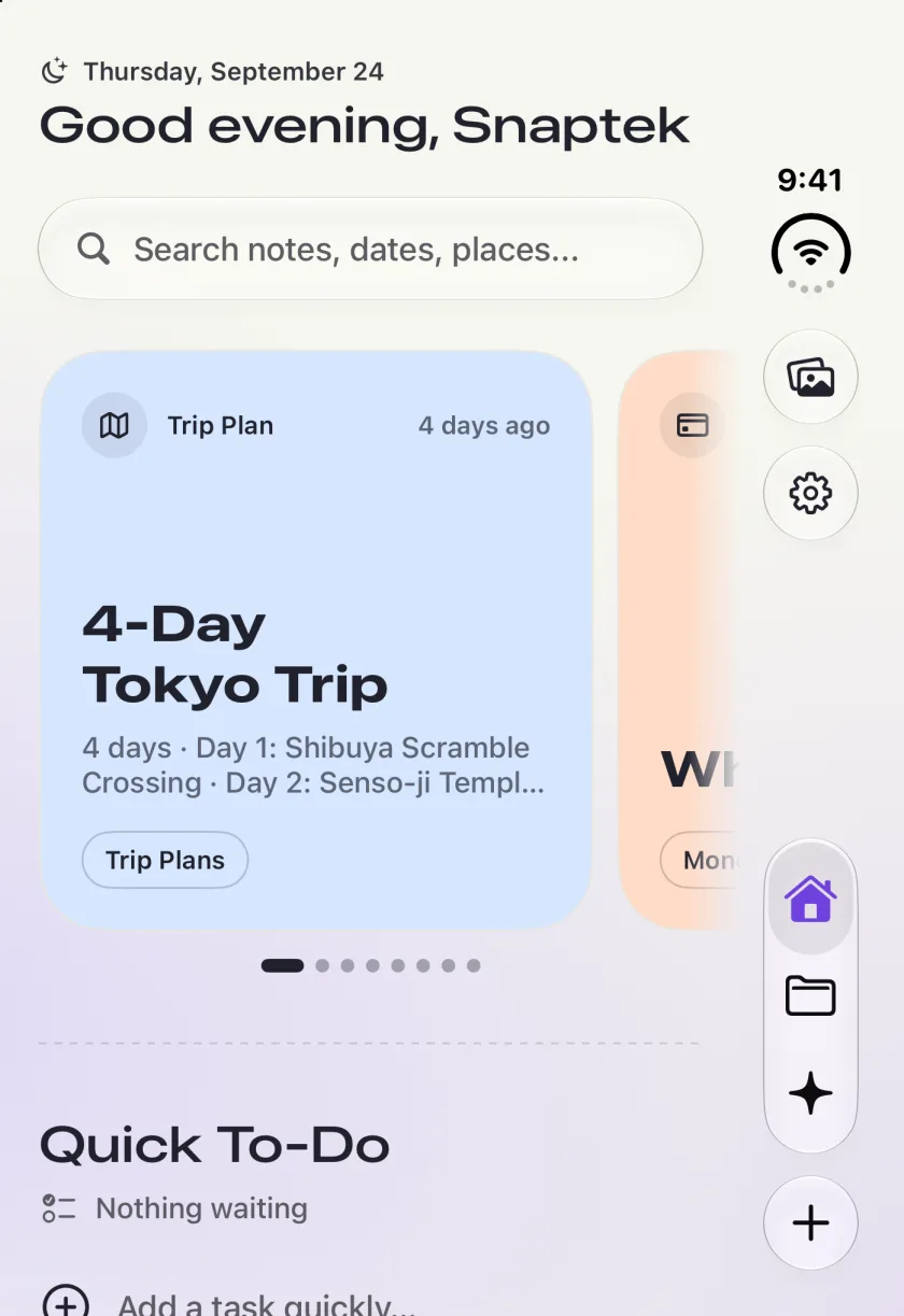
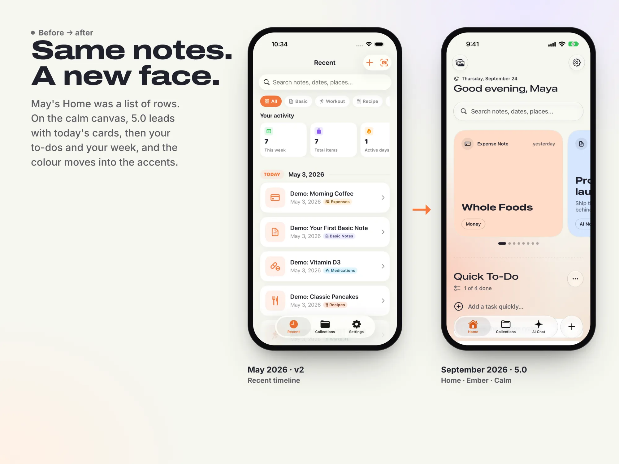
The May 2026 Home beside the September 5.0 Home in Ember calm

What May taught September.

May’s Home was a list of rows. On the calm canvas, 5.0 leads with today’s cards, then your to-dos and your week, and the colour moves into the accents. Along the way, using it taught me these.

  • Money screens flashed wrong numbers while they loaded.

    Fixed in 4.4, the release called “Squashing Money Bugs”.

  • One card for every note type felt generic.

    Every type has its own card.

  • A streak shown as “0 days” beside fourteen dots wasn't understood.

    The streak was redesigned.

  • Cloud AI ran on credits.

    The assistant runs on the device with Apple Intelligence.

Saving shouldn't need a screenshot at all.

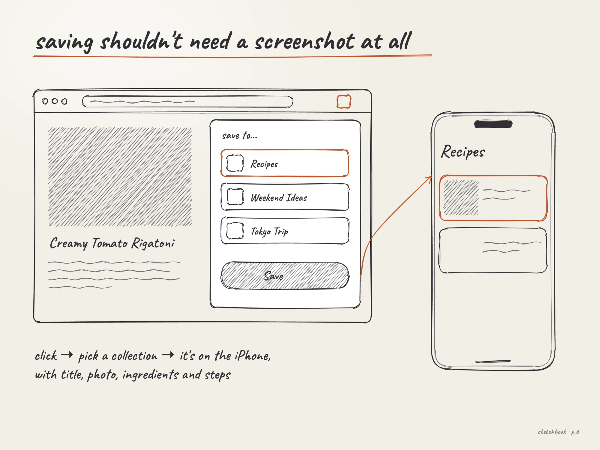
With the Chrome extension, you click the Snaptek button on any page, pick a collection, and it’s on your iPhone. A recipe arrives ready to cook: ingredients with amounts, numbered steps, times and servings.

The extension is live

Sketch: click the extension, pick a collection, it arrives on the iPhone
Sketch, redrawn for this case study

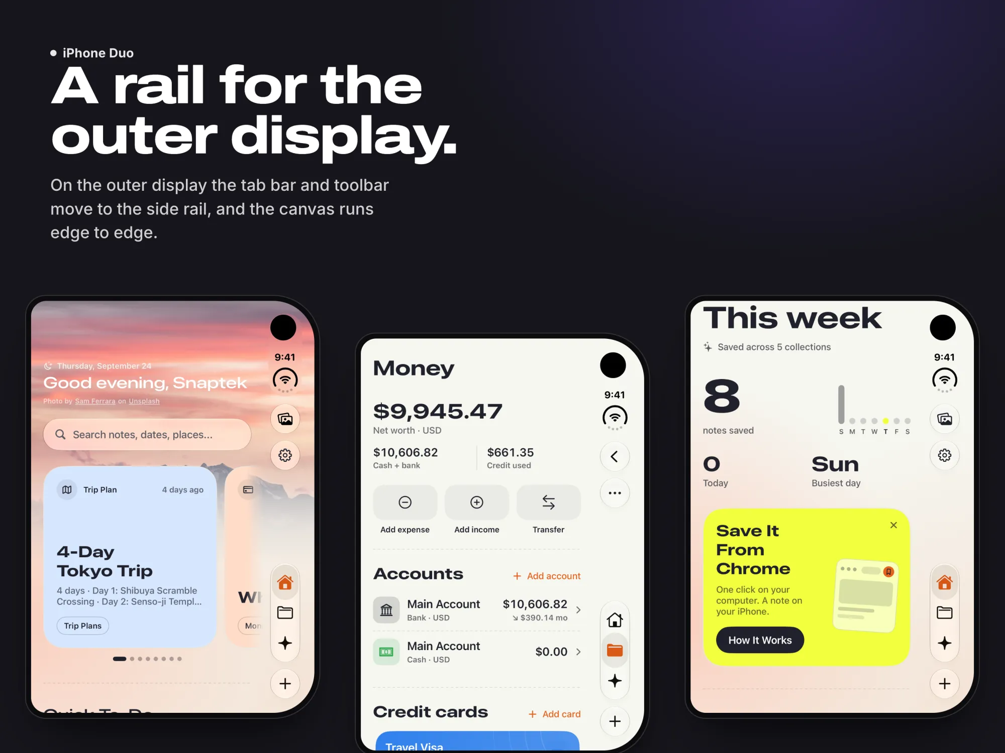
No Duo version of Home.

Home runs as itself at every size, never as a special Duo screen. Folded, only the bars move. Opened up, the inner display keeps them horizontal.

Three outer-display screens with the side rail: Home, Money and This week

Two kinds of AI, kept apart.

Inside the product, Apple Intelligence runs on the device, so the privacy promise stays true and there is no server bill on a feature people use all day.

Around the product, I build with coding agents every day. That is how one person carries an app across iPhone, iPad, Watch and a browser extension. What makes it work is not the model. The repository tells the agent what good looks like before it writes a line: a token contract in DESIGN.md, and rules it has to follow.

The rules the agents work under

  • 01Ground every new surface in real product patterns first, then design.
  • 02The design system is the floor. An agent composes from the tokens, never invents a value or a one-off component.
  • 03Mock first in SwiftUI previews. Nothing enters the app until the mock is approved in the Xcode canvas.
  • 04AI output that reaches a user is a draft with a visible correction path, never a silent write.
  • 05If a check did not run, I do not say it passed.

The reply resolves. It doesn’t type.

Swift

The first AI reply used a typewriter that added one character at a time, and every answer read like a machine at work. Now a single Text is laid out once and a custom TextRenderer resolves each word out of a blur. Nothing reflows under the reader, and Reduce Motion swaps it for a crossfade.

/// Reveals a reply one word at a time. The earlier typewriter added
/// characters one by one and made every reply read as a machine at work.
struct TypewriterBlurText: View {
    let text: String
    /// The vibe type role to set the text in. Wins over `font`.
    var role: VibeFont? = nil
    let color: Color
    /// False shows the text sharp at once. A reply that was read in an
    /// earlier session is a record, not an arrival, and must not perform
    /// again every time the chat is reopened or scrolled back into view.
    var animated: Bool = true

    @Environment(\.accessibilityReduceMotion) private var reduceMotion

    /// 0 is nothing revealed, 1 is every word sharp.
    @State private var progress: Double = 0
    @State private var words = WordRevealMap(text: "")
    /// Reduce Motion swaps the reveal for a crossfade.
    @State private var fade: Double = 1

    var body: some View {
        styled
            .multilineTextAlignment(.leading)
            .textRenderer(WordRevealRenderer(progress: progress, words: words))
            // …
    }
}
5.0 is out. What’s next.

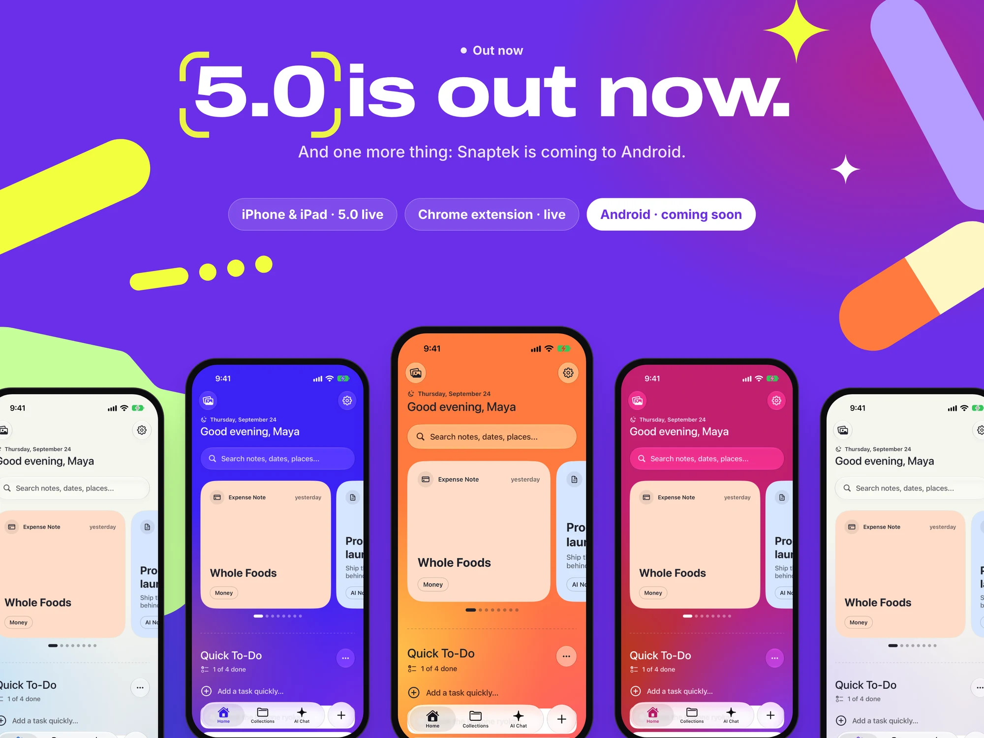
Snaptek 5.0 is out now on the App Store, and the Chrome extension is live. One more thing is still ahead: Snaptek is coming to Android.

Five iPhones in five colours under the line “5.0 is out now”
Next project

Talentera